


When I create wedding planner websites for my clients, I look for one thing. I want the site to feel like the planner behind it. Luxury couples choose a planner because they trust their eye, their ideas, and their energy. Your website has to show that within seconds.
I’ve designed many wedding planner websites over the years, and the ones that book luxury clients share one clear thread. They are simple, warm, and full of personality. They guide people with ease. They look high-end without trying too hard. And most of all, they help couples see what it feels like to work with you.
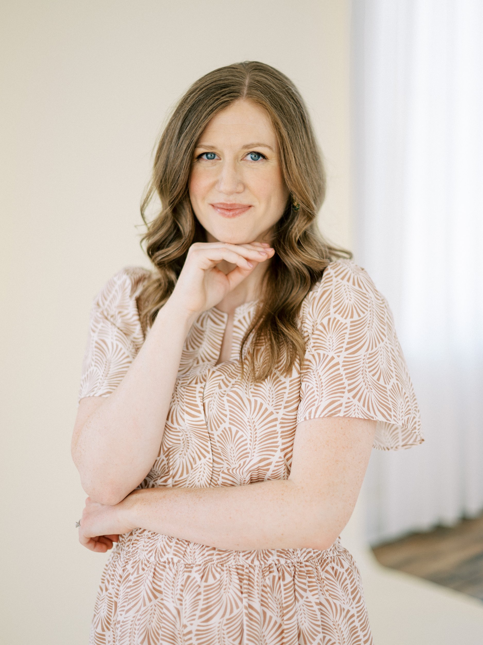
Before we dive into the examples, here’s a bit about me. I’m Alex, a Showit website designer for wedding pros. I design custom branding and websites that match the high level of service you bring to every event. My goal is simple. Your online presence should feel as polished and heartfelt as the work you do in person.
If you want that kind of website, you can explore my services or visit my Template Shop. Both are built to help you move into your next level with confidence.
Now let’s look at four wedding planner websites I designed and why they book luxury clients again and again.

The Common Thread in Every Luxury Planner Website
When a wedding planner website works well, it is not by accident. It’s clear, easy to move through and sets the tone right away. Couples see the planner’s style and personality, and they can picture their day through that lens. That is the secret behind every high-end planner site I create. The design becomes a natural extension of their work.
Here are four sites I designed that show this in action.
Get your website ready before booking season hits! Read my blog for simple website refresh steps to take now that help you attract the right couples with confidence.
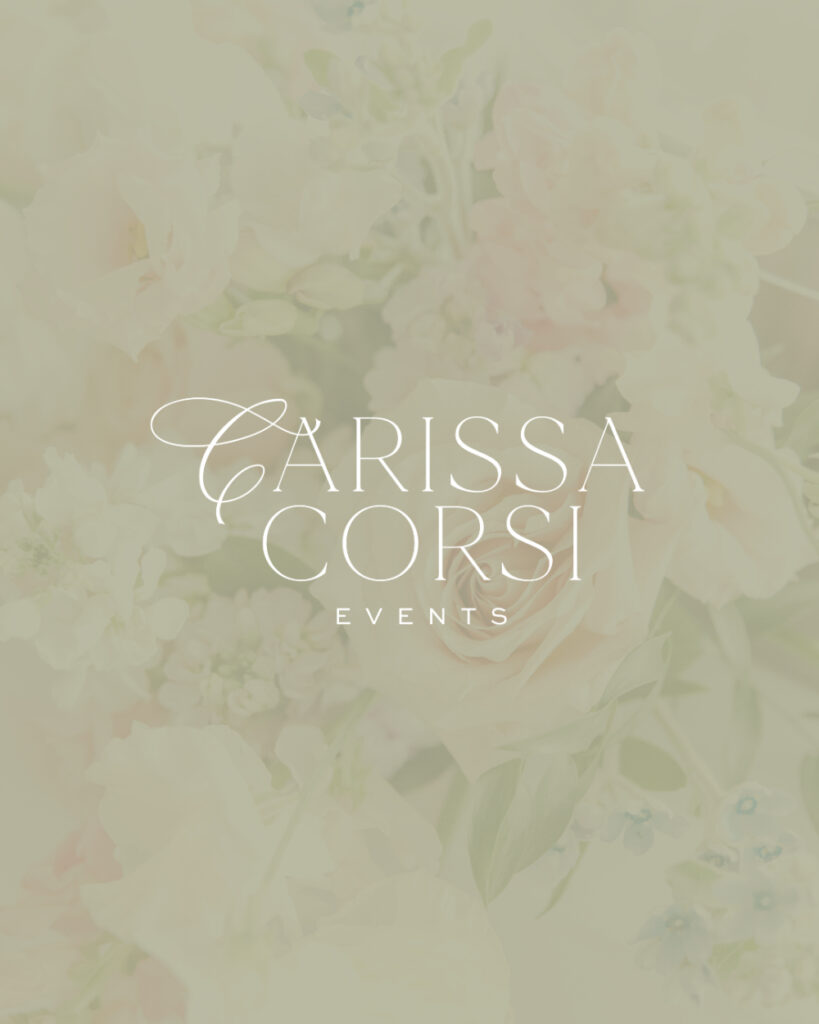
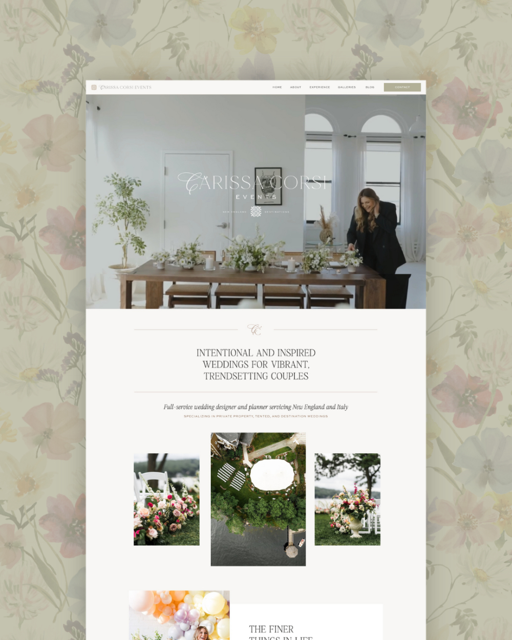
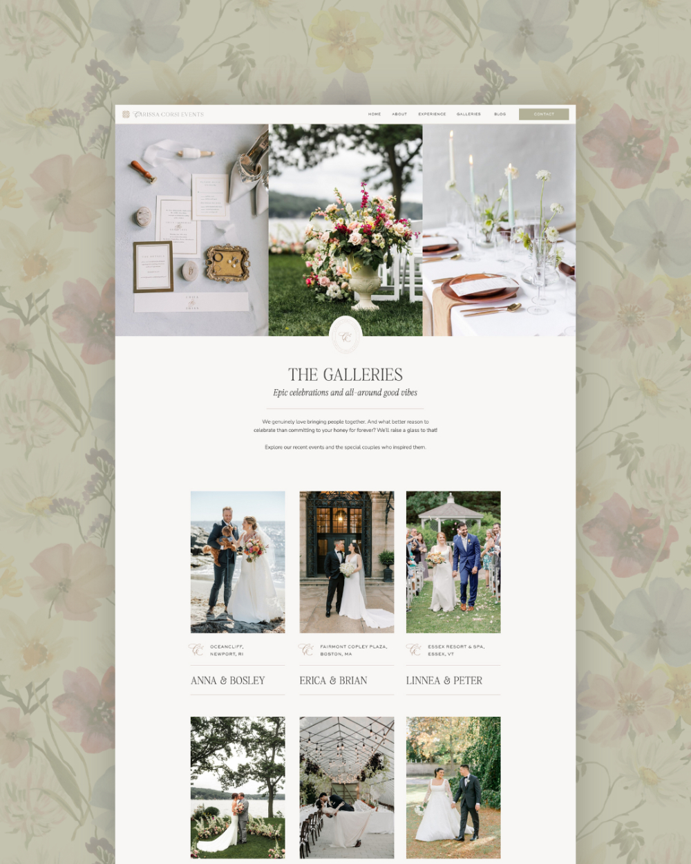
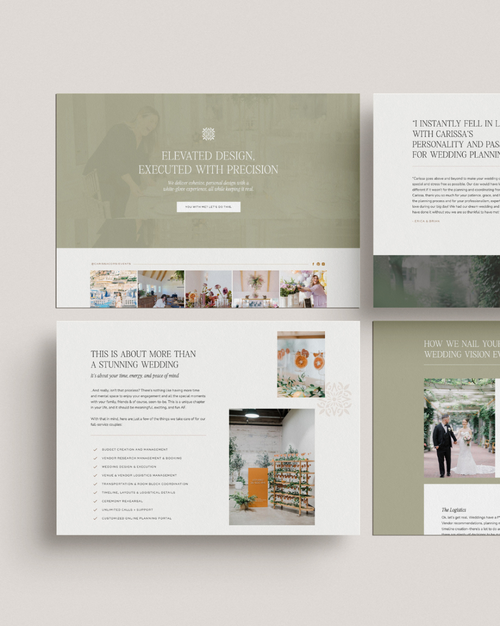
1. Carissa Corsi Events — Storytelling That Feels Warm and Real
Carissa is a full service wedding planner who works across New England and Italy. Her events feel timeless, fun, and thoughtfully designed. When we built her brand, I pulled from the patterns and textures of coastal Italy. (Think soft stone, gentle edges, warm light.) Her logo has a clean serif with a flowing calligraphic C that gives it a custom, romantic feel.
Her color palette is mostly neutral with muted accents. This keeps everything refined, yet still playful. It matches her style and the couples she serves.
For her website, I created a layout that feels calm and elegant. The typography is simple and inviting. The pages flow in a natural way. The soft brand marks help guide visitors while adding a light personal touch. People often tell me how much they love this site. I think it is because it feels like Carissa from the very first scroll. It shows her care, her joy, and her love for building events that feel meaningful.
This is one of the wedding planner websites that always stands out because it uses story and style at the same time.
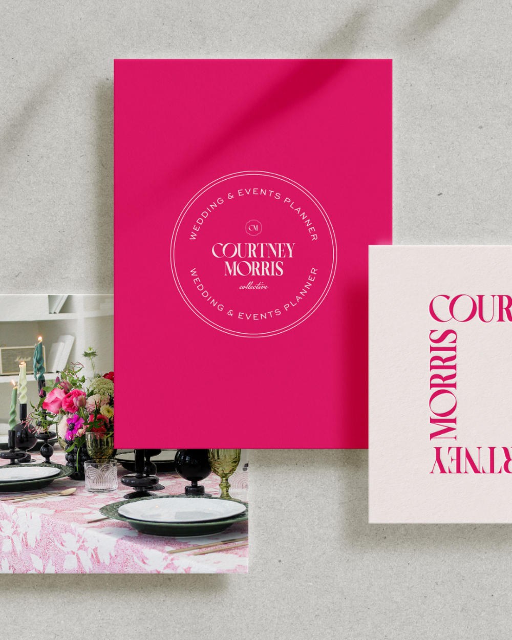
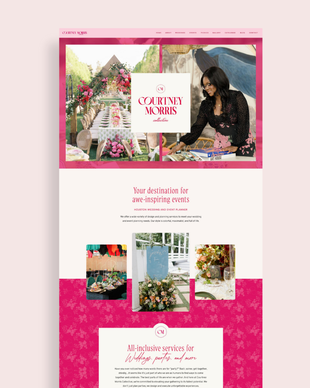
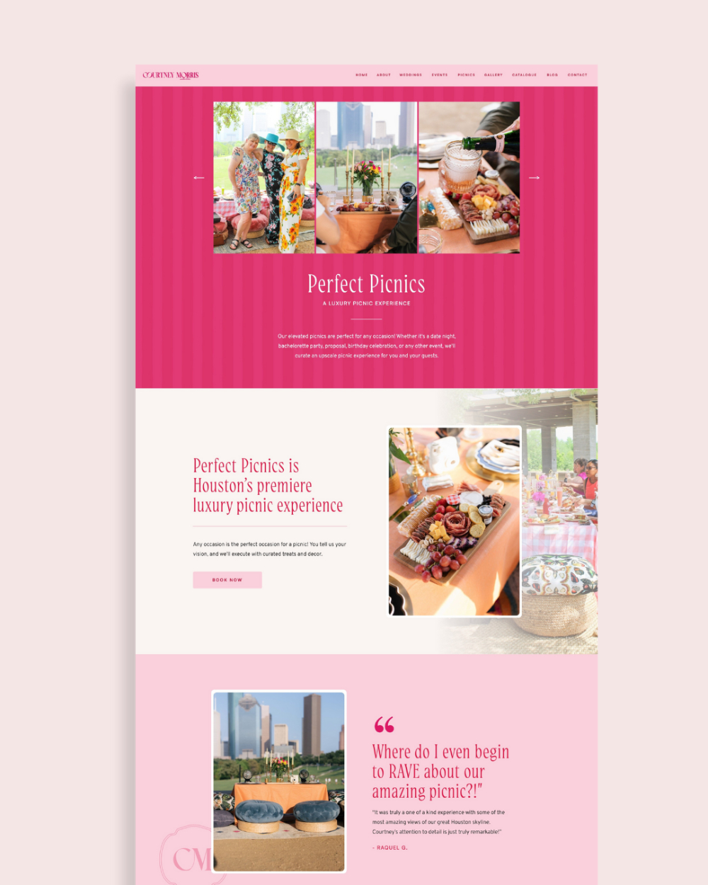
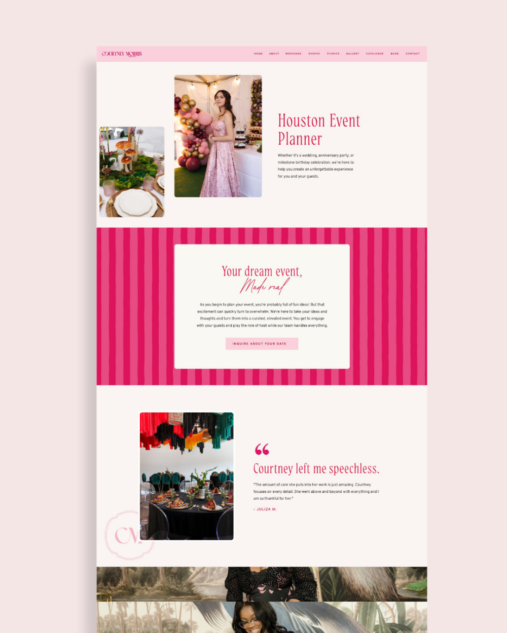
2. Courtney Morris Collective — Bold Color Used With Intention
Courtney is a Houston-based wedding and event planner known for planning events that are bold, colorful, and full of life. When she came to me, she wanted a brand and website that showed her colorful style without losing a polished, high-end feel. This was the perfect chance to prove that luxury sites do not have to be neutral.
Her brand uses a rich palette of pinks and reds. It feels playful but still polished. The logo system mixes chic serif fonts with her bright palette, giving the whole brand a confident look. It shows who she is right away.
Courtney’s custom Showit website uses color in a smart way, intentional way. Her bright, saturated imagery leads the design while the background stays clean so the colors never feel too heavy or busy. The layout guides visitors with ease. That mix of fun and structure is why this site works so well.
This is one of my favorite examples of how wedding planner websites can use strong color and still feel luxury. Couples are drawn to her confidence, her creativity, and her bold style the moment the site loads. It shows she is not afraid to lead with personality, and that is exactly what her ideal clients love about her.
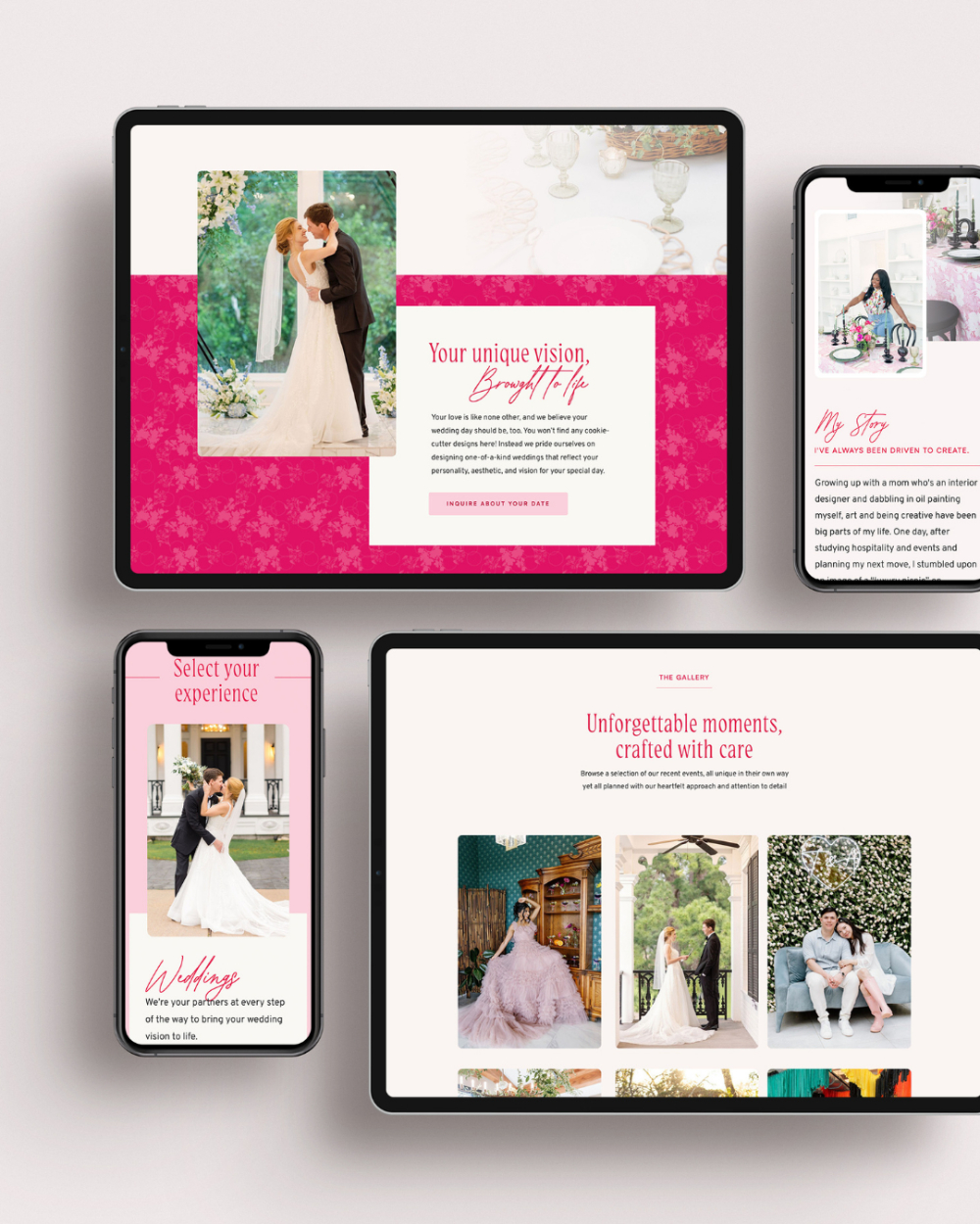
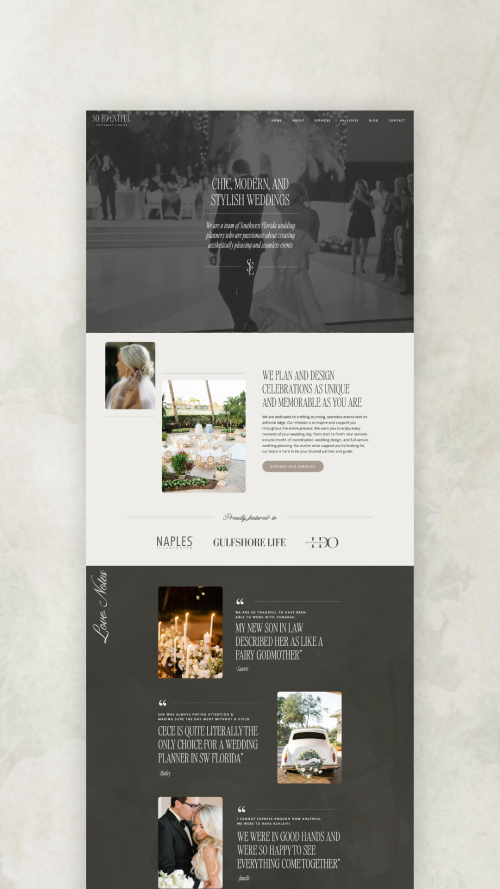
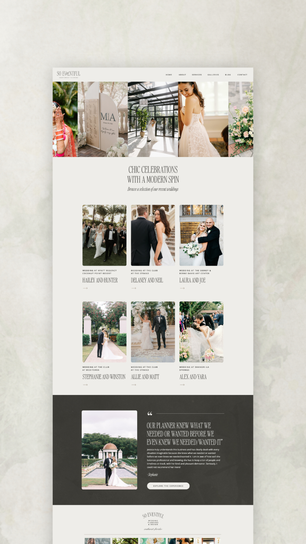
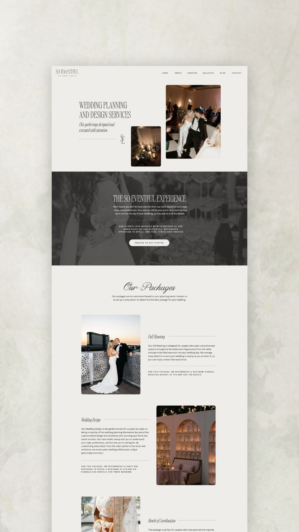
3. So Eventful SWFL — Modern, Chic, and Full of Credibility
So Eventful SWFL creates chic, modern weddings across Fort Myers, Naples, Sanibel Island, and Captiva Island. Their style is cool and editorial inspired. When we updated their brand, I knew they needed something neutral, modern, and crisp. Not the “beige” kind of neutral, but the strong, warm, cool girl kind of neutral. (Yes, that is a real design category in my head).
Their main logo mixes a sharp serif with a soft calligraphic line. It feels clean and stylish. I built a full set of submarks and textures to keep the brand flexible and cohesive.
For their website, I wanted the whole team to shine. We placed team photos in key spots to build trust. We layered brand marks through the pages so the identity feels bold but still minimal. We also added several galleries to show their beautiful events.
This is one of the wedding planner websites that sets trust right away. The clear layout, strong visuals, and modern tone help couples feel confident before they even reach out.
If your brand feels out of sync with your work, it may be time for a change. Read my blog to learn the signs and the steps to take first.
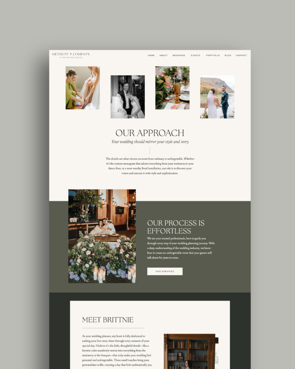
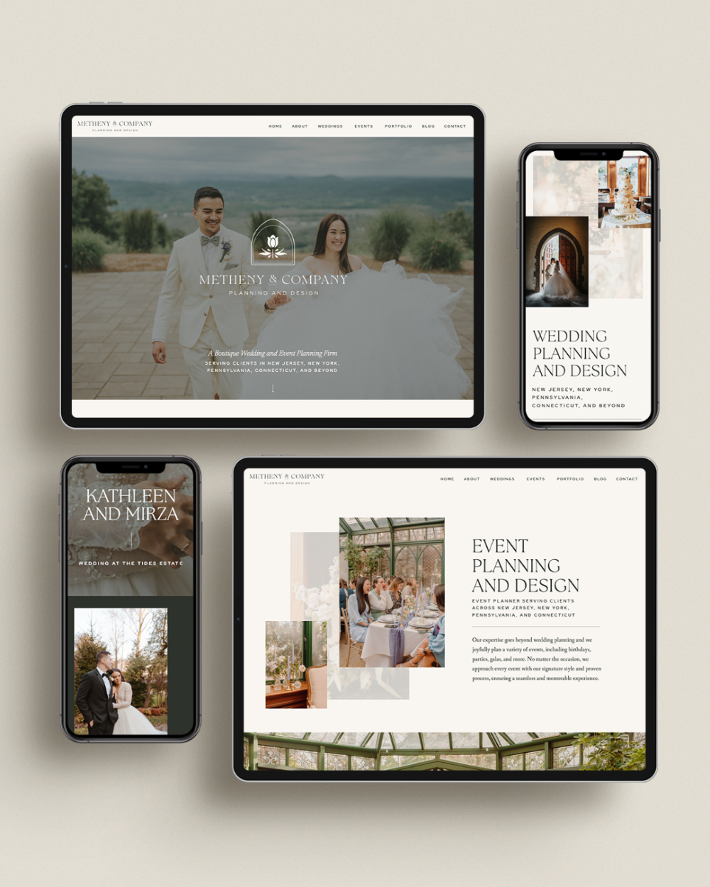
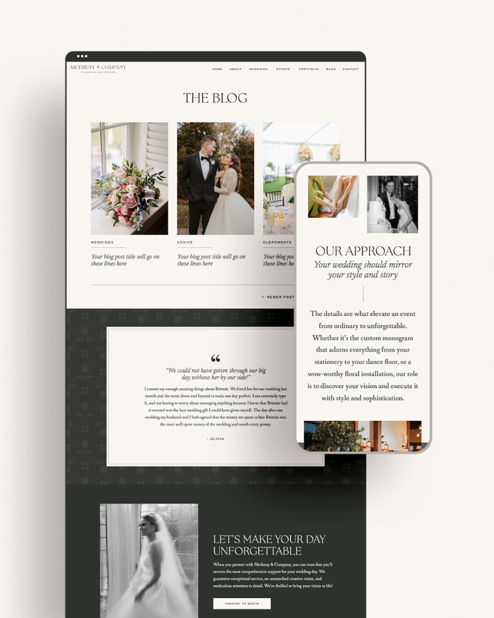
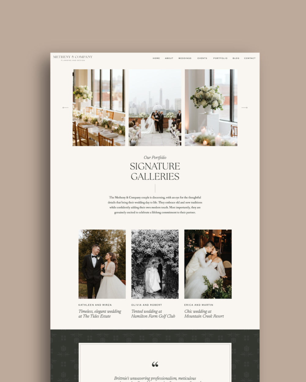
4. Metheny & Company — Classic, Romantic, and Quietly Luxurious
Metheny & Company is known for romantic events with a modern, heirloom feel. When Brittnie asked me to refine her brand, the goal was quiet luxury. Something soft and nostalgic, but still fresh.
The main brand mark is a floral emblem that feels bold and symmetrical. We paired it with a raised ampersand for a strong identity. The palette is moody and muted with soft neutrals mixed in. The typography brings both richness and clarity. It all works together to feel timeless.
For the website, we used my Olive Tree template and customized it fully (template customization is ideal if you want the look of a custom site but in less time!). The new brand elements fit right in. The colors, textures, and typography made the design feel like it was built only for them.
This is one of the wedding planner websites that shows how powerful a template can become when it is personalized with care.
Ready for steady, sustainable visibility? My Showit SEO post shows wedding pros how to boost their site without extra stress. Read it here.
What You Can Borrow for Your Own Website (and Where to Start)
These are my favorite website design tips, and they work whether you are new in business or growing into a higher end market.
1. Audit your visuals
Strong images matter more than anything else. Swap in your best photos. Choose pictures that feel consistent and true to your style. Even five new photos can change the whole look of your site.
2. Simplify your navigation
Make it easy for couples to move around your site. Use clear words. Keep the menu short. Think of it like guiding guests through a venue. They should always know where to go next.
3. Clarify your value message
Tell people who you are, who you serve, and what you do best. Write to the couples you want next year, not last year. Clear messaging is one of the most powerful tools on wedding planner websites.
4. Update your copy so it speaks to your future
If you want higher end couples, your words should sound like the level you want to work at. Small edits can make a big difference.
Ready to Level Up Your Website?
If these wedding planner websites sparked ideas for your own site, I would love to help bring your vision to life. Your website should feel warm, clear, and confident. It should reflect the care and skill you bring to every event.
You can look through all my services to find the best fit for you. Whether you need a full custom brand and website, a brand identity refresh, or a template customization, there is an option that will meet you where you are. You can also browse my Template Shop if you want to start with a design you love. You can DIY it or hire me to customize it for you.
Your dream clients are already out there searching. Let’s help them land on a site that feels clear, warm, and true to you.
Leave a Comment