


If you have been studying the best wedding photographer websites, it likely means something feels misaligned. Your work has evolved. Your standards are higher. But your website still reflects an earlier version of your business.
You can feel the gap.
A wedding is a high-end, meaningful experience. Your couples sense that from the start. Your website should carry that same weight from the first click. It should feel calm, confident, and clear.
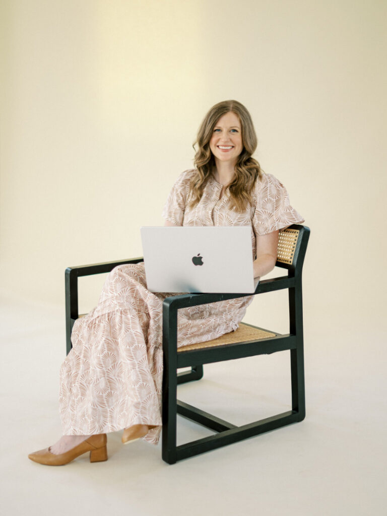
Hi, I’m Alex Collier. I design websites for wedding pros who want their online presence to feel as high-end as their work. More often than not, the difference between a site that feels elevated and one that feels average comes down to clarity and simplicity.
If this post has you rethinking your own site, you can explore my custom website services or browse my template shop to build a refined, confident online presence in your market. And if you’d rather start with a conversation, let’s connect. Reach out here or message me on Instagram. I’d love to hear what you’re working toward.
What Actually Makes a Wedding Photographer Website “Good”
The best wedding photographer websites are not built on luck. They are built with intention and clarity. At their core, they know exactly who they are for. The work feels curated, not crowded. Each section guides the visitor forward without confusion or distraction.
And that matters more than you might think.
Your website is not a museum where people slowly admire every detail. It is an airport. Visitors arrive with a goal. They want to view your work, understand your style, and decide whether to reach out. When that path feels obvious and easy, trust builds quickly.
A strong site makes the next step feel natural. It does not rely on flashy features or busy layouts. It relies on focus, confidence, and simplicity.
Your portfolio is where interest turns into action. Read Designing a Wedding Portfolio Page That Converts Browsers to Bookers to learn how to guide couples from scrolling to inquiring with clarity and confidence.
The Best Wedding Photographer Websites Give the Work Room to Breathe
When you look closely at the best wedding photographer websites, one detail stands out right away. They give their work room to breathe.
There is space around the images. Space around the words. A natural pause is built into the layout. Instead of layering graphics or busy backgrounds, the design steps back and lets the photography lead.
That restraint communicates confidence. Large, uninterrupted images signal that your work can stand on its own. At the same time, generous spacing keeps the viewer focused. Their eye moves calmly from one section to the next without distraction.
One of the biggest mistakes I see is photographers trying to prove their value by showing everything at once. Galleries stack up. Sliders layer in. Multiple font styles start competing for attention. But clarity always wins. When the layout feels calm and curated, your work speaks louder.
Want to see how a refined brand and template customization can elevate a photographer’s presence? Read Custom Brand and Showit Template Customization for Jessica van der Marel Photography to see how clarity and cohesion come together online.
Websites That Feel Effortless to Navigate
The best wedding photographer websites feel effortless from the start. Nothing feels hidden. Nothing feels confusing. Every step feels clear.
Instead of friction, you experience:
- A short, focused menu that guides you quickly
- A clearly labeled portfolio that is easy to access
- Simple calls to action that tell you exactly what to do next
- A contact form that feels straightforward, not overwhelming
- A mobile layout that works just as well as a desktop
This is where many photographers fall short. The design may look beautiful on a large screen, but most couples are scrolling on their phones. If the mobile experience feels cramped or confusing, they move on. Not because your work is lacking. But because their time is limited. When navigation feels smooth and intuitive, trust builds naturally.
Curious how a custom Showit design can support a photographer’s growth? Read Custom Showit Website for Ruth Eileen Photography to see how clarity and refined visuals elevate her online presence.
Websites That Communicate a Clear Point of View
The best wedding photographer websites are not trying to win everyone over. Instead, they lean fully into a specific style and point of view.
Within seconds, you can sense what draws the photographer. Maybe it is grand estate weddings. Maybe it is windswept outdoor celebrations, modern city rooftops, or quiet backyard vows. That preference shows up everywhere, from the color palette to the tone of the copy to the way the galleries are curated.
This approach is not about excluding people. It is about clarity. A defined point of view creates a stronger emotional pull.
When your brand feels clear and consistent, the right couples recognize themselves in your work. Others may move on, and that is not a loss. It simply means your message is doing its job.
Want your site to be seen, not just styled? Read Showit SEO Made Simple: A Guide to Sustainable Visibility for Wedding Pros to learn how to build steady, long-term traffic with clarity and ease.
How the Best Wedding Photographer Websites Balance Personality + Restraint
The best wedding photographer websites feel personal without feeling overwhelming.
You get a glimpse of the photographer. A thoughtful image. A short, honest story. A clear sense of what they care about and how they approach their work. There is warmth, but it never spills into oversharing.
At the same time, the design remains restrained. The layout feels clean. The fonts are consistent. The color palette supports the work instead of competing with it. That balance is what creates a polished, high-end presence. It feels intentional. It feels steady. And that quiet confidence is exactly what higher-end couples are drawn to.
See this balance in action in Custom Brand and Showit Template Customization | Esther Makau Photography.
What to Notice (and What to Ignore) When You’re Gathering Inspiration
As you study the best wedding photographer websites, give yourself time to look beyond the surface. Instead of simply saving screenshots, pause and consider what is actually working.
Notice the feeling each site creates. What makes one gallery feel calm and refined? Why does a certain homepage carry a high-end tone? What kept you scrolling all the way to the bottom without losing interest? When you start asking better questions, you gather better inspiration.
Look at:
- Image size
- Spacing
- Font pairings
- Button placement
- Order of sections
Ignore:
- Trendy animations
- Fancy hover effects
- Design tricks that distract from the work
Trends change. Clarity does not. Your goal is not to copy the best wedding photographer websites. It is to understand the principles behind them.
Trying to decide which path makes sense for your growth? Read Template vs Custom Website Design: Which Is Right for Your Business? to clarify your next step with confidence.
Common Mistakes Photographers Make When Recreating These Sites
Now let’s be honest. This is where many photographers trip up. They see the best wedding photographer websites and try to recreate them without the foundation.
Here are the most common mistakes.
Copying The Look Without The Clarity
You can copy a color palette. But if your messaging is unclear, the site will still feel off.
Overloading The Portfolio
More photos do not equal more value. Curated work builds trust faster than a massive gallery.
Ignoring Copy
Images matter. But words guide. If your about page is vague, couples will not feel connected.
Forgetting Mobile Design
Again, most visitors are on their phones. Test every page on mobile.
DIY Fatigue
Sometimes you have outgrown your own skills. And that is okay. Growth often requires support.
If you recognize yourself in any of these, take a breath. These mistakes are common, especially when you are trying to grow quickly. The goal is not to perfectly copy the best wedding photographer websites. It is to understand the structure and clarity behind them, then build a site that reflects your own work with the same confidence and restraint.
Ready to Create One of the Best Wedding Photographer Websites?
At the end of the day, the best wedding photographer websites are not about trends or perfection. They are about alignment. When your site reflects the caliber of your work, your values, and the experience you deliver, everything feels more cohesive. Couples trust you faster. Planners take you seriously. And you feel proud to share your link. That is the shift we are after.
If you are ready to create one of the best wedding photographer websites in your market, you can explore my custom brand and website experience or browse the templates in my shop. And if you are unsure which path is right for you, reach out. We can talk through it and find the next right step for your business.
Leave a Comment