5 Tips for Creating a Mood Board that Captures your Brand
I remember sitting on my bedroom floor in high school rifling through the latest issues of Teen People and Seventeen, searching for the most inspirational words and images to cut out. Gluestick in hand, I repositioned the different cutouts on a piece of computer paper until they looked just right. I slipped the finished collage into my binder cover and walked into Geometry class feeling pretty cool that my binder perfectly matched my personality.
The entrepreneur’s version of the magazine collage? The mood board!
The mood board is a key part of the branding experience. It captures the look and feel of your brand, which informs the rest of the branding process, including your fonts, colors, logo, and website! All of my clients and I collaborate to create a mood board that communicates their brand personality in a visual way.
Because I know that creating a mood board can be overwhelming, I have my clients start by creating a Pinterest board with 30-40 images for inspiration. I then curate images from that board and supplement where needed with other images, patterns, and textures to create a mood board that perfectly captures my client’s brand.
There are two important things to remember about mood boards:
- It should come at the end of the brand discovery process, and
- Its purpose is to be used as inspiration
When you’re excited about a rebrand, it can be tempting to jump on over to Pinterest and start pinning alllll the ideas. Avoid this trap at all costs! You’ll end up with hundreds of pretty—but unrelated—images with no strategy behind them.
Second, consider that your mood board is not the end result. There’s no point in stressing out about the exact colors, images, and layout of your mood board—no one will ever see it besides you! The mood board serves as the inspiration for your brand. The look and feel it evokes serve as your guide in selecting brand elements like colors, fonts, and logos. The mood board is a great example of a time you can embrace the motto “done is better than perfect.”
Here are my best tips for creating a mood board for your brand:
Mood Board Tips
- Don’t include logos or brand boards I’m starting off with a “don’t” because it’s the number one mistake I see people making on their mood boards! Logos and brand boards from other businesses are the end result of the work you are doing now. Using them on a brand board only serves to confuse and distill your own brand. Even worse, using a logo on a mood board tends to lead to a logo that is very similar, which is definitely not good! You are creating your own unique brand, so resist the urge to draw inspiration from others’!
- Draw inspiration from other industries If you are in the wedding industry, try to avoid having a mood board that consists entirely of wedding images. This can give you a myopic view of your brand where you struggle to see the big picture. Remember, a mood board is all about the look and feel—that does not have to be specific to weddings. I encourage my clients to seek inspiration from outside industries like fashion, interior design, textile design, and architecture
- Use your own work As a wedding professional, chances are you have lots of gorgeous images of your work, whether floral design, calligraphy, or the photos themselves. Don’t be afraid to include your own work on your mood board. If it’s the kind of work you are really proud of and want to be doing more of, it’s perfect for a mood board!
- Base your mood board on your brand adjectives Before you get to the mood board stage, you should have narrowed down about 3 adjectives that describe your brand. This can help you narrow your focus for your mood board. For example, if one of your brand adjectives is “preppy,” all the images, patterns, and colors on your mood board should feel “preppy” in some way.
- Consider color I don’t necessarily think that a mood board has to express a specific brand color, but it should tell a harmonious color story. For example, if your mood board trends more neutral, try not to mix warm and cool neutral tones. If your mood board is bold and bright, a soft and airy image might not fit.
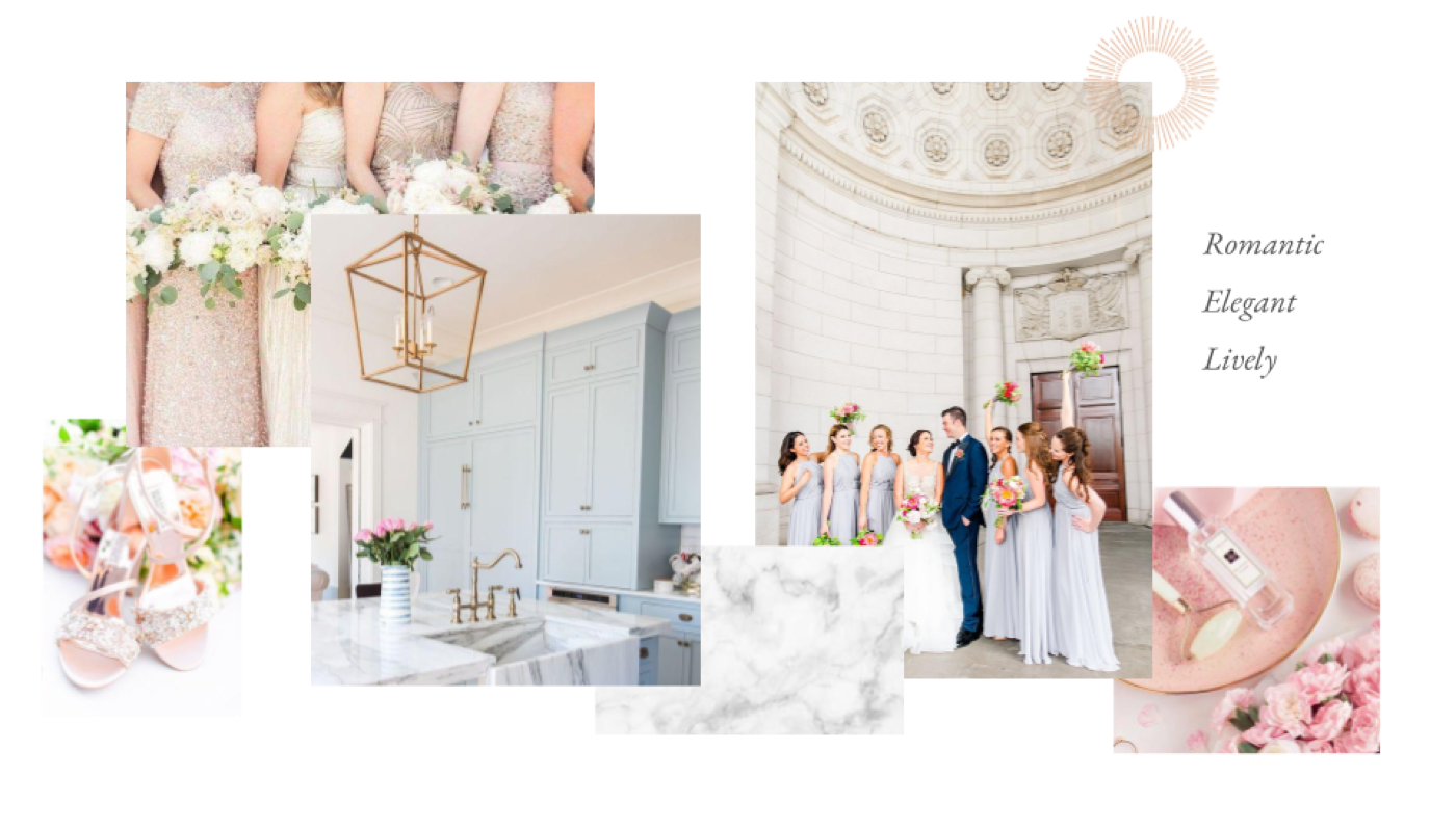
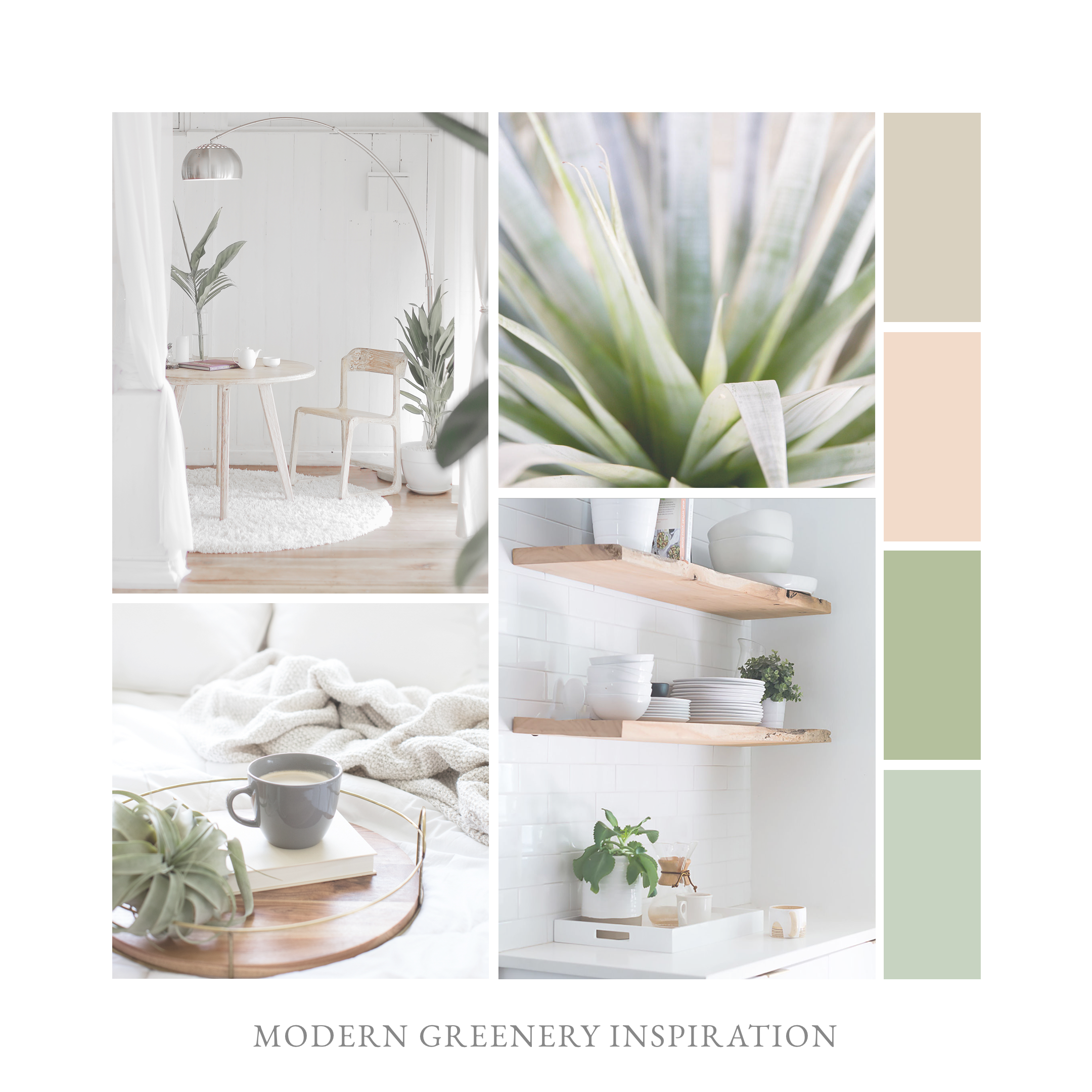
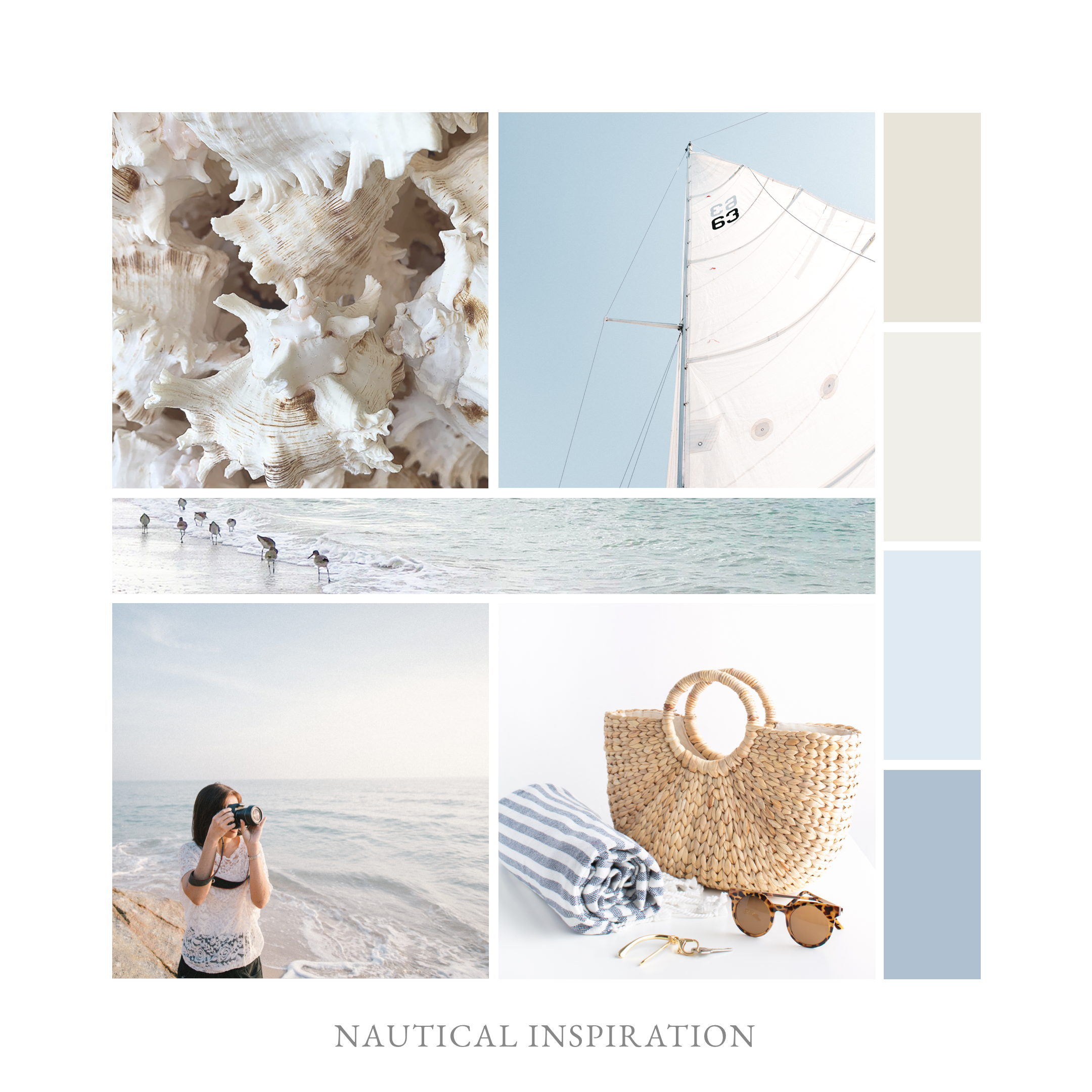
Here are some examples of mood boards I’ve created recently to give you an idea of how these tips work in action:


Do you have a mood board for your brand?
Leave a Comment