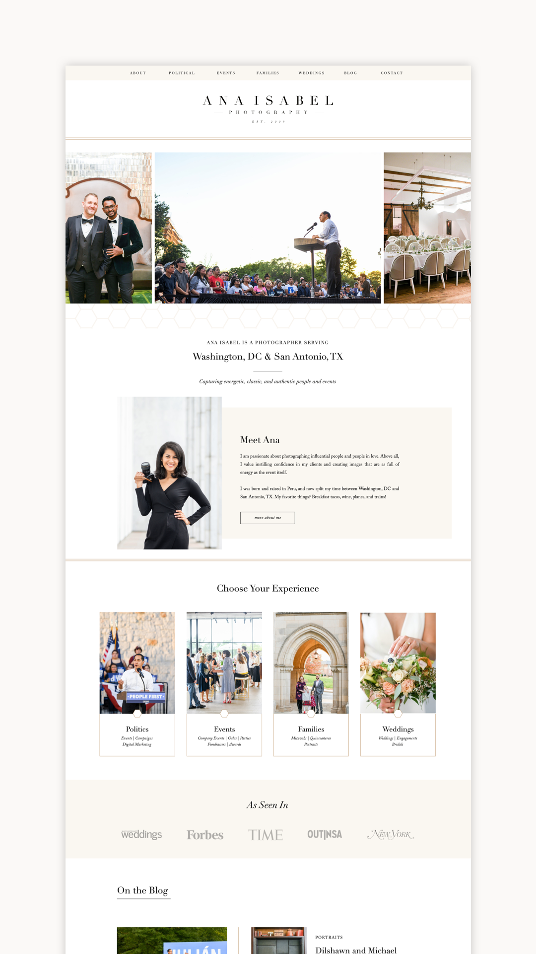
Today is an exciting day: it’s launch day for Ana Isabel Photography! Ana’s new custom Showit website is the perfect reflection of the amazing experience she provides for her photography clients.
When Ana and I first chatted about her website, she mentioned that she just felt like it didn’t flow, didn’t make sense, and was a major frustration! If you’ve been following me for a while, you know my favorite saying: “Your website is an airport, not a museum.” Your website’s number one job is to help users achieve a goal or solve a problem! So, the very first thing Ana and I did was put our heads together to completely re-structure her site in a way that made more sense and was easier to use.
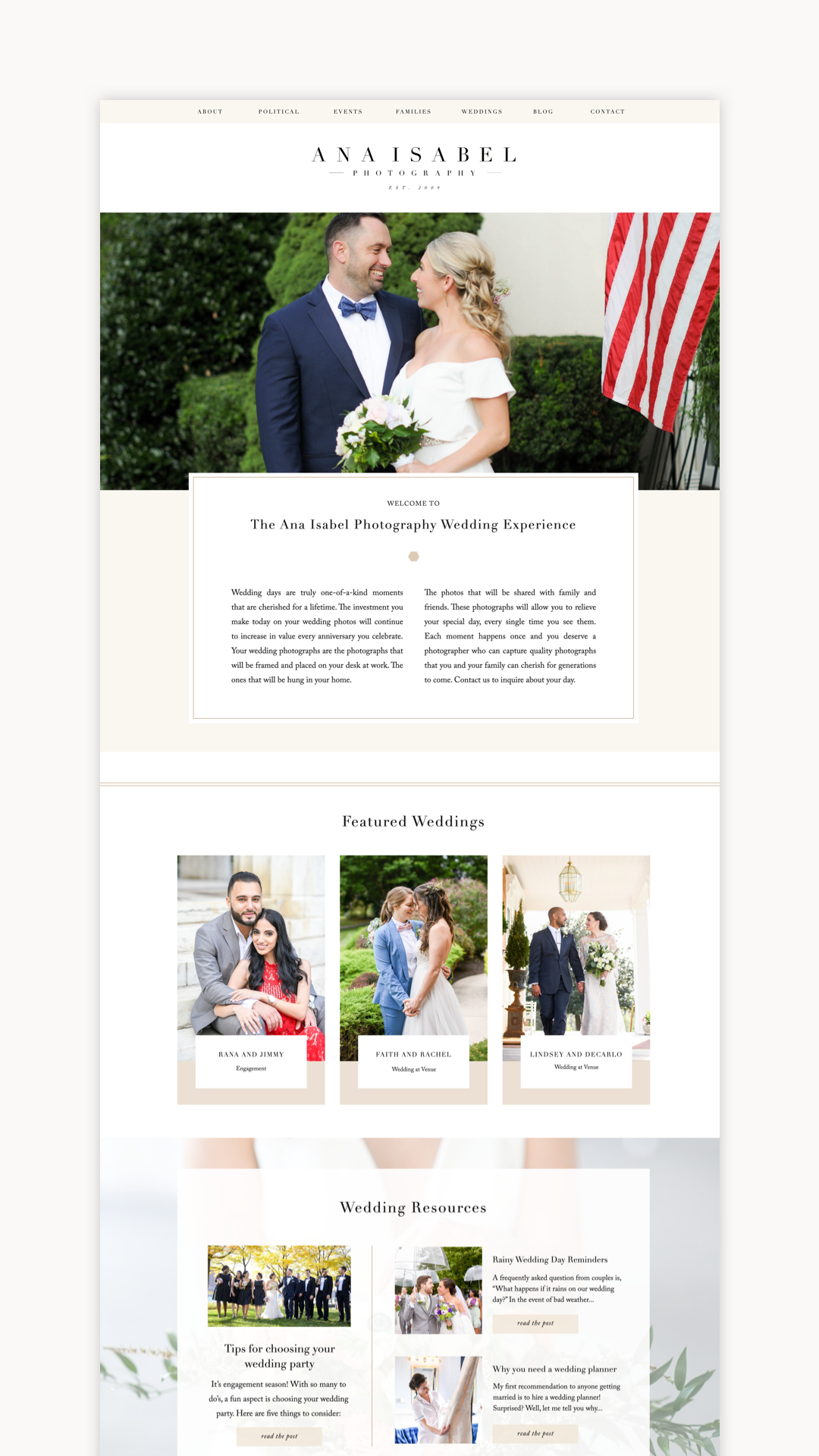
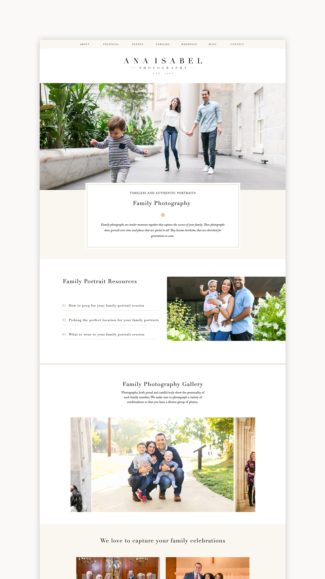
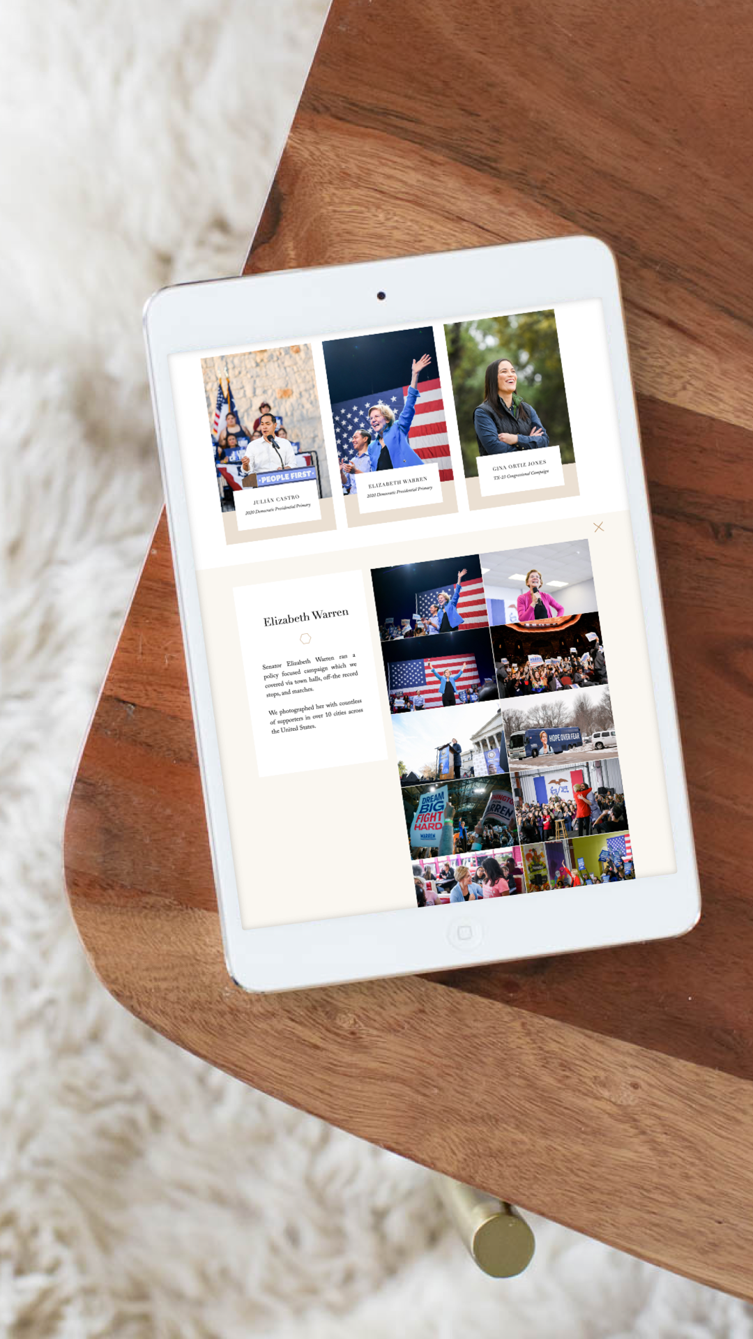
Ana serves a wide variety of clients in her business—weddings, families, political campaigns, and corporate and nonprofit events. Our challenge was speaking to ALL of those different clients to help them achieve their goal, while still presenting a cohesive website and brand. Our solution was individual pages for each client “bucket” that included all the information that client would need! (p.s. I highly recommend this method for anyone who serves different types of clients, like wedding and maternity).
A few of my favorite details about Ana’s new site are:
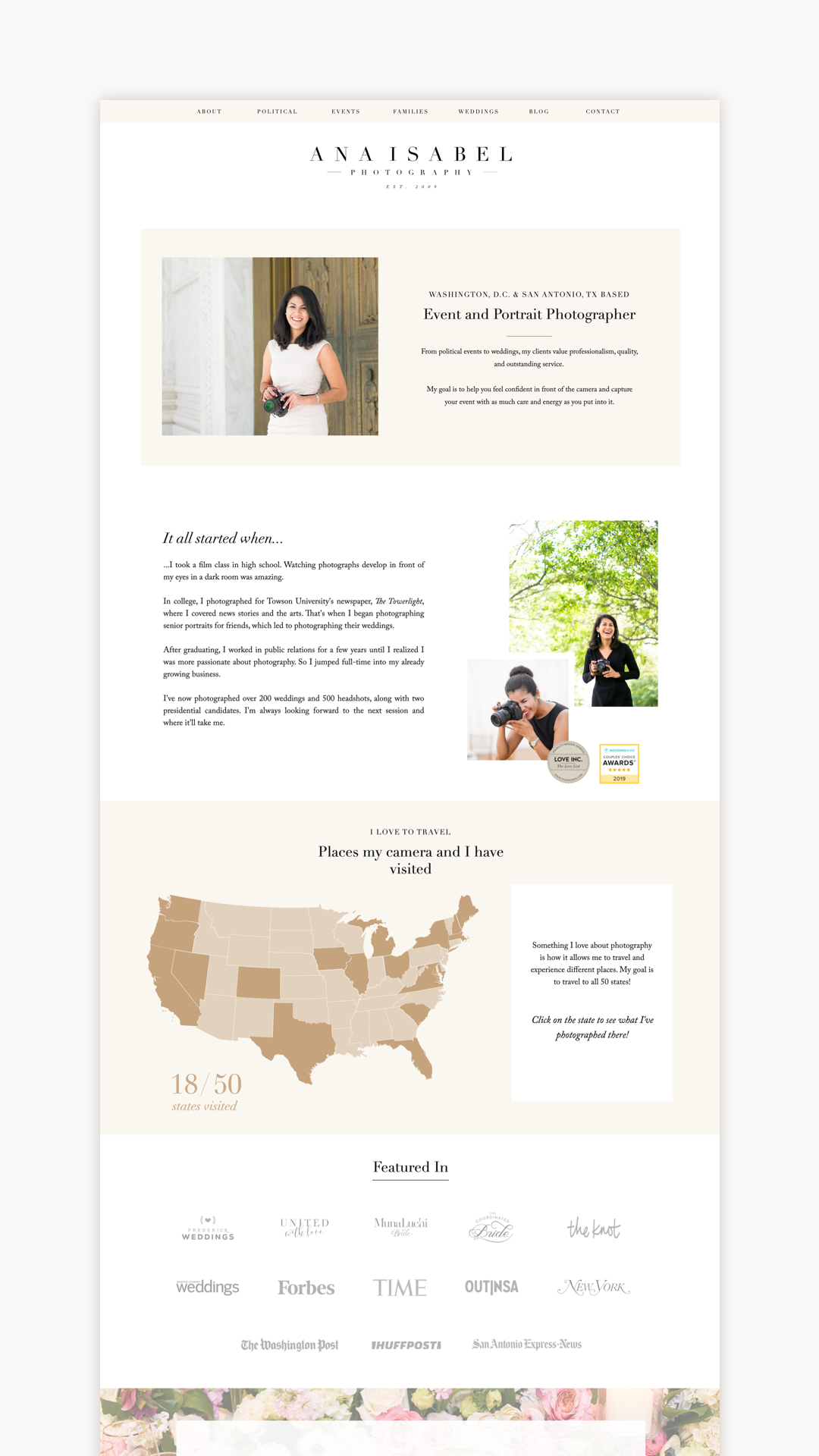
- The about page, where we included a fun interactive map of Ana’s travels (her goal is to visit all 50 states!)
- The blog page that showcases Ana’s work in a stunning way. This gal is a pro at the blogging game!
- The experience/portfolio pages are broken out by client type, allowing every client to easily find exactly what they need, including helpful tips and galleries!
Ana was kind enough to answer a few questions about her experience redesigning her site and moving to Showit!
I had my website made in 2015 and it was lovely then, but so much has changed. In addition to weddings, I began photographing conferences, events, and political candidates. My site no longer reflected the types of photography I was creating and I needed something that was going to do that well. In addition, it didn’t flow well and had a lot of dead ends.
What was the benefit of working with a designer rather than DIY?
Working with a designer is the best thing you can do for your business. Doing it yourself is like trying to build a physical building for your business by yourself when you’re not an architect. With a designer, you’re better able to express your self and your business needs, while still focusing on running your business. Your designer (Alex) will ask you all the questions you didn’t even think to ask. She’ll make sure you’re well prepared for each process through your design, and make adjustments as needed. You’ll come out with a very polished look–much better than you would have imagined.
I’m so excited for clients to explore! I now have sections for each specific style of photography and my clients will be able to tailor their experience directly to their needs.
What was it like moving to Showit from WordPress?
Moving to Showit was much easier than expected. I thought it would be more complicated, but it turned out to be just fine! The interface is incredibly easy to use and I’ll now look forward to updating my photos and text, rather than dreading it!
Thanks so much, Ana! I hope you love your new site as much as I loved working with you!
Head on over to Ana Isabel Photography to see Ana’s live site!
Alex Collier is a Showit web designer for wedding professionals. Are you ready for a website with beauty and brains? Get in touch!
Leave a Comment