Your website isn’t just some formality or box to check off your list; it’s one of the most powerful tools you have to promote your business and turn visitors into paying clients. So, it’s pretty important that you put your best foot forward! One of the toughest questions when first creating your site is, what the heck should you even include??
Having designed dozens of websites for creative entrepreneurs like you, I believe there are 5 must-have (often overlooked!) website sections that will uplevel your site and your user experience.
Let’s dive in!
In this post, we’ll cover:
1. About You
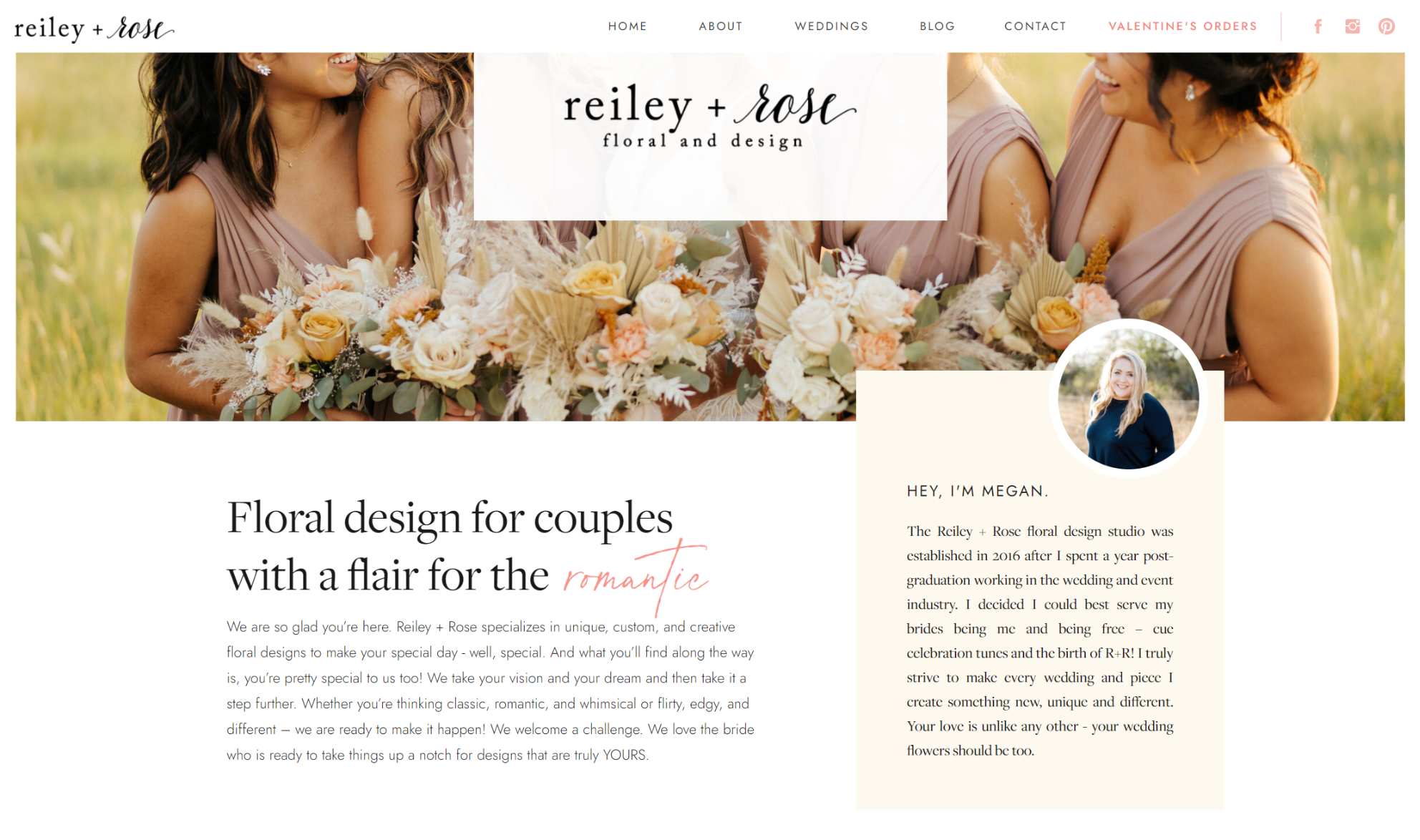
First off, let’s talk about YOU! It’s important to make your site personal. This is especially important in the wedding industry. As people make decisions regarding the most important day of their lives, they are going to want to choose a company they can trust. To establish this connection and trust, let them get to know you! A great way to do this is by including your name and a picture of yourself on your site, preferably right on the home page. As soon as someone opens your website, they can put a name and face to the gorgeous work they see.
And while we’re at it? I’m all for those gorgeous, artsy pictures, but an image of you making eye contact with the camera is SO powerful. Studies have shown that eye contact is so compelling that it can actually make people like and trust you more. I’d say that’s a win!
My client Megan, of Reiley and Rose, executes this beautifully, as you can see below. In addition to getting to know Reiley and Rose as a company, website visitors can get to know her personally! She is building the know, like, and trust factor right off the bat.
In addition to a brief intro on your home page, I encourage all of my clients to create a separate about page. The about page should mostly be about your business: your why, your core values, and the story behind what you do. But it’s also a fantastic place to let your personality shine!
This page is the perfect place to establish yourself as fun and personable (if that’s your jam), as well as someone who knows what you’re talking about. I love including some random fun facts and aspects of personality that allow potential clients to get to know you. After visiting your about page, clients should not only have a better sense of who you are, but what sets your business and brand apart.
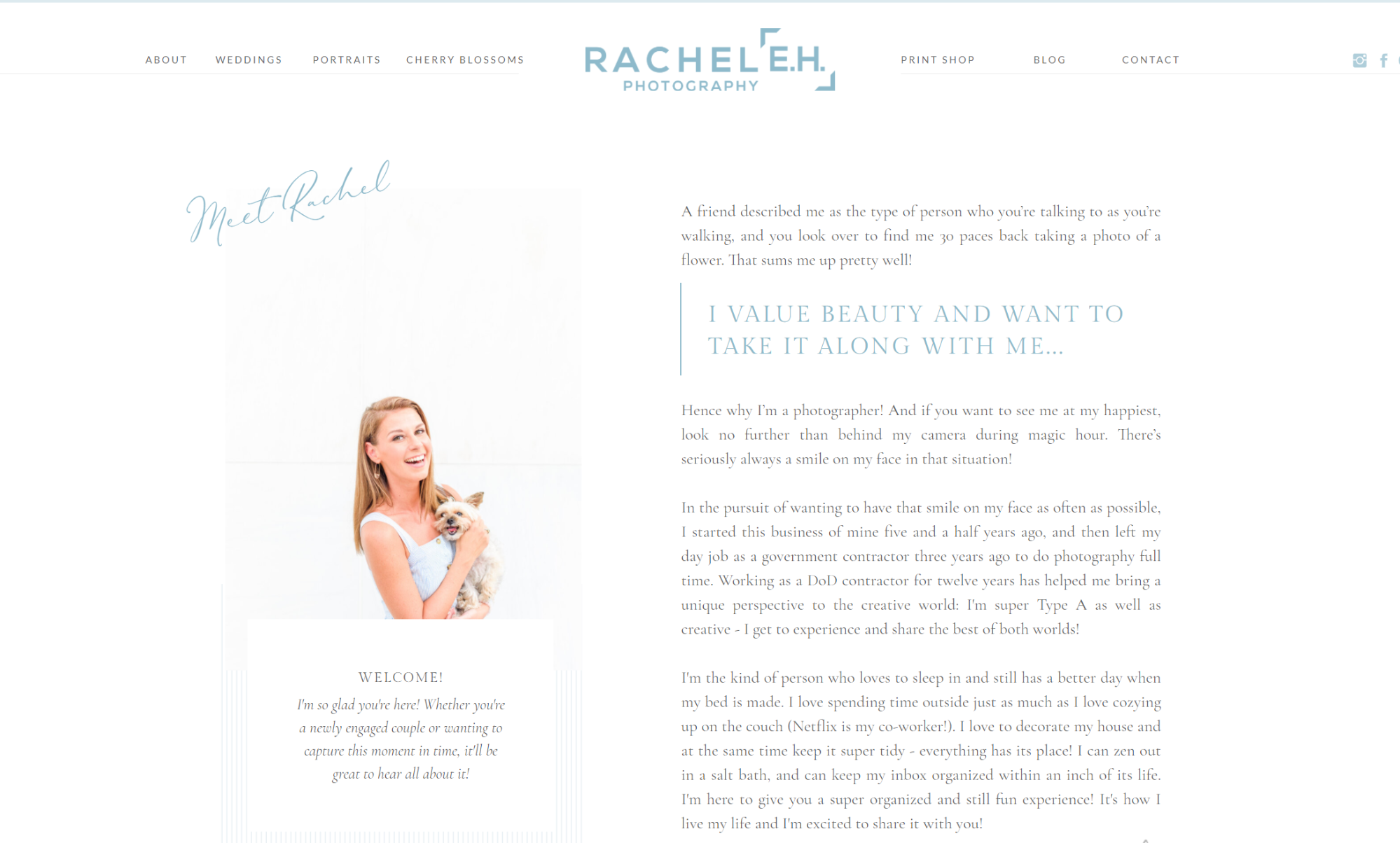
A great way to do this, as my client Rachel of Rachel E.H. Photography did, is to share the journey you took to create your business. This can give potential clients insights into your passions and skills. Be sure that the aspects of yourself that you share relate to your business!
2. Testimonials
Yay! Happy clients! Testimonials serve as a great way to establish yourself as a successful brand. Let’s say you just received a raving review from a bride on The Knot. It may be tempting to copy and paste their words into a testimonial for your site. While we all love reading each and every word of what our clients have to say about their experience with us, this can overwhelm potential clients. Instead, ask yourself—what are the key points this review makes? Focus on pulling these out, correcting spelling and grammar, and editing them down.
I know it’s tempting to round up all those sweet reviews and plop them on a dedicated testimonials page, but I advise against that! Instead of a designated testimonial page, weave in testimonials THROUGHOUT your site! Testimonials are called social proof for a reason; they are the evidence backing up the claims you are making about your work and experience. Instead of YOU telling potential clients how kind and bubbly you are to work with on your weddings page, it’s so much more powerful to hear from a recent couple!
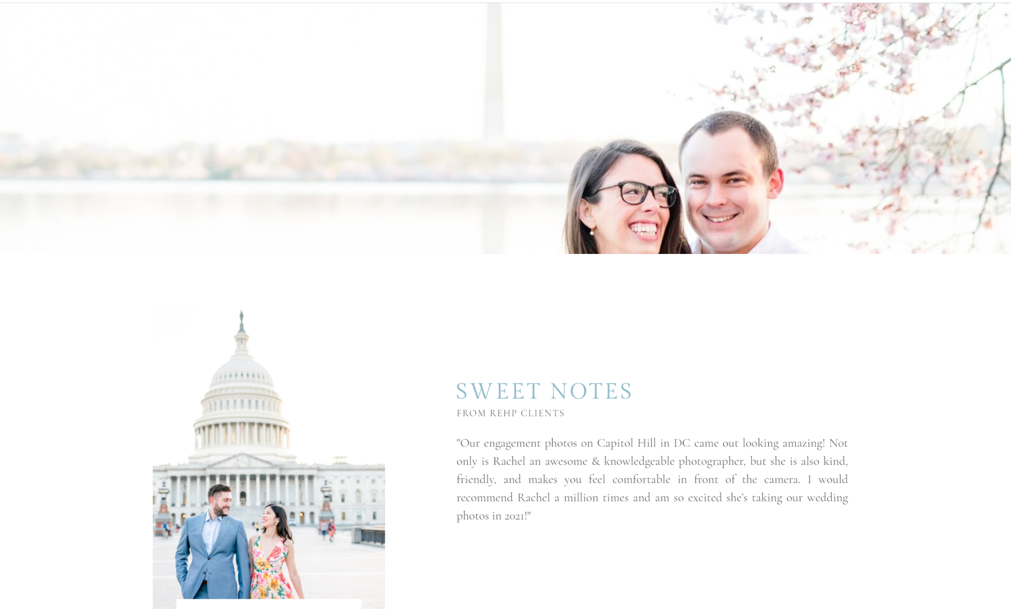
Another example is if you serve multiple types of clients, include reviews on the relevant services pages. Serve your website visitors with relevant testimonials to the services they’re interested in! Rachel does just this, as you can see below.
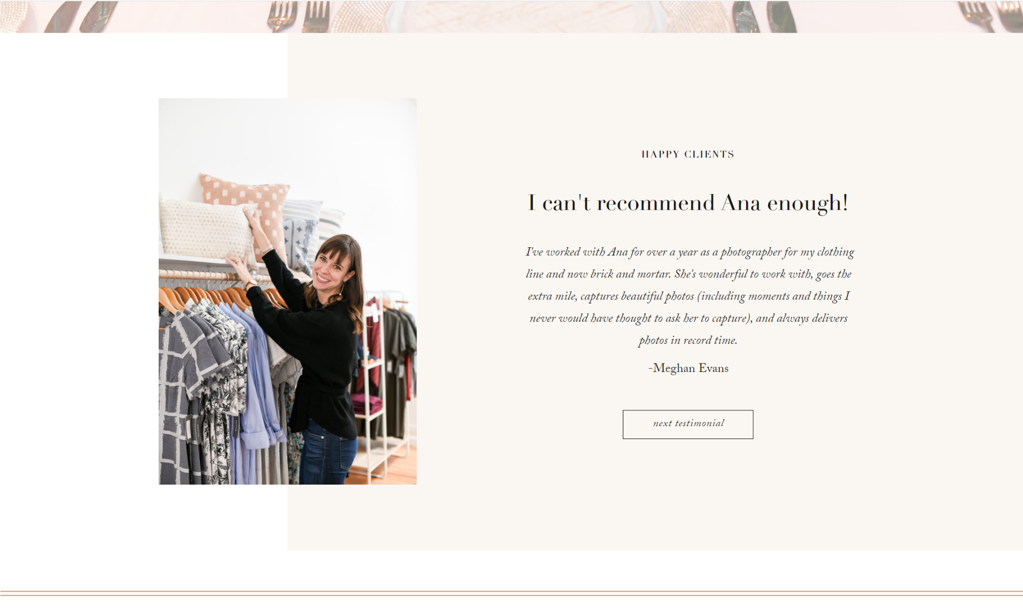
Another trick I love to do with testimonials is to pull out the most important sentence to serve as your headline. Remember that most internet users don’t read, they scan! Make sure they read the most important information by pulling it out FOR them so they can’t miss it! Below you can see how my client Ana of Ana Isabel Photography pulls a strong “mic drop statement” as a headline, and includes the rest of the testimonial below. This testimonial lives on her about page, giving potential clients a taste of what it’s like to work with her as an individual!
3. FAQs
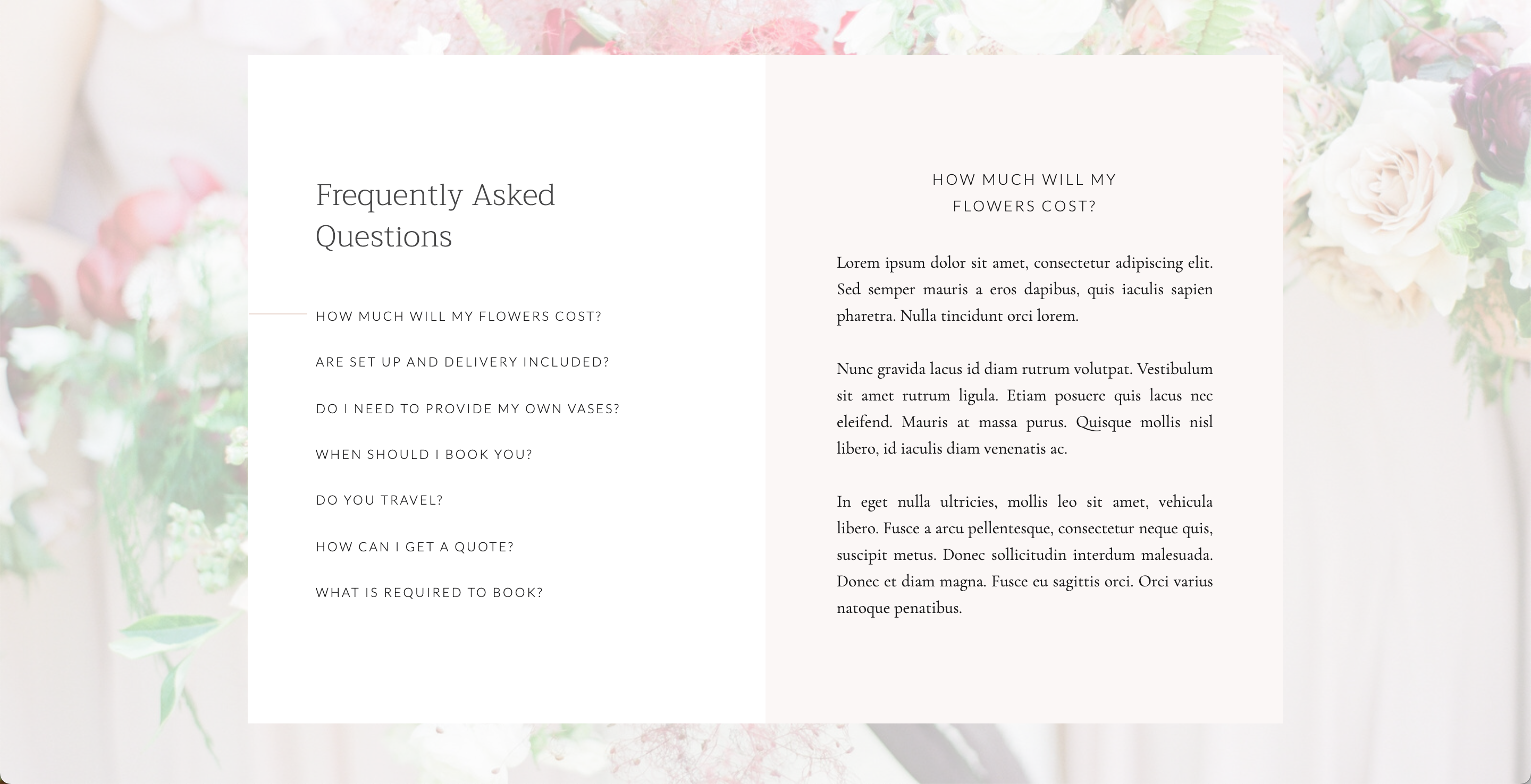
The next must-have section to include on your website is frequently asked questions. The biggest mistake I see creative entrepreneurs make is creating a loooooong list of FAQs for users to sort through. For a strong FAQ section that actually helps your clients, it’s best to keep it short and sweet! I love the FAQ section in my Garden Rose template for this exact reason! A few FAQ questions aren’t too overwhelming and keep users engaged.
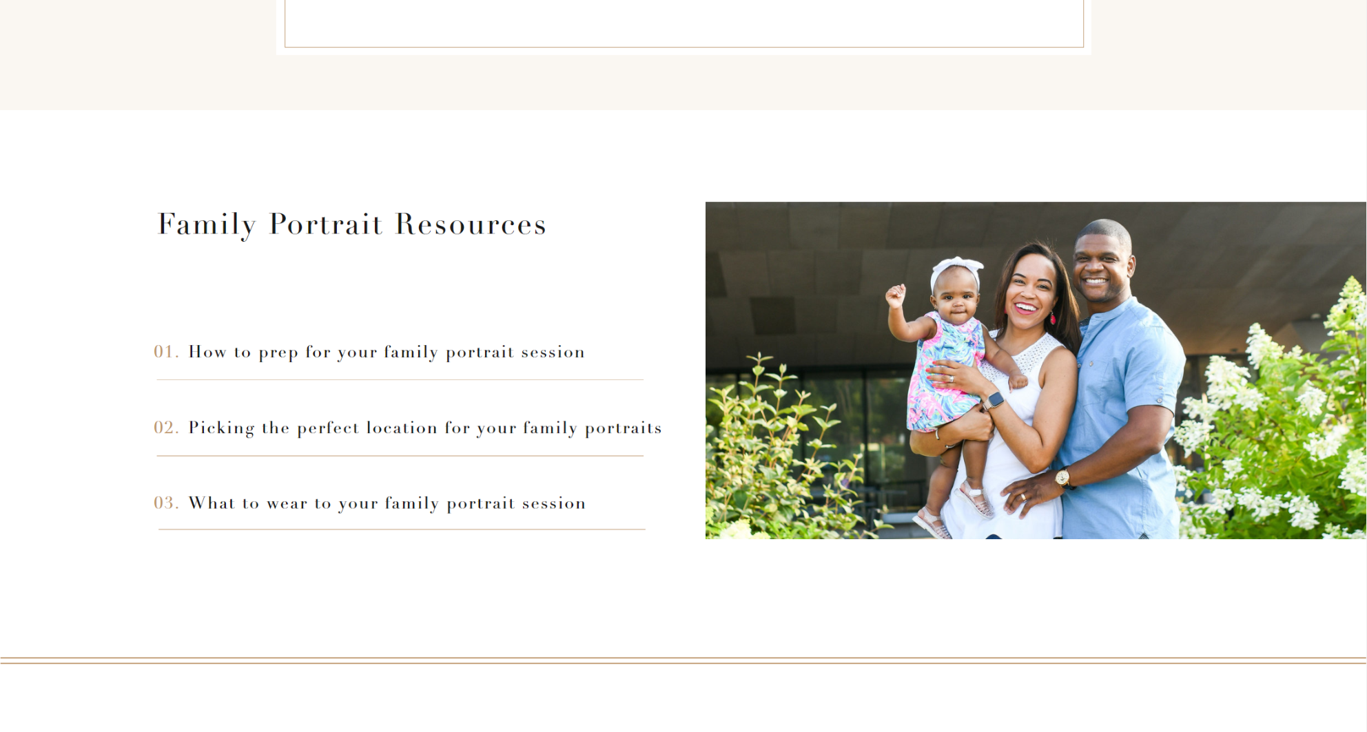
Similar to testimonials, I recommend including FAQs in context, rather than as their own dedicated page. A great place for an FAQ section is on your services page. As folks learn more about what your business offers, they’ll probably have some questions before deciding to contact you. What better place to answer these questions than right on that page? Ana Isabel Photography provides the perfect example. On her families page, Ana offers resources to answer common questions someone may have about family portrait sessions (and bonus, these link to her blog posts that answer these questions in detail!).
 A word of caution with FAQs—don’t overdo it! Make sure these are actually questions people ask you on a regular basis. Avoid using FAQs as a crutch to give all the information about your service. For example, instead of answering “How much does it cost?”, include this information in a section specific to pricing or investment. More on this below!
4. Pricing
Next up is pricing! A fiercely debated topic when it comes to websites. Some folks advise not to include pricing, as it could simply attract price shoppers. But, let’s get real. People need to know whether or not they can afford your services. This will determine whether or not they choose to contact you, so let’s make it easier for them to find that out. This doesn’t mean you have to include an extensive pricing list of every service or add-on you offer. Instead, I recommend clearly listing your average or minimum investment package. This will give potential clients an idea of whether or not you fit within their budget.
This section from my Dahlia template, for example, gives you space to explain in a couple of sentences what kinds of budgets or starting prices you work with.
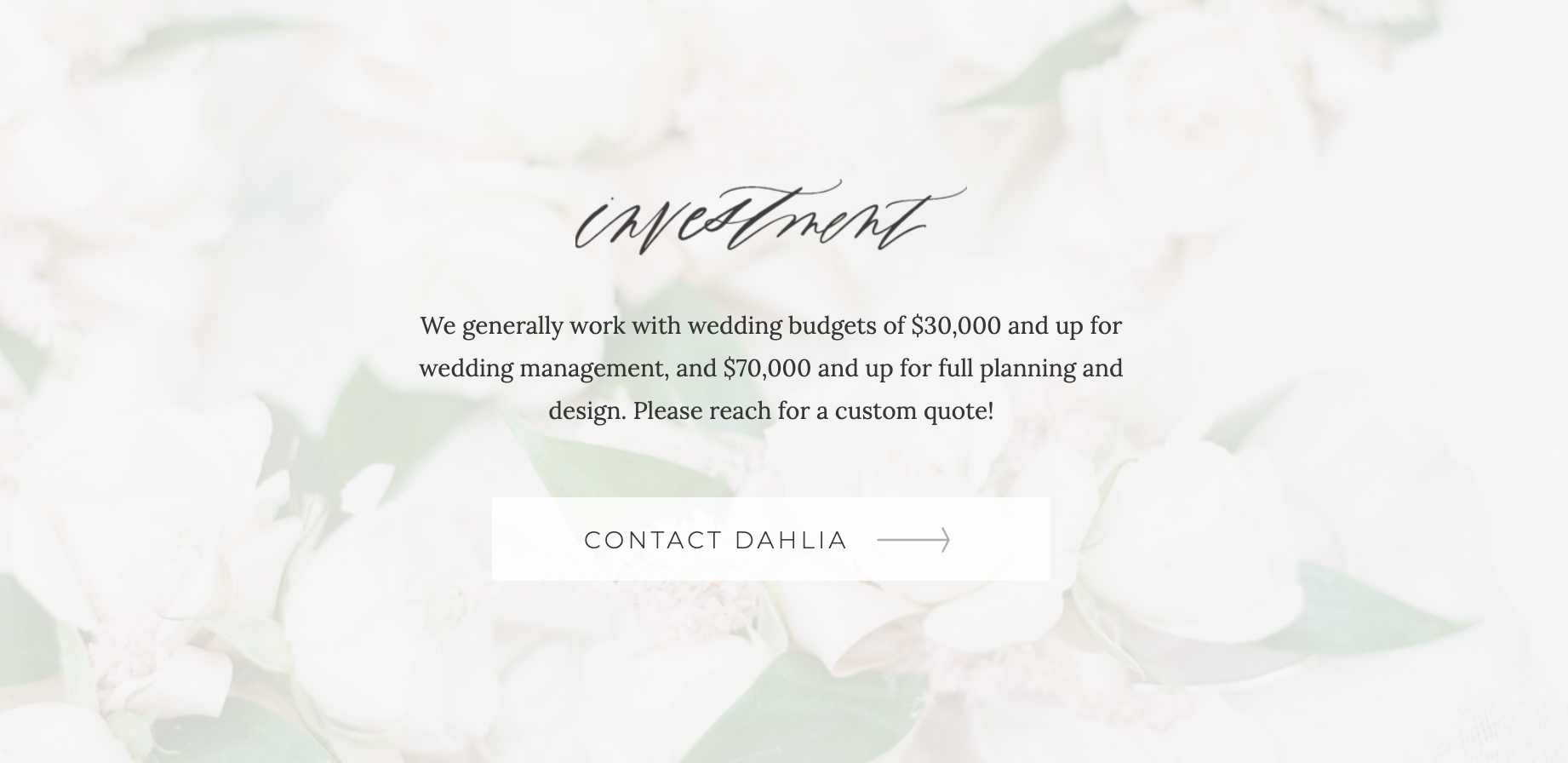
Also, notice how I recommend using the language of “investment”, rather than “pricing” on your website. This is especially relevant in the wedding industry, as your services will play an instrumental role in a day they cherish for years to come. A couple’s decision to work with you really is an investment!
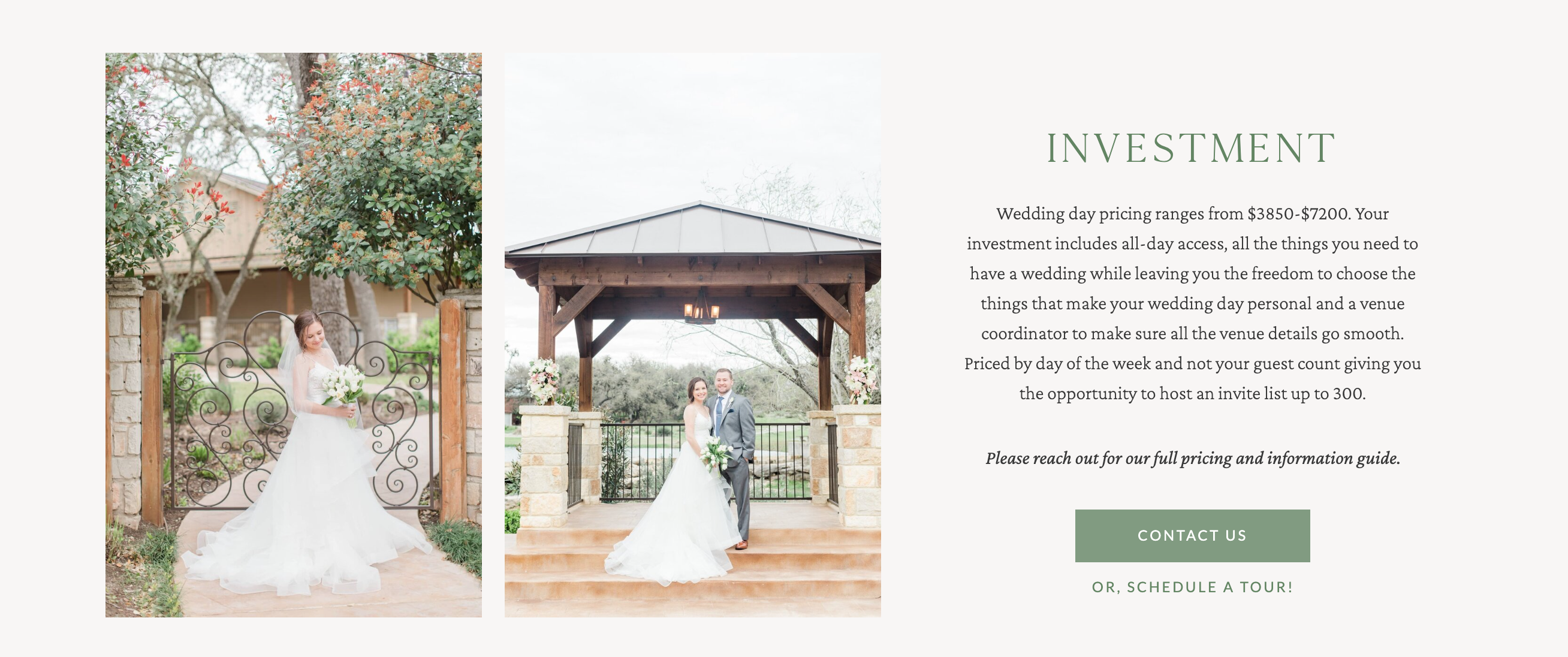
As shown below, my client The Club at Garden Ridge gives a range of what couples can expect to invest to book their venue, as well as a brief overview of what’s included. However, for the full pricing and information guide, couples are encouraged to contact the venue or schedule a tour!
5. Footer
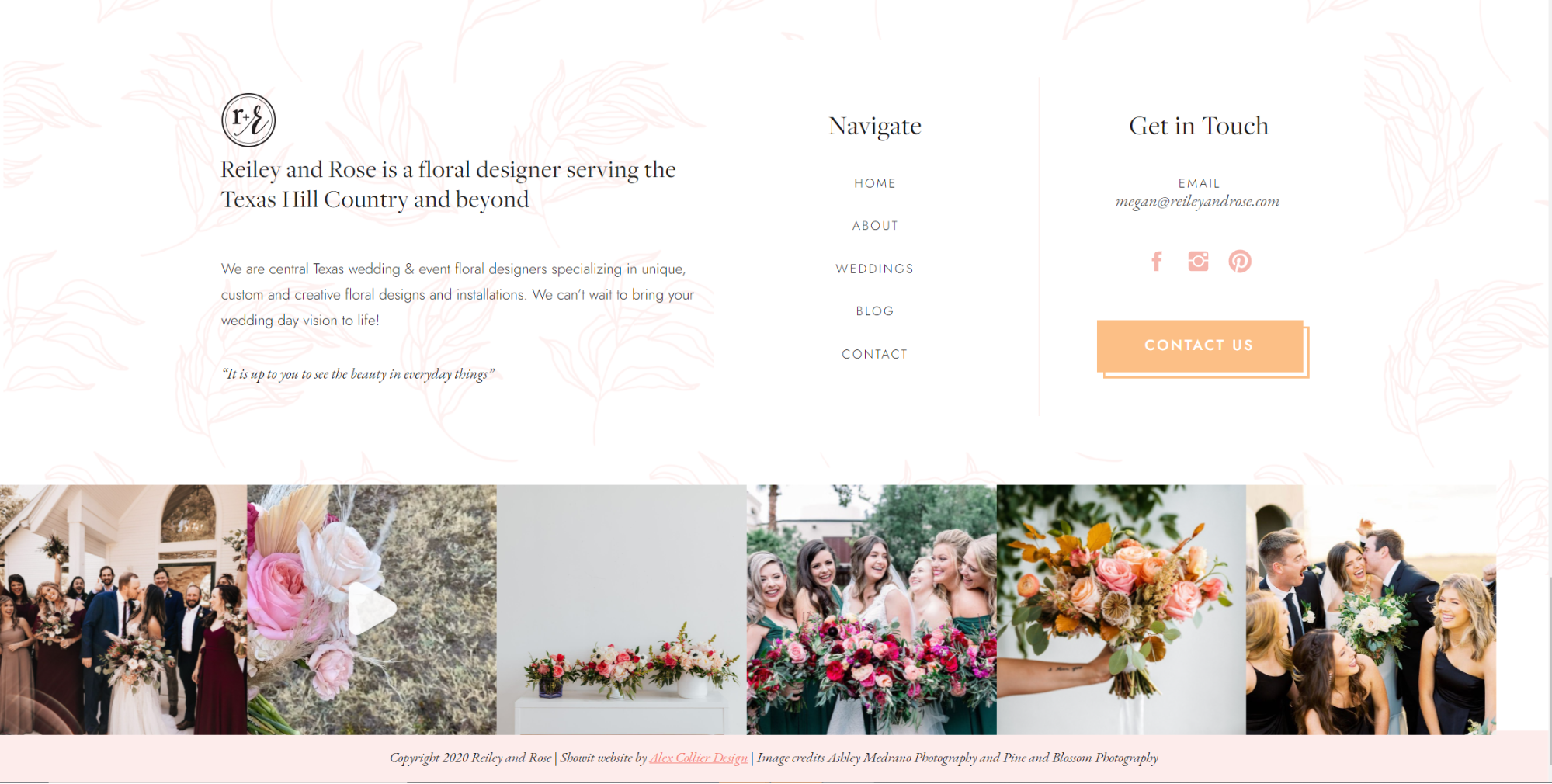
Lastly, let’s talk about your footer, an often overlooked website section. There are usually two reasons why people visit a website’s footer. First, to find the information people typically expect to see there, such as an address for a brick and mortar business. Or second, as a last-ditch effort to navigate somewhere on your website that they were unable to find on their own. So, in addition to including the standard footer content—your contact information, your company name, and location—you should include a way for visitors to navigate your site with links to all or most of your pages. Making your site as accessible and easy to navigate as possible encourages visitors to spend more time exploring!
While visitors are viewing your footer, you also have the opportunity to capture their attention with a call to action button to contact you or sign up for your email list! On Megan’s site over at Reiley and Rose, you can see how she provides both the essential information, as well as helpful links for navigating the site.
In Conclusion
While every aspect of your website should work to create a seamless experience for visitors, paying close attention to these 5 must-haves can put your site a step above the rest. A luxury client experience starts with your website, and these 5 sections are a great place to start!
Alex Collier is a Showit web designer for wedding professionals and creative entrepreneurs. Are you ready for a website that elevates your business and books ideal clients? Get in touch!
Leave a Comment