As a Showit web designer for wedding pros, I help my clients rebrand ALL the time. It’s what I’m best known for and the reason why clients place their trust in me. But when I rebranded earlier in 2023, I have to say, taking my OWN business through this process felt entirely different. Being a designer myself, I felt like the pressure was on to create a brand that truly resonated and that I could “live in” for a long time.
I typically use my blog to showcase my clients’ launch stories, but today’s post is slightly different because it’s all about my OWN launch! Specifically, I want to be transparent about everything that happened behind-the-scenes: the highs, the lows, and the valuable lessons I’ve learned from this experience.
So pull up a seat and grab your favorite beverage so we can dive in.
How did I know it was time to rebrand?
Since the moment I came back from maternity leave and took my business full-time in January 2022, I knew a rebrand was on the horizon. Stepping into a new chapter as a full-time business owner was a huge milestone for me, and something I’d worked toward for a long time.
Over the previous two years, my main focus was on creating an elevated client experience and refining my design skills. So, when I was ready to go all-in with my business, I knew it was the perfect time to take my brand to a whole new level.
The first iteration of my website launched in 2019 with a small relaunch in the summer of 2020. But once I returned from maternity leave two years later, I noticed a couple of things in my brand that felt “off”:
- The color palette with pinks felt a bit too cutesy and not as sophisticated as I wanted
- The messaging was too vague and didn’t clearly represent my niche of working with wedding pros
Don’t get me wrong, my first website served its purpose well, and I’m proud of how far it took me. But as I grew and evolved, it became clear that it no longer aligned with the direction I wanted to take my business. If I was going to be the go-to Showit designer for wedding pros, a total rehaul of my brand was necessary.
In an ideal world, I would’ve loved to rebrand right after my maternity leave. But with the whirlwind of going full-time in business and transitioning into working mom life, it just wasn’t feasible. It was important for me to take the time and adjust to this new chapter first before anything else.
I was determined to rebrand when the time was right. And that time finally came later that year, when I had the bandwidth, clarity, and resources to dedicate to the rebrand my business deserved.
Who did I hire and how long did the process really take?
Phase #1 — Brand Shoot April 2022
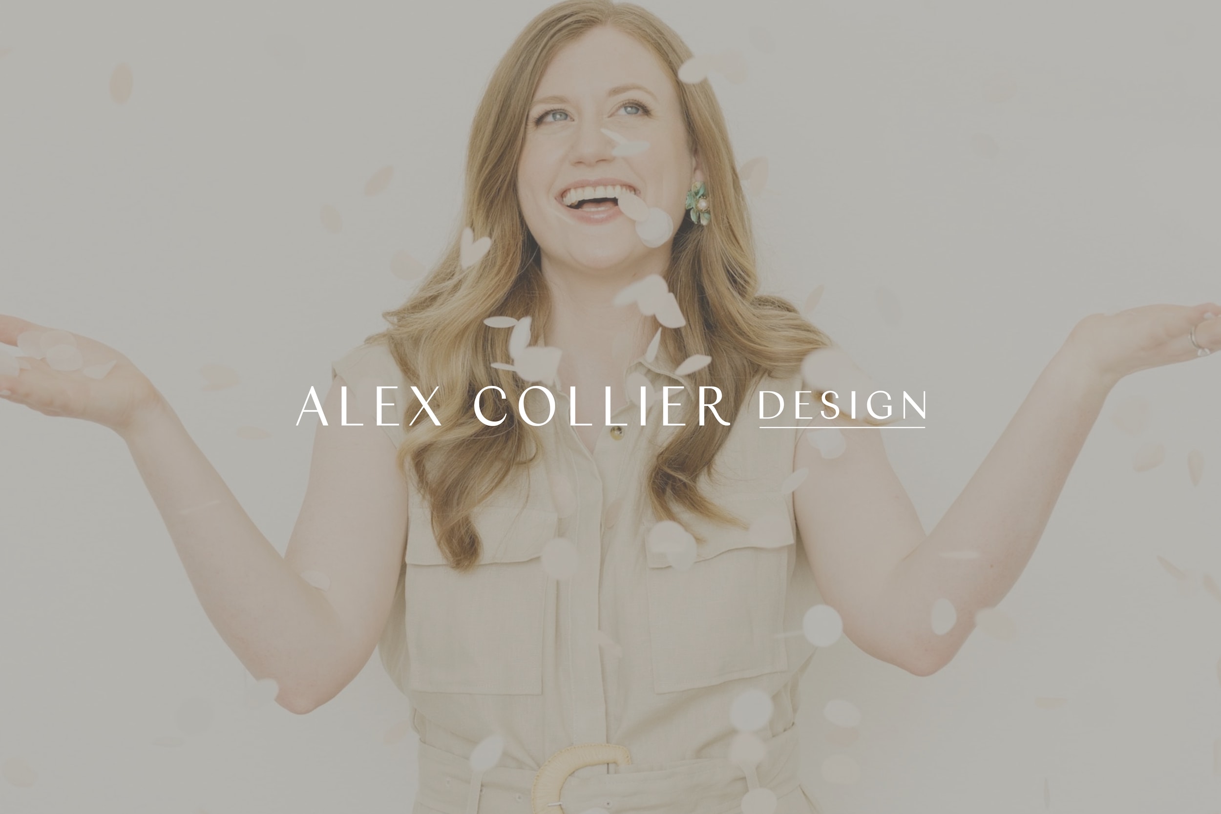
After returning from maternity leave, one of my top priorities was getting updated brand photos to showcase my business in a new and fresh light.
I booked a team of incredibly talented professionals for my shoot:
- Paige Vaughn for photography
- Caleigh of Chillannn Styling for wardrobe
- Makenzi Laine for hair & makeup
- And Cityhouse Collective for the elevated shoot location
Let me tell you, these pros were worth EVERY penny and I’m so glad I invested in their talent and expertise. I wanted these photos to last a long time and knew it wasn’t worth the risk of trying to DIY everything on my own.
Not to mention, being a few months postpartum with my daughter, I wasn’t feeling like my usual self. So it was important to have an amazing team around me making sure I looked and felt beautiful.
When the image gallery landed in my inbox, I’m pretty sure I gasped in excitement. Paige absolutely crushed it and I LOVED every image she captured. I sat on the images for quite a while though, and decided not to share too many so they could feel fresh for my rebrand. But little did I know that the actual rebrand would take more than a year from that point. I’ll share more about that later on.
Phase #2 — Copywriting & Brand Messaging October -November 2022
For me, copywriting was probably THE most transformational part of the process and absolutely essential to my rebrand. I needed the time and space to focus solely on visual design, so I knew I’d benefit from an outside perspective to handle the wordsmithing.
The tough part was choosing a copywriter to outsource this task. I’ve made SO many copywriter friends over the years, because of the nature of what I do. And this made narrowing down my choice a bit of a challenge.
I’m a big advocate for my clients hiring a copywriter if they can. But more than that, I recommend finding a copywriter who meshes well with you because they will take a lot of time to understand YOU and the essence of your business.
I was so excited to find that all in Kathy of Rekindle Communications. Beyond her skills as a copywriter, she takes the time to really understand your business and vision moving forward. After our first conversation, I knew she could breathe life into my vision with the words to match.
We worked on website copy of course, but we also created a comprehensive Brand Messaging Guide. This guide became the foundation of my entire rebrand, ensuring that every aspect of my rebrand felt in sync and all told the same elevated message.
Phase #3 — Web Design (January – April 2023)
As a web designer, I naturally find creative inspiration when I’m fully immersed in a website build. So the moment I got fresh copy in my hands, I couldn’t wait to roll up my sleeves and get to designing my site right away.
However, that’s when the rebranding process began to stall because honestly, being your own client is hard. I see it all the time with my own clients, particularly photographers struggling to select images for their sites. It’s easy to get caught up in overthinking your own work when you’re so close to it.
So even though I built some momentum with my home page layout, I sat on the rough draft for what felt like ages. Big picture, I knew my brand would incorporate a neutral color palette and elegant typography. But fine-tuning those details took a lot longer than I anticipated. Researching fonts alone took weeks, especially because I was doing it all in between client work, which of course, always takes first priority.
Once I had landed on my brand fonts and colors, I blocked off a solid week to build out the entire site. And it was a WAY bigger project than I initially thought it would be. With my shop, products, newsletter opt-ins, and portfolio, my site added up to about 30 pages in total!
A website may seem simple at first glance, but let this serve as a reminder that there’s always more going on behind the scenes to keep it running smoothly.
Phase #4 — Logo Design (April – May 2023)
One of the aspects my clients appreciate from working together is having a clear, straightforward, and streamlined process. And within my process, that means logo design always precedes web design.
Now, here’s the interesting part: when it came to working on my own site, I went about things a bit differently. Remember how I mentioned earlier that being your own client is difficult? Well, since I knew it would be a challenge to design for myself, I ended up leaving my logo design for the end. I wanted to give myself the time to explore plenty of logo iterations until I created one that perfectly fit my vision.
Would you believe I crafted a whole version I thought I loved, only to scrap it altogether? It was back to the drawing board to continue fine-tuning every detail.
Finally, after several creative breakthroughs (and several cups of coffee), my logo suite took shape and perfectly reflected my new, sophisticated brand. I knew this would be something I’d be proud to display throughout all touch points of my business.
With my logo finally in place, I felt like I could confidently set a launch date — May 24th, 2023. I whipped up a teaser reel for Instagram announcing the date of my launch, and that’s when the rebrand started to feel real.
Phase #5 — Launch (May 2023)
I began dropping hints on Instagram and Tiktok a few weeks before to build up excitement, and finally, the big day arrived.
I’m so often guilty of not taking the time to truly celebrate my wins, so I felt like it was important to mark this day as a special milestone. That’s why I took the afternoon to enjoy a fantastic lunch with champagne and had a dear friend with me to share the occasion. (By the way, I highly recommend Full Goods Diner and their kale salad if you’re based in San Antonio).
I didn’t want it to be another ordinary day. Launching my website was a BIG deal, and I believed it was worth honoring all my hard work leading up to it.
What was the inspiration behind my brand?
I didn’t expect this initially, but after wrapping up copywriting with Rekindle Communications in November of 2022, I relied so much on my brand messaging guide to make sure the visuals I’d craft accurately captured my brand.
Overall, these were three core ideas that I kept in mind:
Less is More
One thing we surfaced in my brand messaging is the idea that “less is more”. Specifically, one line I kept referring back to says:
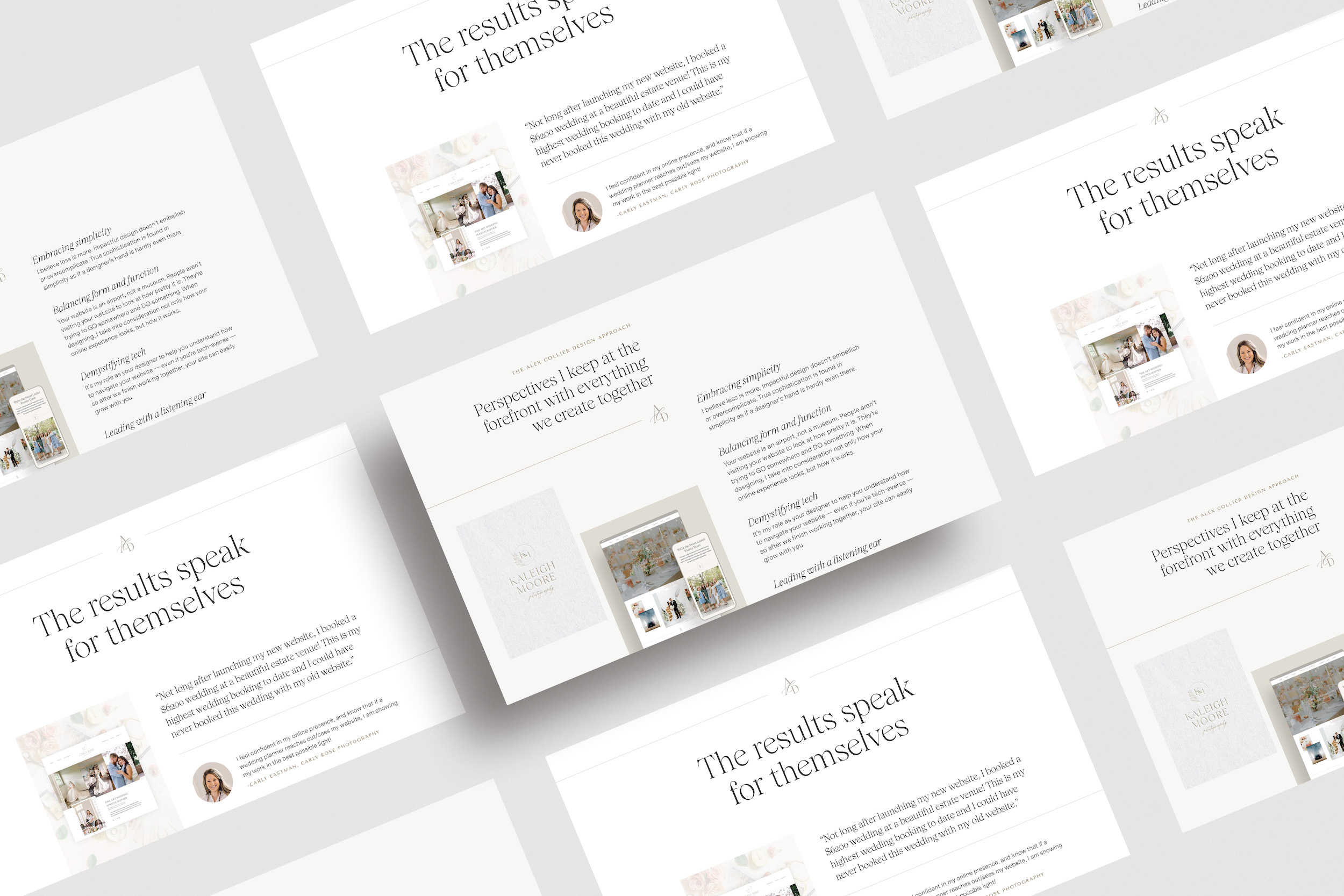
“Impactful design doesn’t embellish or overcomplicate. True sophistication is found in simplicity as if a designer’s hand is hardly even there.”
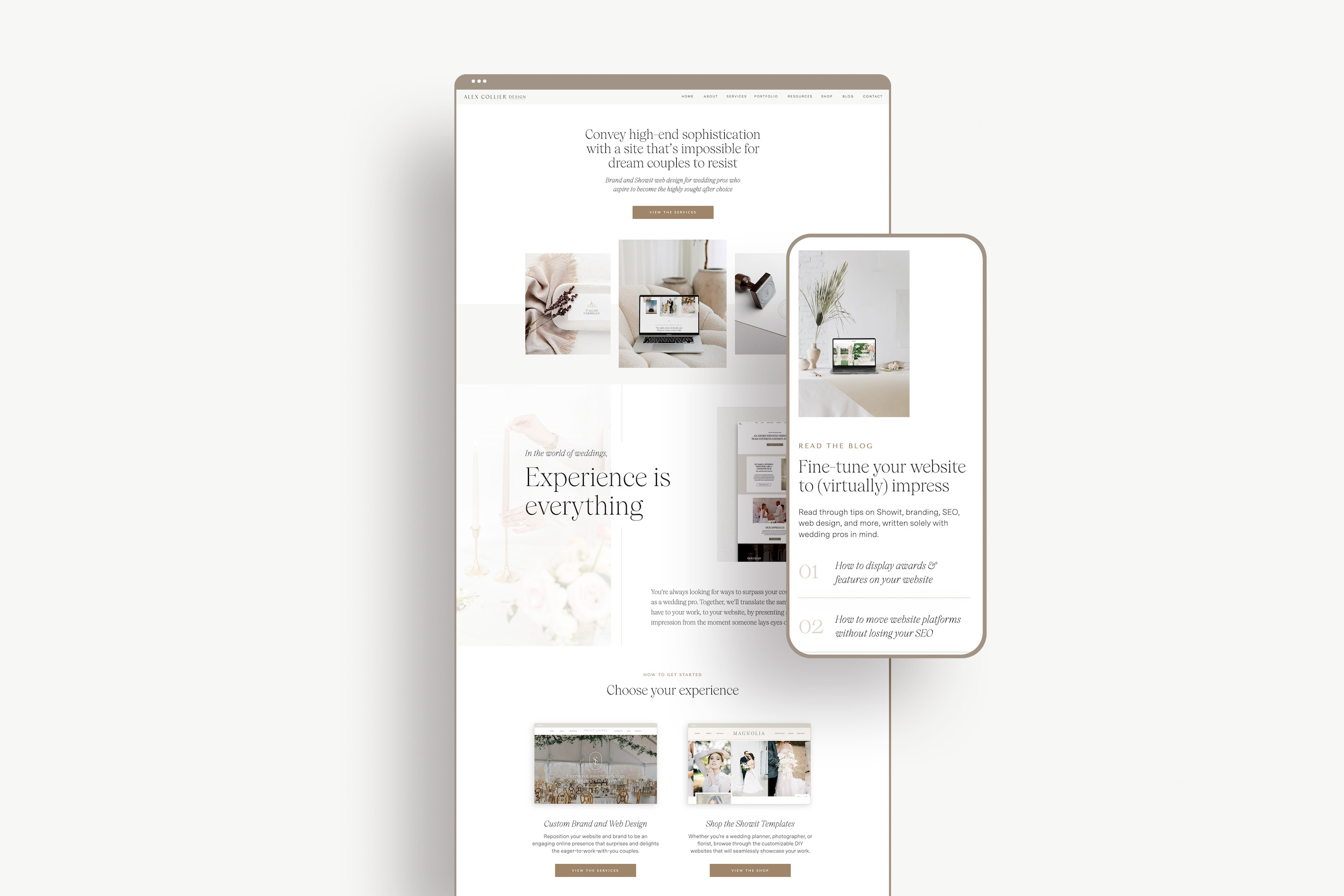
I never want my brand to distract from my clients because I believe their brands deserve to be center stage. From color palette and typography to logo and web design, I incorporated that same ethos by using an overall clean, minimal, and streamlined aesthetic with plenty of white space.
Form and Function
I always emphasize the idea that your website is an airport, not a museum. People don’t visit your website to look at how pretty it is. They visit your site to try and GO somewhere and DO something. With this mindset, my top priority was to craft a website that offered an elevated experience while remaining user-friendly and easy to navigate:
Color Palette
Opting for a neutral color palette ensured my website would be easy on the eyes and provide a pleasantly comfortable experience for website visitors. And more importantly, it’s helped my brand nicely complement my clients’ brands — not overshadow them.
Typography
Readability is a crucial aspect I kept in mind when choosing fonts. And because I had worked with a copywriter who wrote some powerful, statement-making headlines, it was important for the typography to complement those statements whether scaled up or down.
Funny enough, I actually had a different font selected entirely before I started building out the site. As the design came together, that’s when I realized something didn’t feel right visually, and I swapped it out for the font I’m currently using now which worked out even better.
Logo Design
Your logo is meant to be versatile and have many uses across a website and other brand collateral. So as I designed my logo, I made sure to create different versions for their various applications. That’s how I approach my clients’ logos as well — always keeping in mind the ways they’re likely to use their logos in the real world.
Sophisticated Aesthetics
Referencing back to my brand messaging guide, the final core idea that came up during my rebrand was sophistication — a blend of being polished and refined yet warm and approachable. I wanted to make sure my brand captured this sentiment as well:
Color Palette
To infuse more warmth and layered depth into my brand, I crafted a neutral color palette of rich brown and taupe tones. This helped communicate the same warmth my brand messaging guide references when describing my brand voice:
“Alex Collier Design’s voice is insightful, aspirational, yet at the same time approachable, plain-spoken, and warm. It’s casually walking into an upscale bridal boutique meets a casual conversation with an industry friend over coffee.”
Typography
My goal was for the typography to strike a balance of feeling delicate with personality. Something that feels distinctive and personal to Alex Collier Design, but still exudes elegance. Some of my favorite places to go for font inspiration are:
- Typewolf
- Fonts in Use
- Maxi Best Of
- Spruce Rd Type-Driven Brand (fellow designers, this course is amazing and full of amazing typography inspiration and resources!)
I scoured through probably hundreds of fonts until I found “the one”. And in the end, the weeks I spent searching became all worth it.
Logo Design
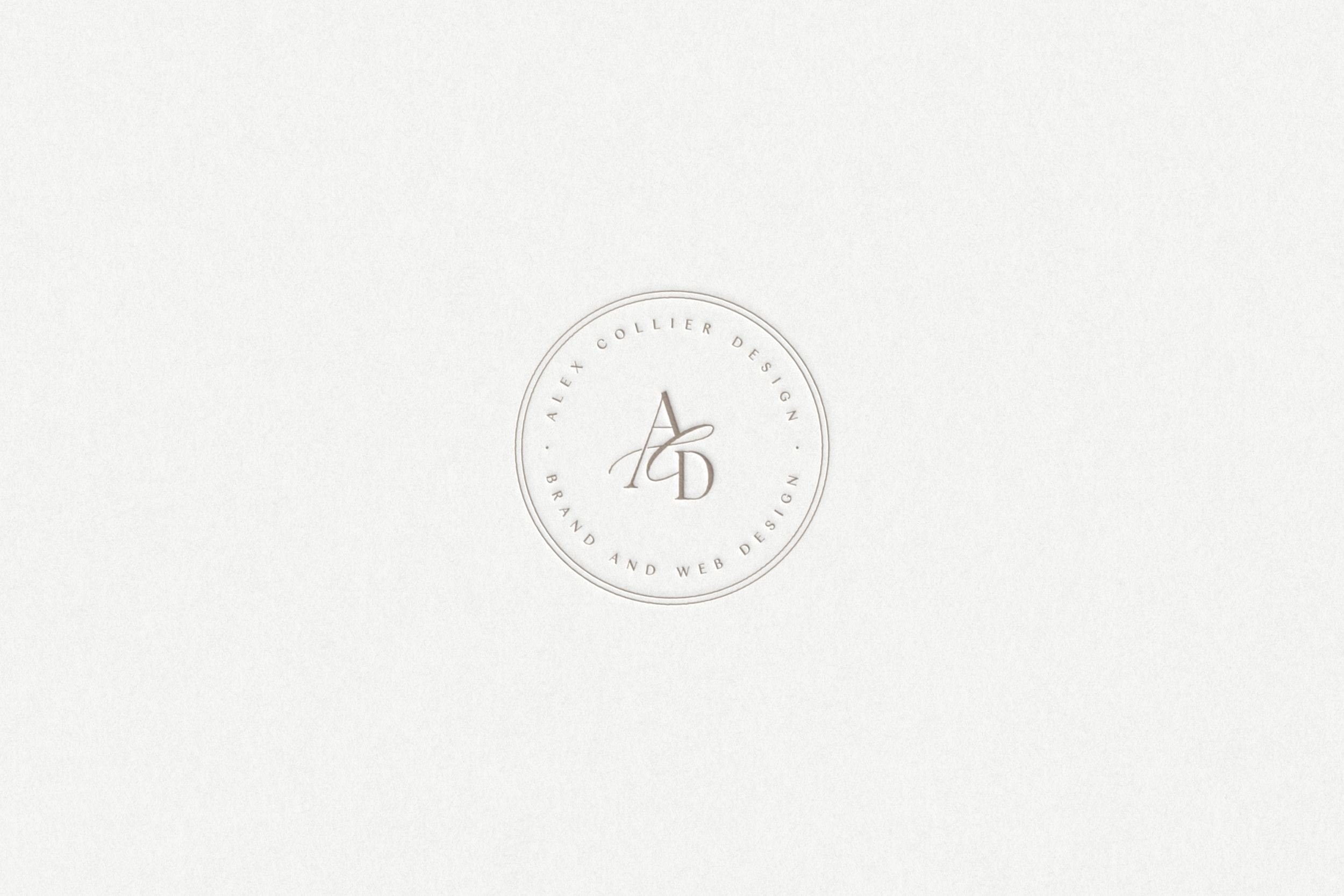
For my logo, my vision was a typographic-focused mark featuring my initials to keep with the sophisticated feel. I went back and forth on whether to use “AC” or “ACD” and didn’t feel too strongly about either. But when I landed on my current logo, I knew that “ACD” had the perfect visual balance and harmony. Plus, behind the scenes, that’s how I refer to my business, so it felt “right” in that respect, too.
What was essential to my rebrand vs. where could I have saved time (and stress)?
They say hindsight is 20/20, right? Going through a rebrand is no small feat, even for a web designer like me. It was an incredibly valuable experience, but now looking back, I can see there were ways I could’ve made the process easier for myself. Here’s a combination of highlights and lessons I learned that hopefully empower you for whenever you decide to rebrand:
I’m glad I…
- Hired a copywriter — I can only imagine how long this project would’ve taken if I hadn’t. Plus, with a copywriter’s help, I had SO much more clarity and confidence in not only my messaging, but my entire brand.
- Took the time to get the design right before launching — I didn’t want to worry about adjusting and re-adjusting minor things like fonts or layouts after my website went live. It paid off that my website launched with a polished look I was proud of.
- Created a versatile brand system — It’s been so easy for me to apply my new branding to other aspects of my business like Dubsado form and social media graphics. That’s why having a versatile brand suite is so important. Anytime I need to add a new page to my site or create a new asset for my brand, it feels so seamless.
I’m not so glad I…
- Took months to launch — Instead of working on this rebrand in between client work, it would’ve been much easier for me to block off a couple weeks of focused work. If I had put a due date on myself, I believe a lot of time would’ve been saved and my website could have launched much, much sooner.
- Put a lot of things on hold in my business — There were so many things I told myself I’d wait to do until AFTER my brand launched — email marketing, posting on social media, pitching podcasts, launching new services, and overall getting more visible. I feel more confident doing those things now with my new brand. But there was a lot of lost opportunity and wasted time that could’ve been used to move my brand forward leading up to my launch.
- Kept my rebrand close to my chest — Truth be told, I didn’t share that I was rebranding with very many people. I was worried about getting unsolicited feedback that might make me second-guess decisions and feel less confident about the process. I always caution clients not to rely too much on others’ opinions during a rebrand.But I do think sharing with trusted business colleagues who understand your vision can be so valuable. They can help get you out of your own head and provide much-needed encouragement (I could’ve used more of that especially in my case because I was my own designer).
How do I feel now and what’s happened since launching?
It’s one thing to celebrate when others rebrand, but it is a whole OTHER thing to be on the flip side of it yourself.
Now, a few months after my rebrand, I can honestly say l feel confident showing up as the professional expert I know I am. The confidence gained alone makes rebranding totally worthwhile in my opinion.
Getting positive feedback from my designer colleagues on Slack the day of my launch (shoutout to Showit DXP!) was so validating. I trust their opinions as fellow experts, and plus, they knew how to encourage me when I finally hit that nerve-wracking “publish” button.
On launch day, I even got emails from people excited to work with me — talk about an investment already paying for itself! Since the rebrand, I’ve seen an upswing in business and hit my highest revenue month of 2023, just after the site went live.
This rebrand felt like a huge hurdle. But now that it’s off my to-do list, I feel like I can move on to other exciting things in my business, like showing up as an educator, launching new services, and marketing myself as an industry leader.
In a way, it feels like my brand has “grown up” through this experience and I know I’ll look back on this rebrand as a turning point in my business.
So, if you’re thinking about rebranding, I hope this insight helps you feel more informed and inspired. If you have any questions or need advice about your own rebrand, comment below — I’d love to help! I’m so grateful for everyone who supported me through this process and I know the best is yet to come.
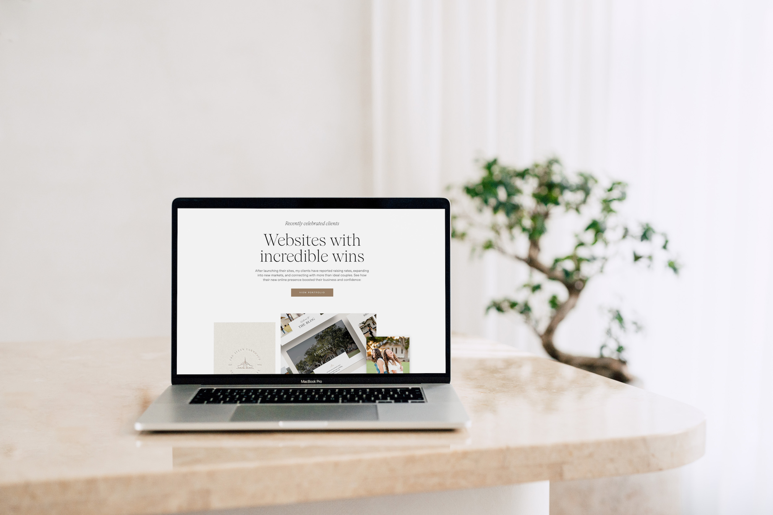
Alex Collier is a brand and Showit web designer for wedding professionals. Are you ready for a brand and website that’s impossible for dream couples to resist? Get in touch here or shop Showit templates.
Leave a Comment