


Design a professional-quality website using a 12-column grid
Are you a wedding professional looking to design your own website? Designing on a grid is an essential skill to learn to create a professional-looking website.
Remember when you were a kid and it was a big deal learning to “color inside the lines?”
As a kid, I got a thrill taking my 96-pack of Crayolas and transforming a simple outlined picture of Cinderella into a masterpiece. Given a totally blank sheet of paper, could I have re-created that same masterpiece? Heck no! It might have been creative, sure, and maybe even kind of good, but nowhere near the quality of the coloring book version. The lines gave me guidance. They showed me exactly where to color to create a stunning visual.
Your website is the same way!
The great thing about Showit is that it allows you total creative freedom. When they say you can simply drag and drop, they really mean it! But…all that creative freedom has a downside. Given this totally blank canvas, it’s easy to go nuts and place elements where they “seem” like they should go. Creativity without any boundaries can look messy, unorganized, and unprofessional.
The solution? Designing on a grid! Grid-based design is the difference between a website that looks just okay and one that looks amazing and professional.
Today I’m going to teach you why and how to design on a grid in Showit!
What is a grid and why should you use one?
A grid is composed of columns (and sometimes rows) that organize a page’s structure. The grid system’s origins are in print design; pick up any newspaper or magazine and you will notice that the content is organized in proportional columns! Check out this example (of course, I had to choose a T Swift example as I did as a teacher, old habits die hard):
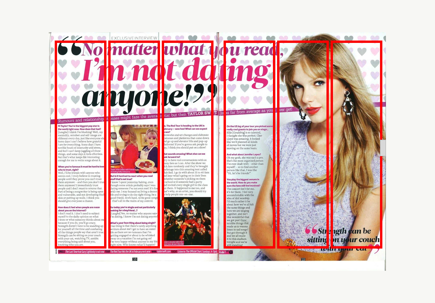
While some elements on this page “break the grid,” like the cutout image of Taylor and the splashy headline, the anchor elements—the text and images—follow a grid pattern. This gives structure and organization to the layout and makes the page look exciting without being haphazard and chaotic.
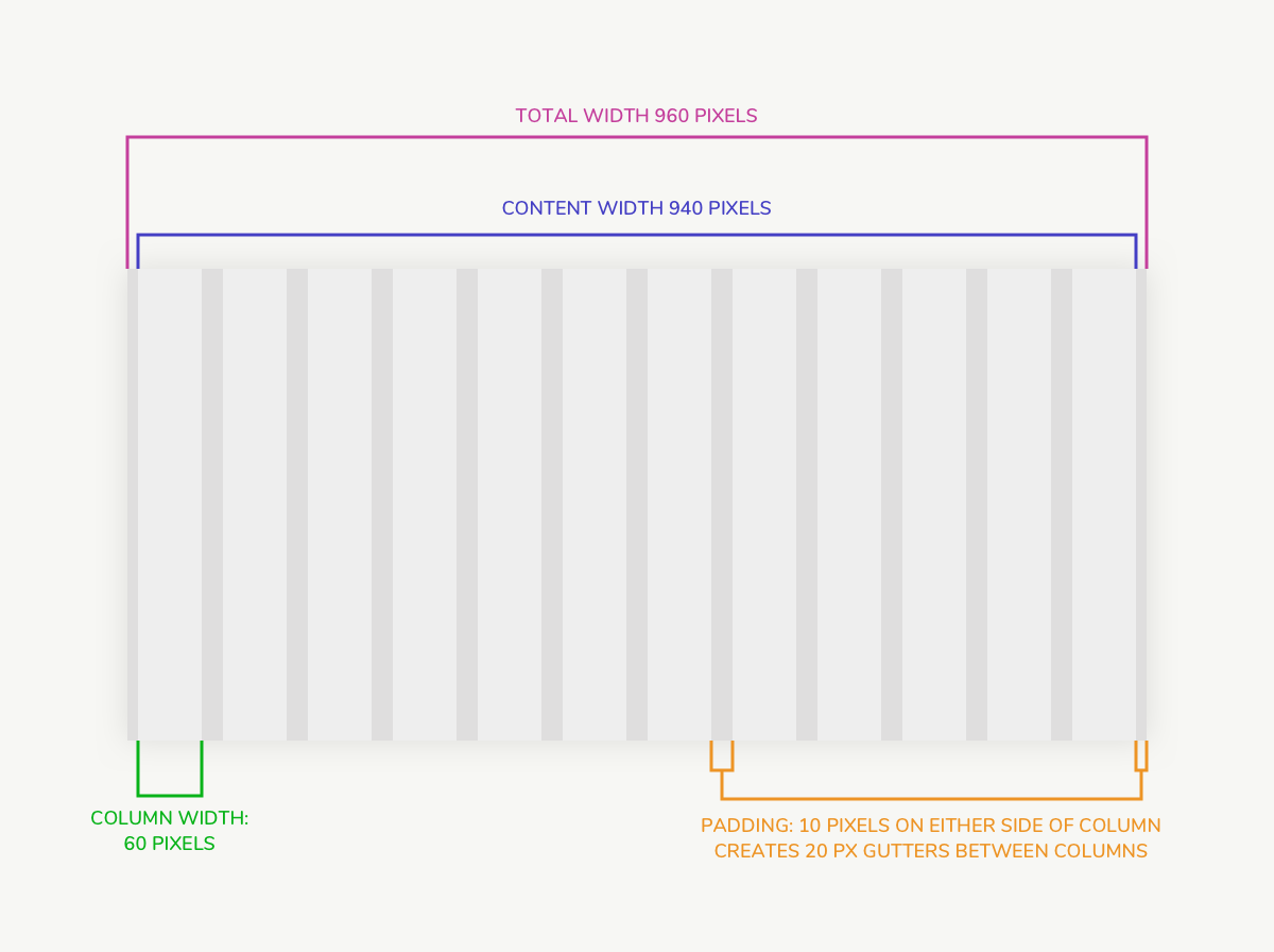
Grids come in many different shapes and sizes! Notice in the Taylor Swift example, each page follows a three-column grid. The standard grid for web design is a 960-pixel 12-column grid. This grid has 12 columns that are each 60 pixels wide, with 10 pixels of space on either side of each column. This creates a 20 pixel “gutter” between each column.
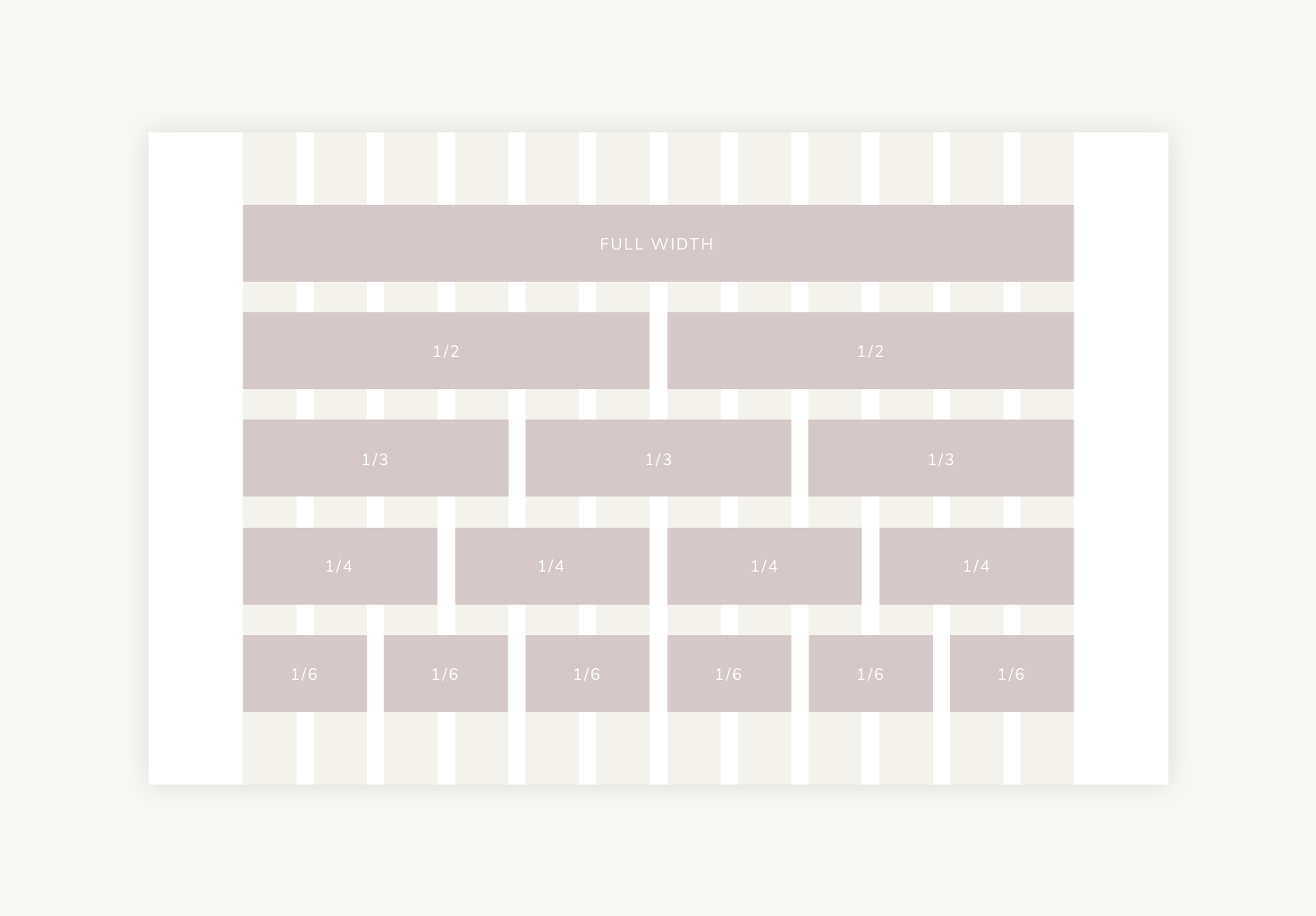
A 12-column grid is great for web design because it gives you so much flexibility. You can make elements stretch the full width of the grid, or you can break them into proportional sections. See, your 4th grade math teacher wasn’t joking when they said you’d use fractions in real life!
Using a grid is one of those designer secrets that will make your website look amazing! Next let’s chat about how to create a grid in Showit.
How to create a 12-column grid in Showit
Many design programs, like Sketch (which I use and love), have grid templates you can easily download from the web. But if you’re creating your site directly in Showit, you can still create and use a grid!
Here are the steps to create a 12-column 960-pixel grid in Showit!
-
- Create your first column: Create a rectangle with a width of 60 and height the size of your canvas. Set the x,y position to x=130 and y=1. I make my columns color #eeeeee because it’s light enough that it won’t distract from your design!
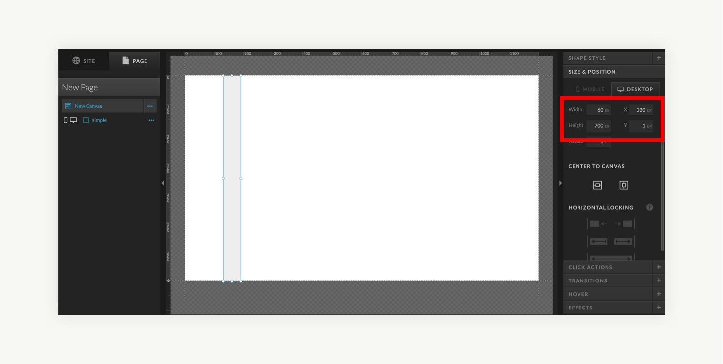
- Create your first column: Create a rectangle with a width of 60 and height the size of your canvas. Set the x,y position to x=130 and y=1. I make my columns color #eeeeee because it’s light enough that it won’t distract from your design!
-
- Create your last column: Create another rectangle with a width of 60 and height the size of your canvas. Set the x,y position to x=1010 and y=1.
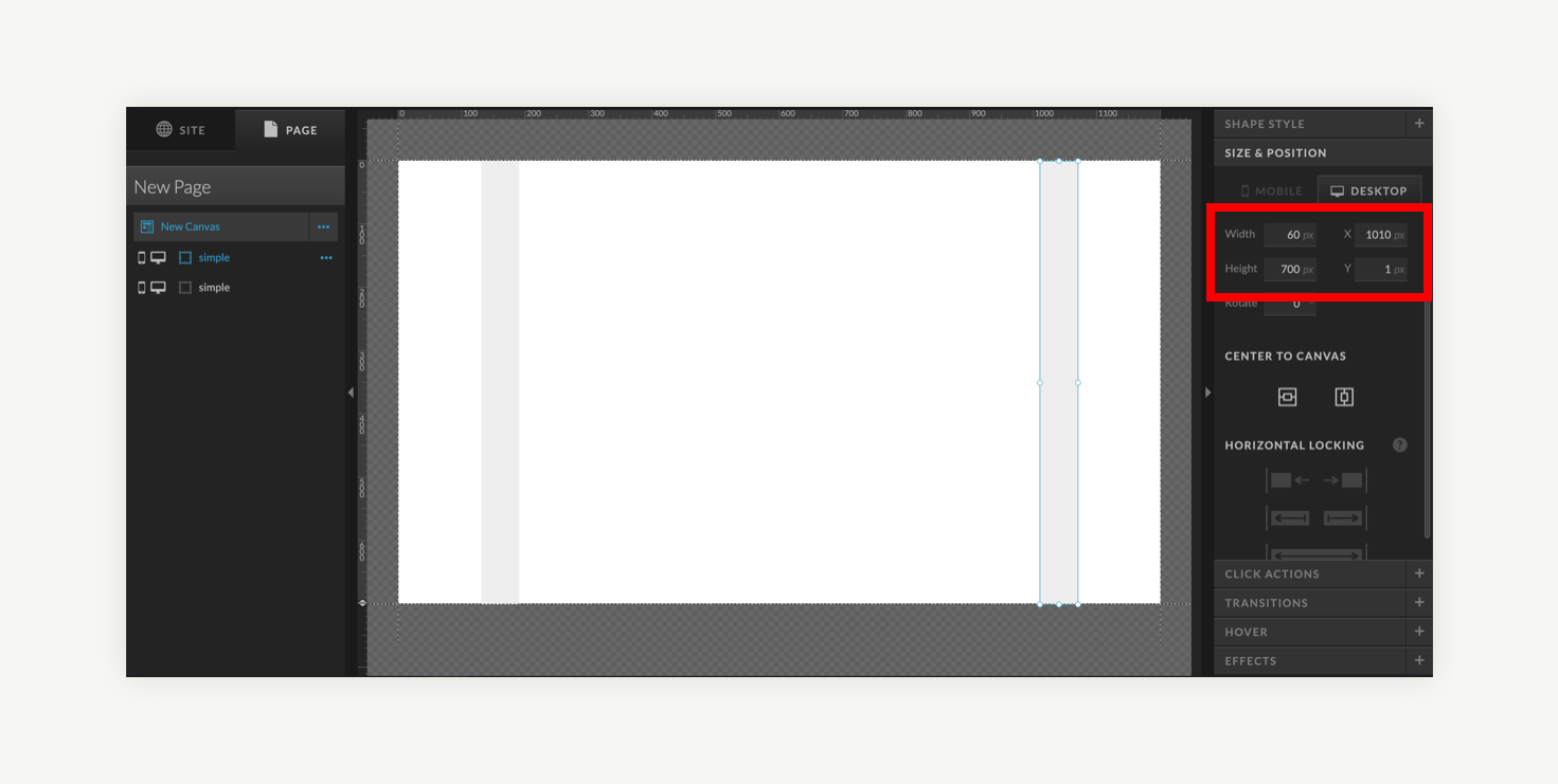
- Create your last column: Create another rectangle with a width of 60 and height the size of your canvas. Set the x,y position to x=1010 and y=1.
-
- Copy and distribute the columns: With the last rectangle selected, make 10 more copies using control+c and control+v. The last rectangle will look the same but keep in mind you now have eleven copies stacked directly on top of one another! Select all 12 columns by dragging your mouse or in the left-hand panel. Under the “alignment” menu, select “Distribute: Horizontal space”
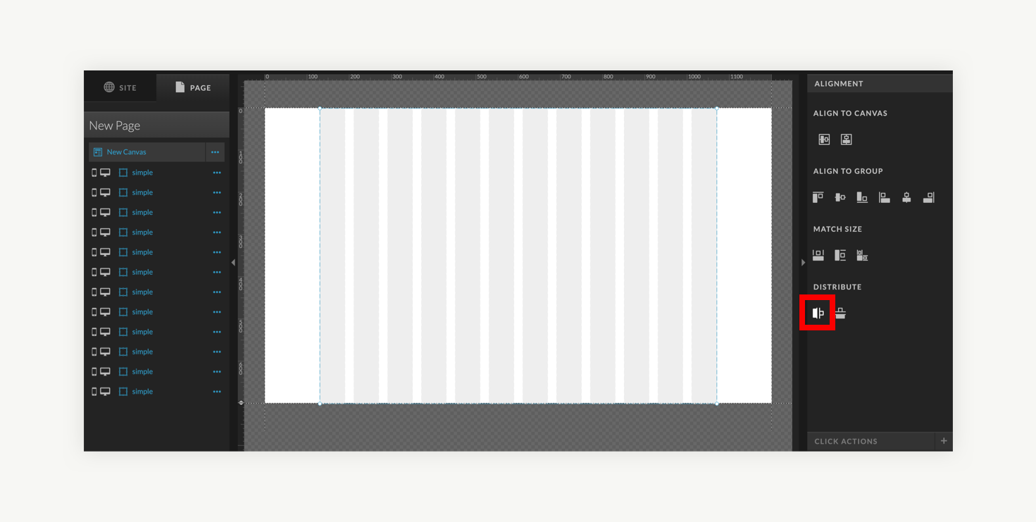
- Copy and distribute the columns: With the last rectangle selected, make 10 more copies using control+c and control+v. The last rectangle will look the same but keep in mind you now have eleven copies stacked directly on top of one another! Select all 12 columns by dragging your mouse or in the left-hand panel. Under the “alignment” menu, select “Distribute: Horizontal space”
-
- Design your page elements: As you start to add elements to your page, ensure that the grid is the bottom layer, so elements sit on top of it. Create your design on top of your grid, ensuring the edges of elements meet the edges of the columns. It’s ok for some elements to be centered within the grid, rather than stretching all the way to the edge, as I’ve done with the text in this example!
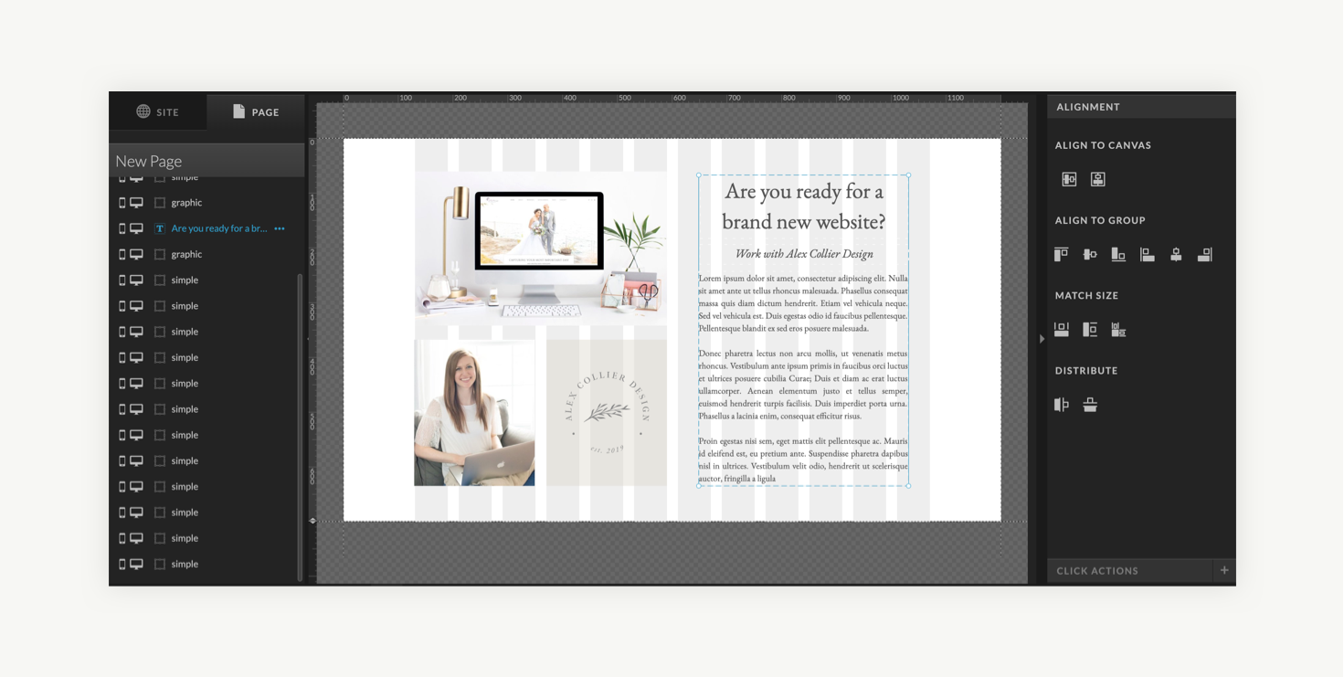
- Design your page elements: As you start to add elements to your page, ensure that the grid is the bottom layer, so elements sit on top of it. Create your design on top of your grid, ensuring the edges of elements meet the edges of the columns. It’s ok for some elements to be centered within the grid, rather than stretching all the way to the edge, as I’ve done with the text in this example!
-
- Hide or delete the grid: Before you publish your design, don’t forget to delete your grid! If you want to save yourself some work if you need to edit your design in the future, you can simply hide the columns from view!
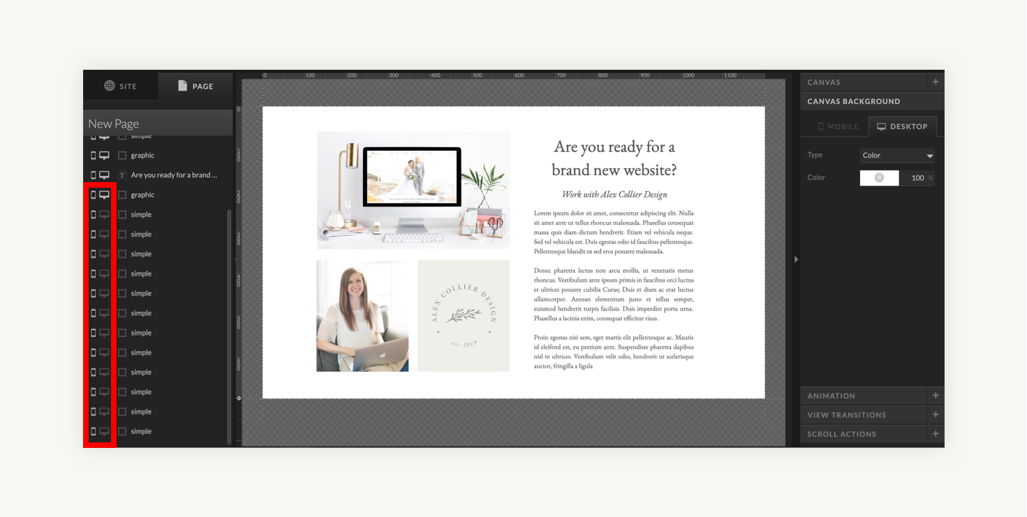
- Hide or delete the grid: Before you publish your design, don’t forget to delete your grid! If you want to save yourself some work if you need to edit your design in the future, you can simply hide the columns from view!
-
- Don’t forget mobile: Because the screen on mobile is so small, a multicolumn layout doesn’t really make sense. You can think of your mobile layout as a one-column grid! A one-column width of 280 pixels works well for mobile. Since you are mostly stacking elements vertically, it’s easy to just make most of them 280 pixels wide!
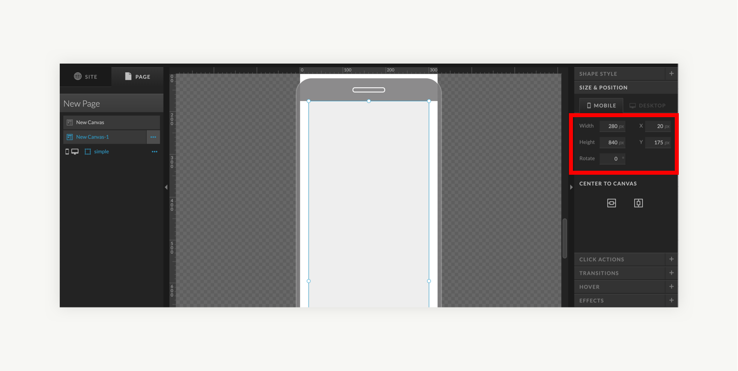
- Don’t forget mobile: Because the screen on mobile is so small, a multicolumn layout doesn’t really make sense. You can think of your mobile layout as a one-column grid! A one-column width of 280 pixels works well for mobile. Since you are mostly stacking elements vertically, it’s easy to just make most of them 280 pixels wide!
In Conclusion
Remember, a grid is like the lines in a coloring book. It gives us friendly limits for where our content should go so that our creative ideas look polished and professional. That said, it’s okay to break the grid, like in the Taylor Swift magazine example above! Occasionally breaking the grid with a splashy image or quote can make your design more dynamic and fun. You gotta know the rules to break the rules!
I’d love to hear if you try creating a grid in Showit and designing your website with it! Comment to let me know how it goes!
Alex Collier is a brand, logo, and Showit web designer for wedding professionals. Are you ready for a brand and website that elevates your business and books ideal clients? Get in touch!

Leave a Comment