


My foolproof guide to optimizing your contact page
Picture this: the dreamiest of dreamy ideal clients is visiting your website. They read your about page and think, “Wow, this photographer totally gets me. I want to be her friend!” They visit your weddings page and think, “Yes, totally in my budget!” They click around a bit more, get distracted, and…leave.
What the heck just happened????
Your contact page is the “closer” on your site. It’s the page that magically turns visitors into leads. Even if the rest of your website is amazing, if your contact page is lacking, you could be losing potential leads in that precious last minute.
Read on to learn how to avoid this tragedy and create a contact page that’s a conversion machine!
Tips for your contact page
1. Test your form!
The only thing worse than no contact page at all is a contact page that doesn’t actually work! Whether you take advantage of Showit’s built-in form capabilities or embed a lead capture form from Dubsado or Honeybook, be sure to test your contact page form to make sure it’s working correctly! Check that there are no error messages and that the test message lands in your inbox safe and sound!
2. Tell couples what to expect next
Don’t leave users guessing what’s going to happen after they inquire with you. Tell them exactly what they can expect after completing your inquiry form. On my site, I say, “Complete the form and I will get back to you within 1-2 business days.” And then, of course, live up to your promise! If you say they will get a response within 24 hours, you should be prepared to do so!
The button users click should also tell them exactly what’s going to happen when they click it. I like to use “send” or “send your message” so they are very clear that this is a message you will be receiving in your inbox. Make sure people know where to click to submit their form!
3. Create a “thank you” message
When a visitor submits their form, reassure them that their message was sent and when (and how) they can expect a reply. For example, you could say, “Thank you! I’ve received your message. Please check your inbox for my response in 1-2 days.”
Once users are on your “thank you” screen, it doesn’t mean they are necessarily done with your site. Let’s imagine a case in which they simply submit their inquiry and move on. What are they probably going to do next? Research and inquire with your competitors! Keep couples’ attention by inviting them to visit your blog or portfolio.
This can be either a message that appears on the page, or a separate page that users get sent to after completing your form. It doesn’t matter much either way; so long as you are letting them know you received their message!
Bonus tip: set up an automation in your CRM to send an email also confirming you have received their inquiry. You can send a more personalized message later, but the immediate confirmation shows them you are on the ball and puts them at ease.
4. Keep it short & sweet
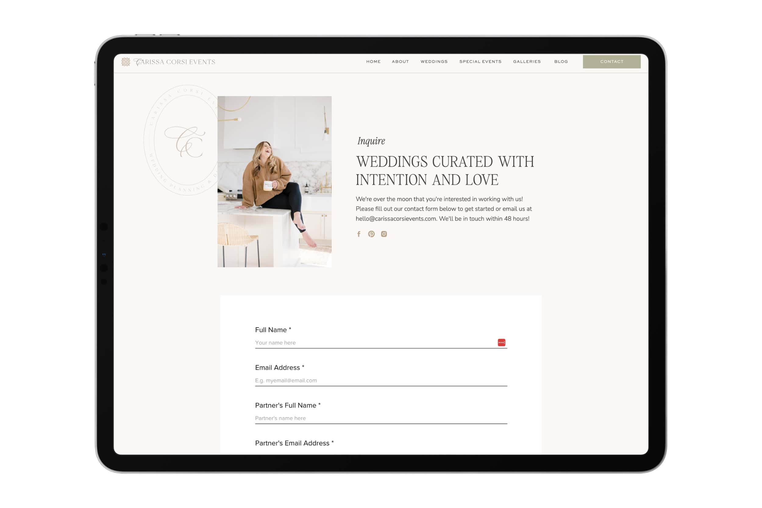
Studies have shown that conversion rates increase with the fewer form fields there are. That’s why I encourage my clients to include no more than 10 items in their form. My must-include form fields:
- First and last name
- Partner’s first and last name (Keep it gender neutral for inclusivity! Also great to ask for their pronouns too!)
- Phone Number
- Wedding date or desired date
- Wedding venue
- How did you hear about me? (Keep it open-ended for market research gold!)
- Message (An open-ended field where you can ask for more details they would like to share)
Potential know how necessary this information is and they will be happy to tell you!
Everything else can wait until you are a little farther along in the inquiry process. At best, your clients will give you an answer that may or may not be accurate, and at worst, you risk confusing or annoying them. The sales call is a great place to ask more open-ended questions to get to know your couples and start building a relationship.
5. Consider the structure
Make your form design clean and simple. Ensure that visitors can quickly and easily select the next form field using the “tab” key. In Showit, you do this simply by putting your input fields in order from first to last in the left panel. Here’s a more detailed explanation if you need it! It’s also a good idea to order your form fields from easiest (your name) to hardest (tell me more about your wedding). This makes users more likely to complete the form—by the time they get to the harder questions, they’re already mostly done!
6. Design for mobile
Don’t forget that most clients are likely visiting your site from their phones! It’s a good idea to make your form fields and submit button a little larger on mobile so they are easily clickable. Keep in mind that on an iPhone, iOS automatically zooms to focus on form text smaller than 16 px. I recommend keeping your contact form font 16 px or larger; this makes it both easier to read and more usable.
We also don’t want couples to have to scroll too far to get to your form. If you have elements like images or a sidebar on this page, typically I prefer to put those under the form on mobile. The goal of this page is for couples to complete the form, so we don’t want to make it difficult to find!
7. Include alternate contact info
On the off chance that your form isn’t working (even though you tested it…right? 😉), this gives couples a way to still reach you. Plus, your email address is there for other people who might need to get in touch with you—other vendors, press inquiries, collaborations, etc. Don’t miss out on opportunities because you’re too hard to contact!
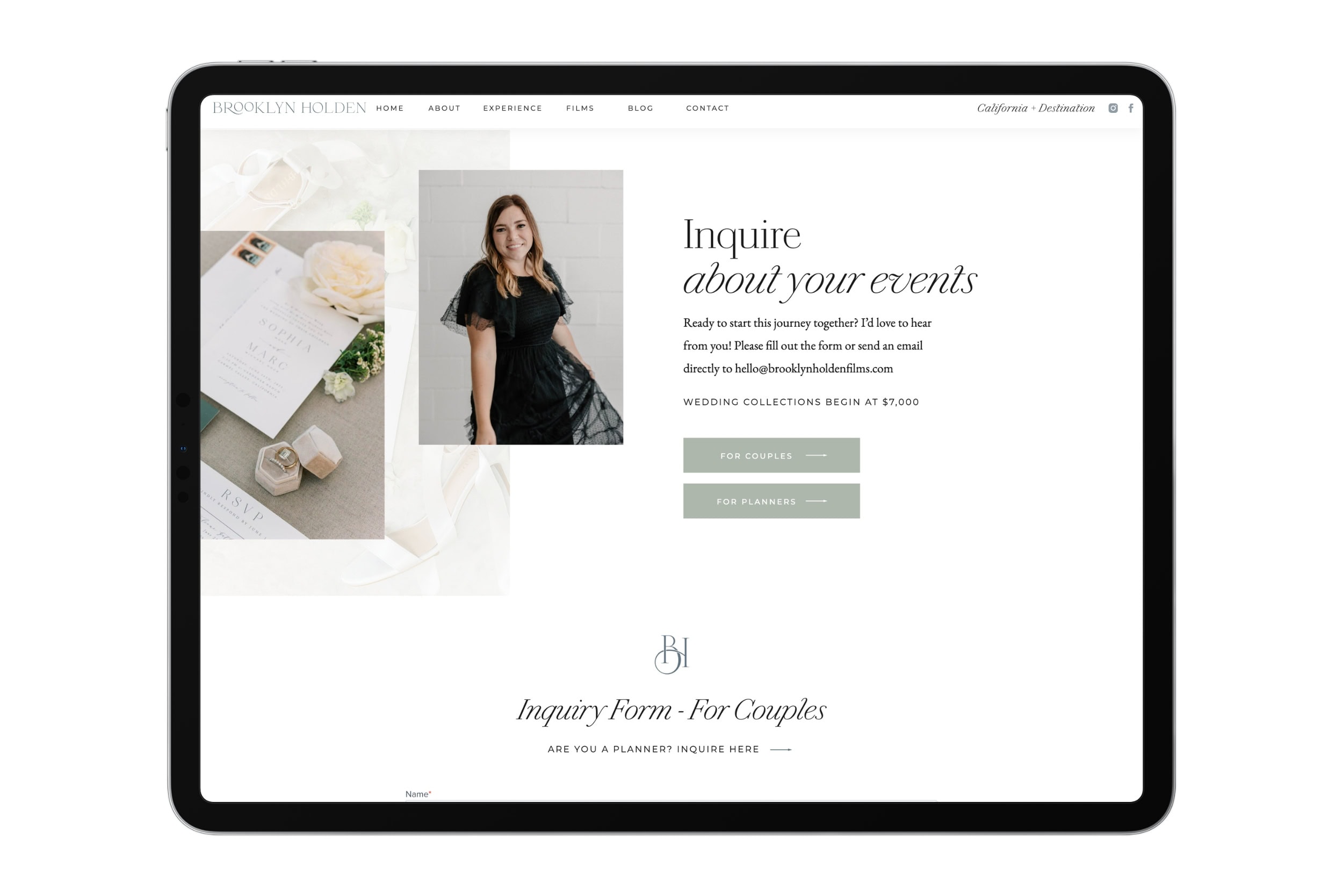
8. Add an image of you
Including a photo of yourself making eye contact on your contact page helps potential clients feel an immediate sense of trust and connection. Studies have shown that eye contact activates regions in our brain tied to empathy and understanding. A photo of you injects warmth and credibility at a moment when clients might feel vulnerable or second-guess themselves. It shows them: “Hey! I’m a real person. And I would love to work with you.”
Bonus tip: Don’t be afraid to show off your personality in the micro-copy on this page! Use language to attract your ideal couples and repel those who aren’t for you (for example, “let’s chat about your badass, one-of-a-kind wedding” isn’t for everyone, but if it’s for your people, it’s a subtle way to let them know they’re in the right place.
9. Include your pricing on the form
I’m a huge advocate for including your pricing on your website, whether it’s an average investment, starting price, or minimum spend. But I often hear from wedding pros who tell me “I do have my price on my website, I’m still getting lowball inquiries, or couples seem like they’ve never seen it!”
The solution is including your pricing on your contact page, even in the form itself! You can introduce your form with a blurb about pricing, for example: “Please inquire below. Wedding photogrphy packages start at $7500.” Or, I’ve also seen vendors include a dropdown for couples to select their planned investment (just be sure those ranges/options are actually inclusive of your services)!
It may feel like a bold approach, but it’s just one more way to build trust with your couples and show transparency!
10. Lead couples to the form
Throughout every page of your website, consider that your ultimate goal is for couples to inquire. That means you need to get them to the contact page in a way that feels seamless and natural. Incorporate calls to action throughout every page of your site linking couples to your contact page.
In your navigation, link your contact page from your navigation as the last item listed. The serial position effect is a UX principle that states users are most likely to remember the first and last item in a series. We can direct their attention by positioning the contact tab as the last item they see. You can even outline it as a button to call more attention to it!
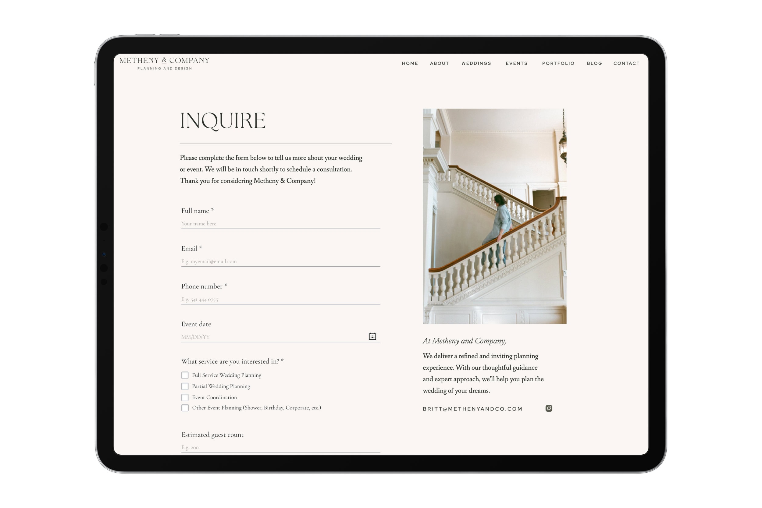
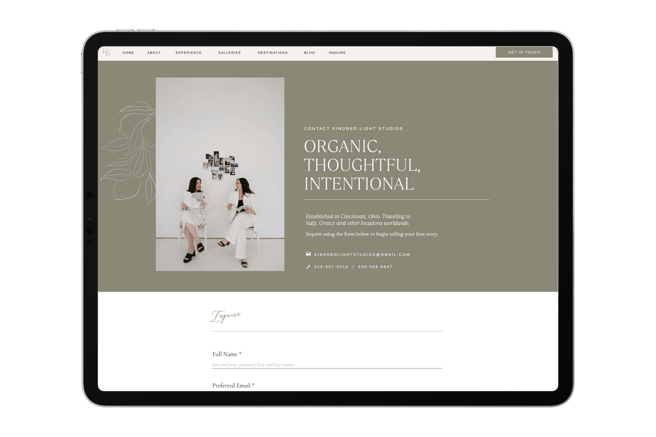
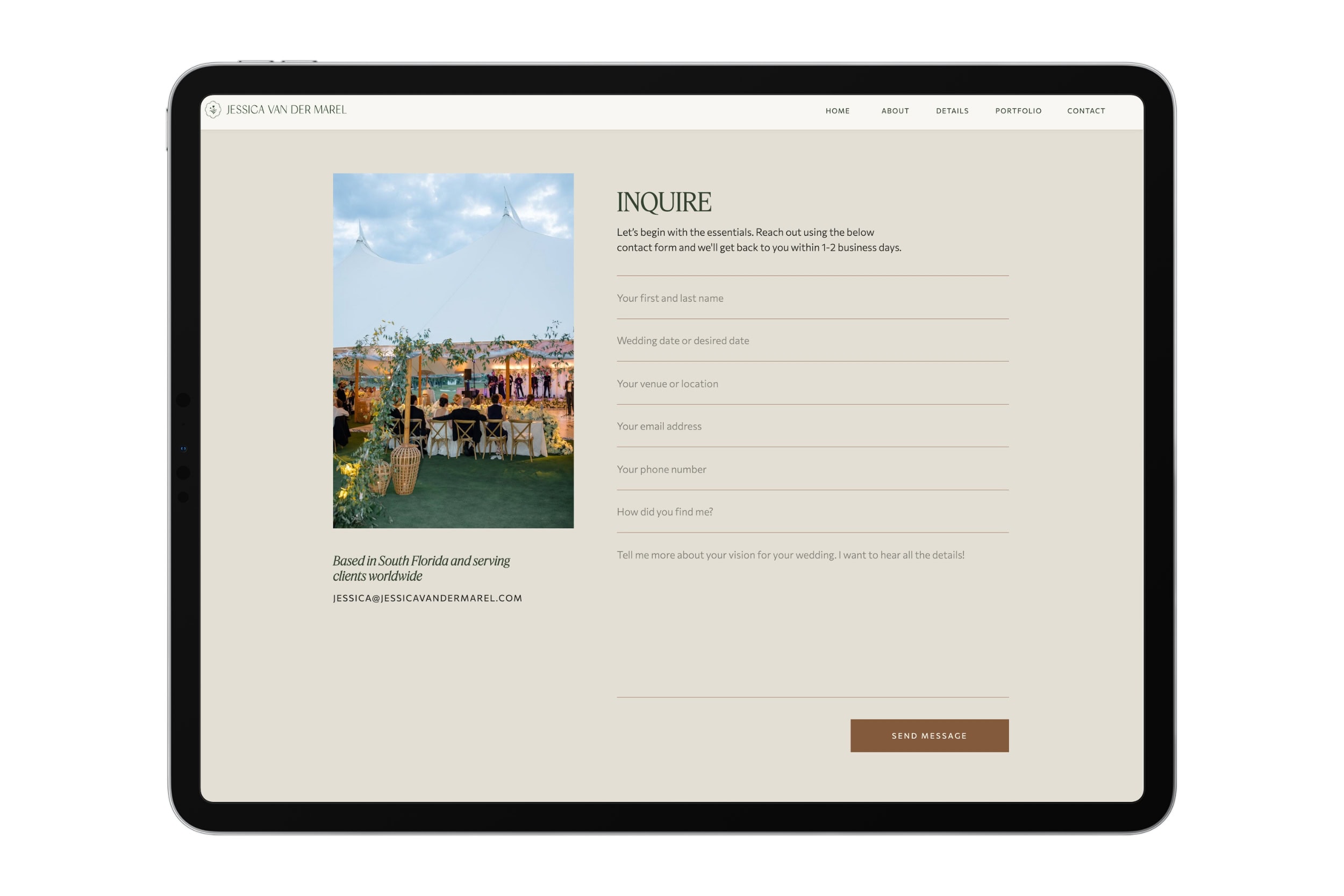
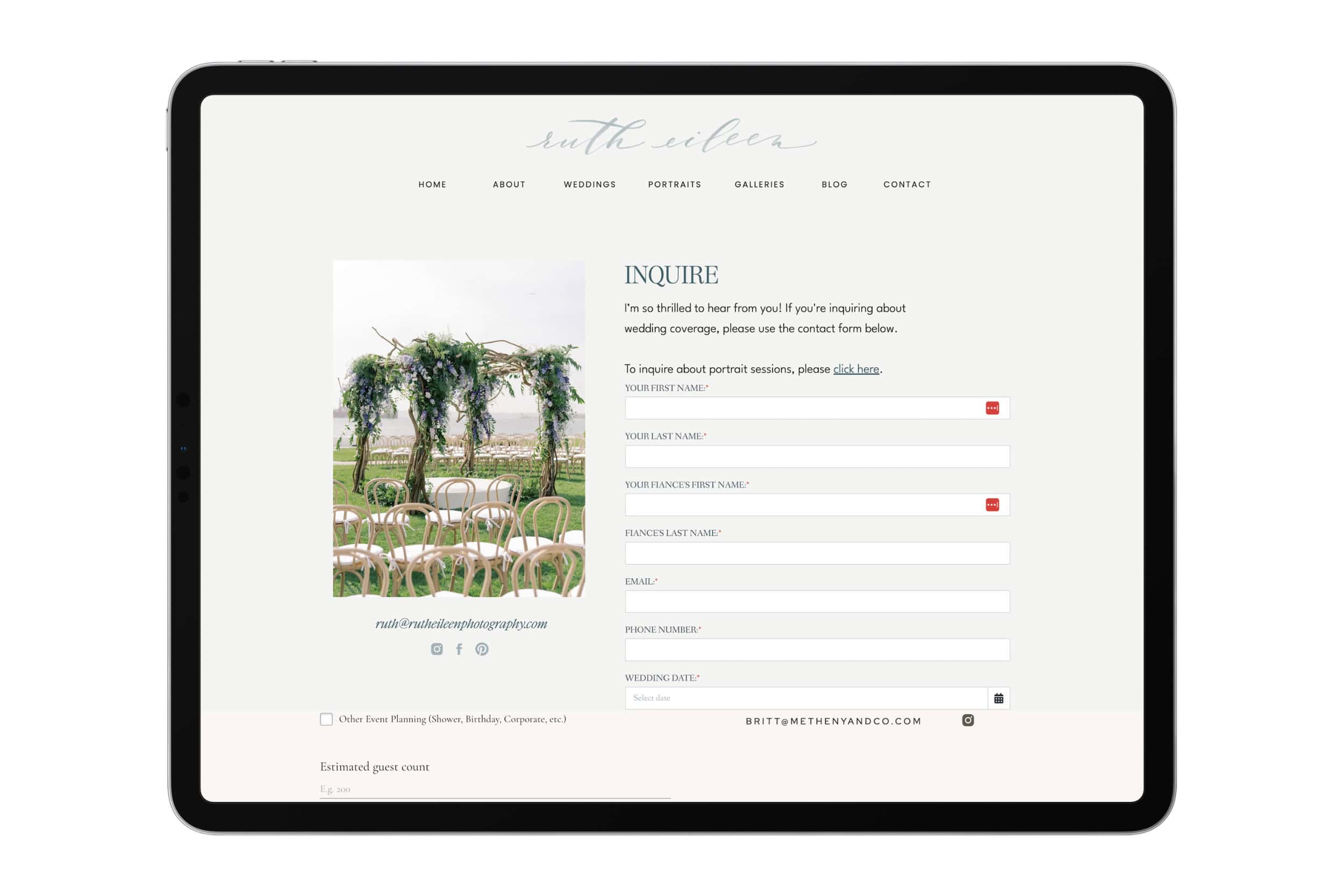
Contact Page Examples
Take a look at these examples of great contact pages from real Alex Collier Design clients:
In conclusion
Your contact page is such an important page for your business. It turns website visitors into leads (who eventually turn into clients, aka the people who pay you!). It’s worth taking the time to make sure your contact page is designed to convert.
Ready for an elevated design experience? Alex Collier is a brand and Showit web designer for wedding professionals. Check out my services here and get in touch to schedule a discovery call about your project!
Practical tips, especially love the emphasis on testing the contact form and adding a personal touch. Clear, concise, and super valuable.