I’m excited to share with you the behind-the-scenes of a recent web design for Alaina Kristine Photography.
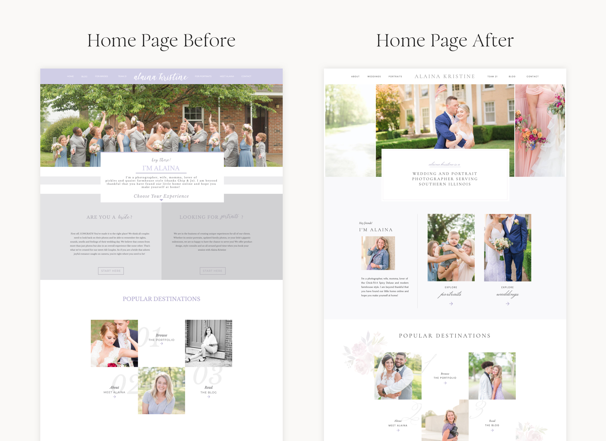
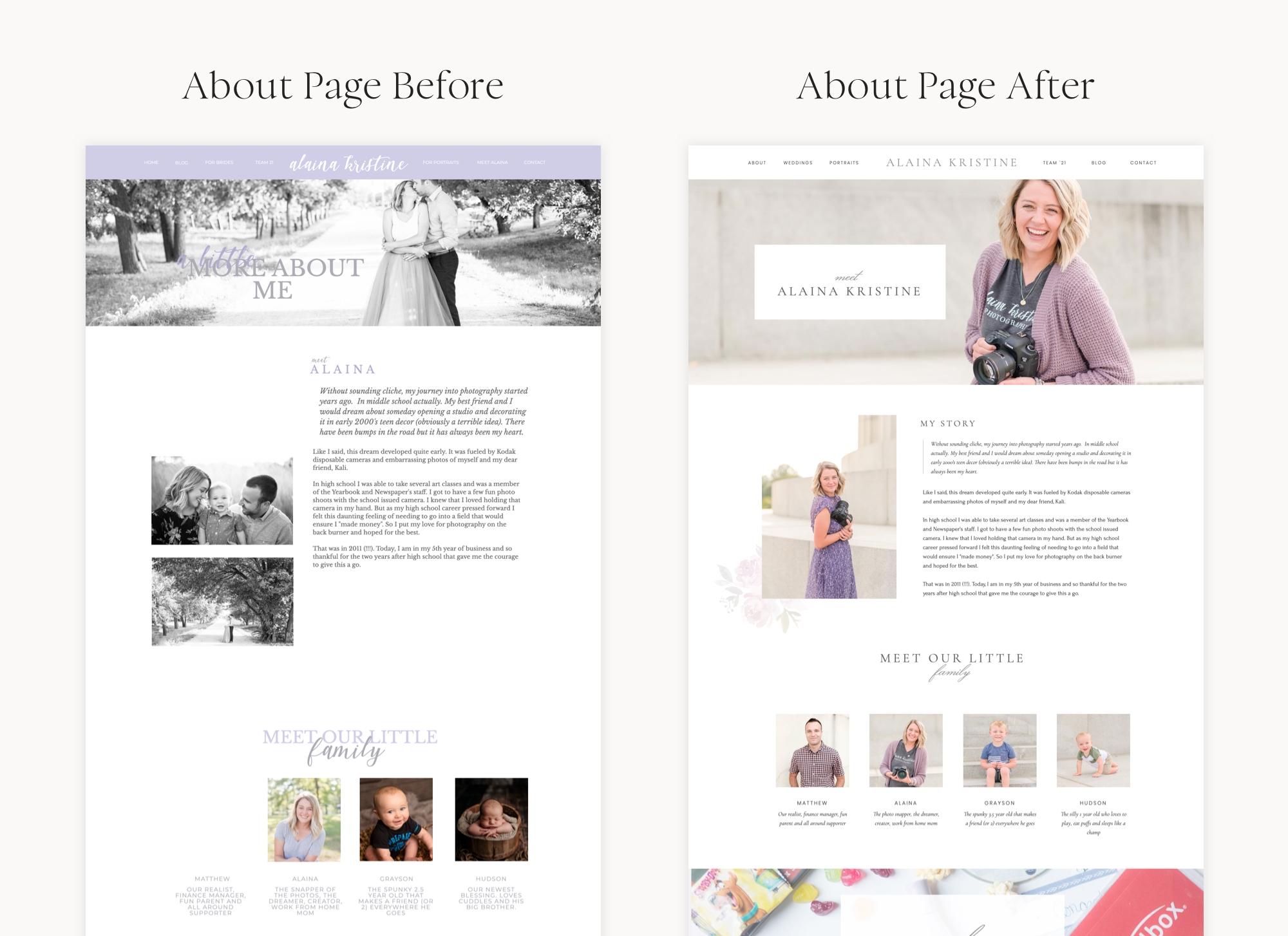
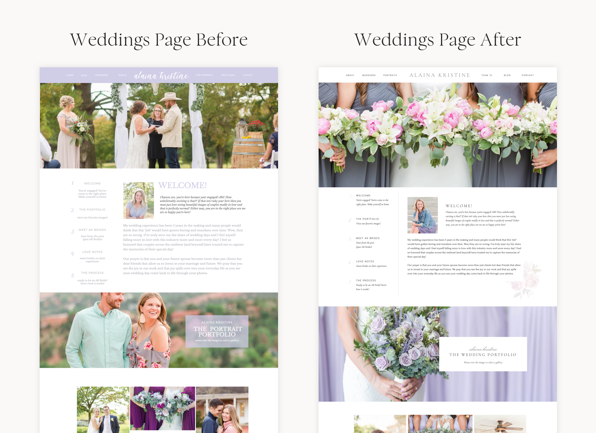
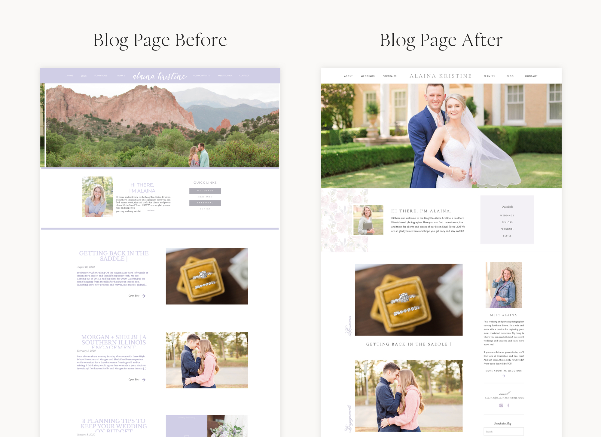
Alaina reached out to me because it was time for a website refresh. As her business had grown and her photography style had evolved, her website was no longer reflecting her brand and experience. Alaina had used a few different Showit templates to create and design her own site! Her site was working well as far as the flow, but the design just wasn’t working. Alaina and I worked together to polish up her website and give it a high-end brand look.
I love this project because it’s such a great example of how tweaking colors, fonts, and spacing can give your site a TOTALLY new look and feel!
Here are just a few of my favorite details on Alaina’s site:
- The floral details: I am a huge fan of florals and love how we tied in Alaina’s brand color, purple, with some watercolor florals. These details add texture and visual interest to Alaina’s design.
- The white space! White space (also called negative space) is a great way to make a design instantly feel more high-end. We gave a lot of Alaina’s site elements some more breathing room in order to create a more luxurious vibe.
- The galleries: On Alaina’s old site, her galleries weren’t very easy to navigate or explore. We streamlined things so that the galleries are organized, easy to navigate, and (of course) beautiful!
Check out some before & afters of Alaina’s site below!


I loved working with you Alaina! I hope your new website serves you for many years to come!
You can see Alaina’s site live at alainakristine.com.
Alex Collier is a Showit web designer for wedding professionals and other creatives. Are you ready for a website with beauty and brains? Get in touch!
Leave a Comment