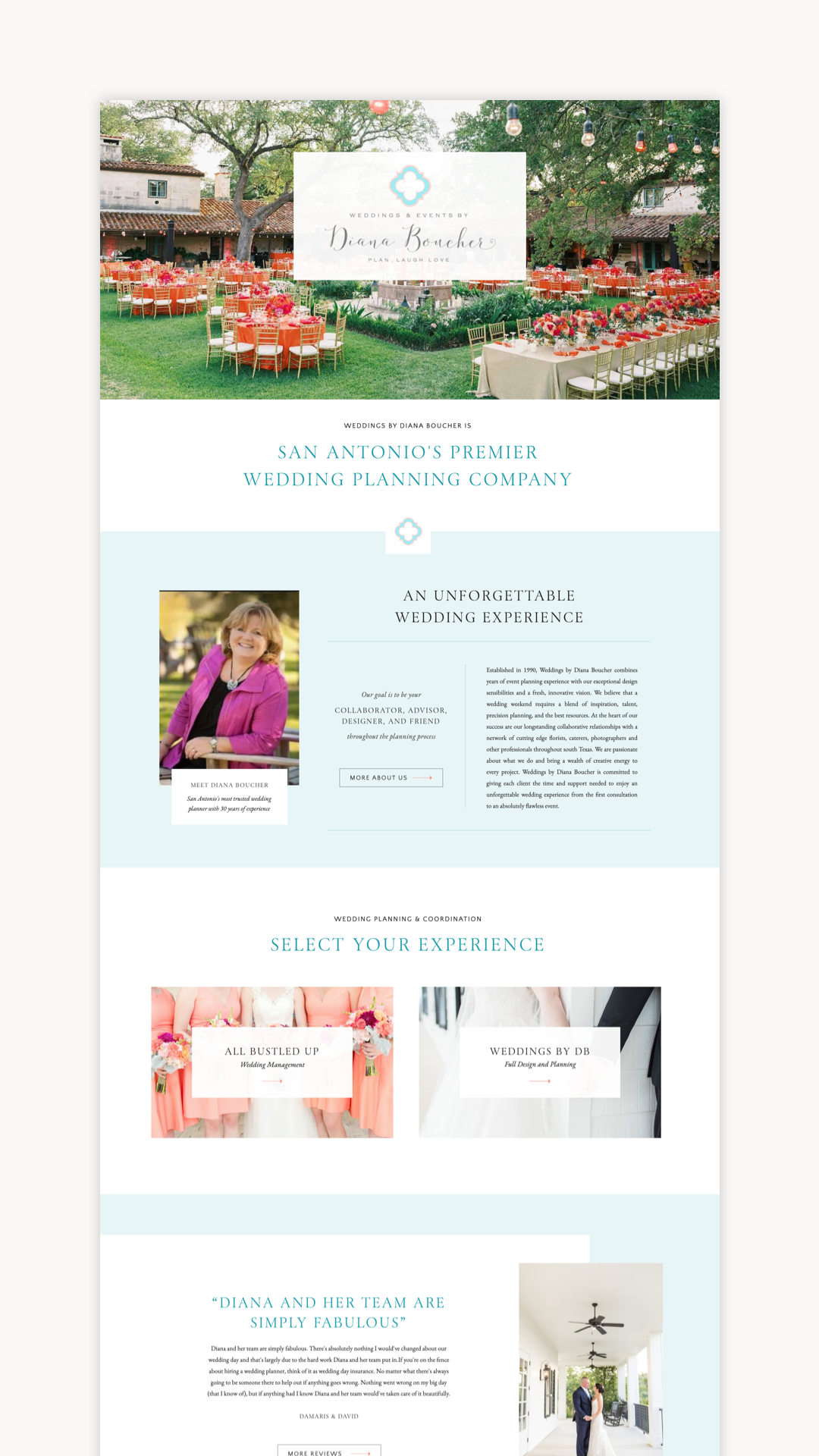
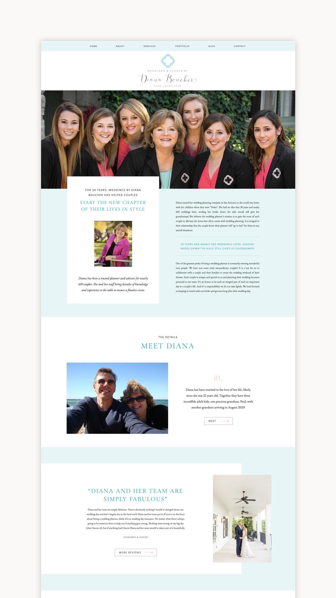
If you have worked or planned a wedding in San Antonio, chances are you have already heard of the amazing Diana Boucher! Diana has been serving Texas couples since 1990. This year marks 30 years of planning gorgeous weddings! I remember admiring Diana’s work back when I was planning my own wedding a few years ago, so it was such an honor to bring her new site to life!
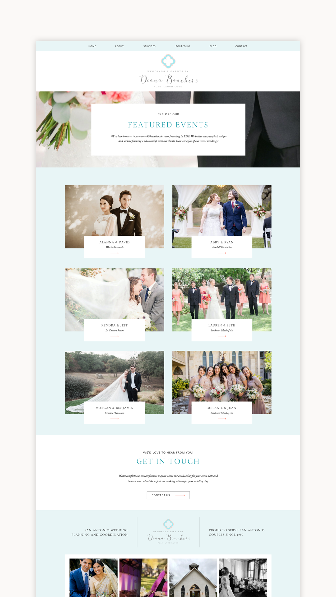
During our pre-launch call, I was walking Diana through her portfolio page featuring some of her beautiful recent weddings. I noticed that as Diana looked back at these weddings, she didn’t tell me about the flowers, or the place settings, or the stunning venues. Her voice grew excited as she pointed out to me which couples were expecting their first child, which couples had amazing careers helping the community, and which couples were so kind and fun to work with. My heart grew three sizes that day, y’all! It was so sweet and such a clear example of why Diana is so amazing at what she does.
My favorite thing about Diana’s site has to be the color palette! Diana’s logo was coral and aqua, and she wanted to keep those colors consistent with her brand. We were able to bring in a lot of that color with images from her weddings, and then also used it subtly for headers and backgrounds. I love that the end result is fun and colorful, while still being elegant and refined.
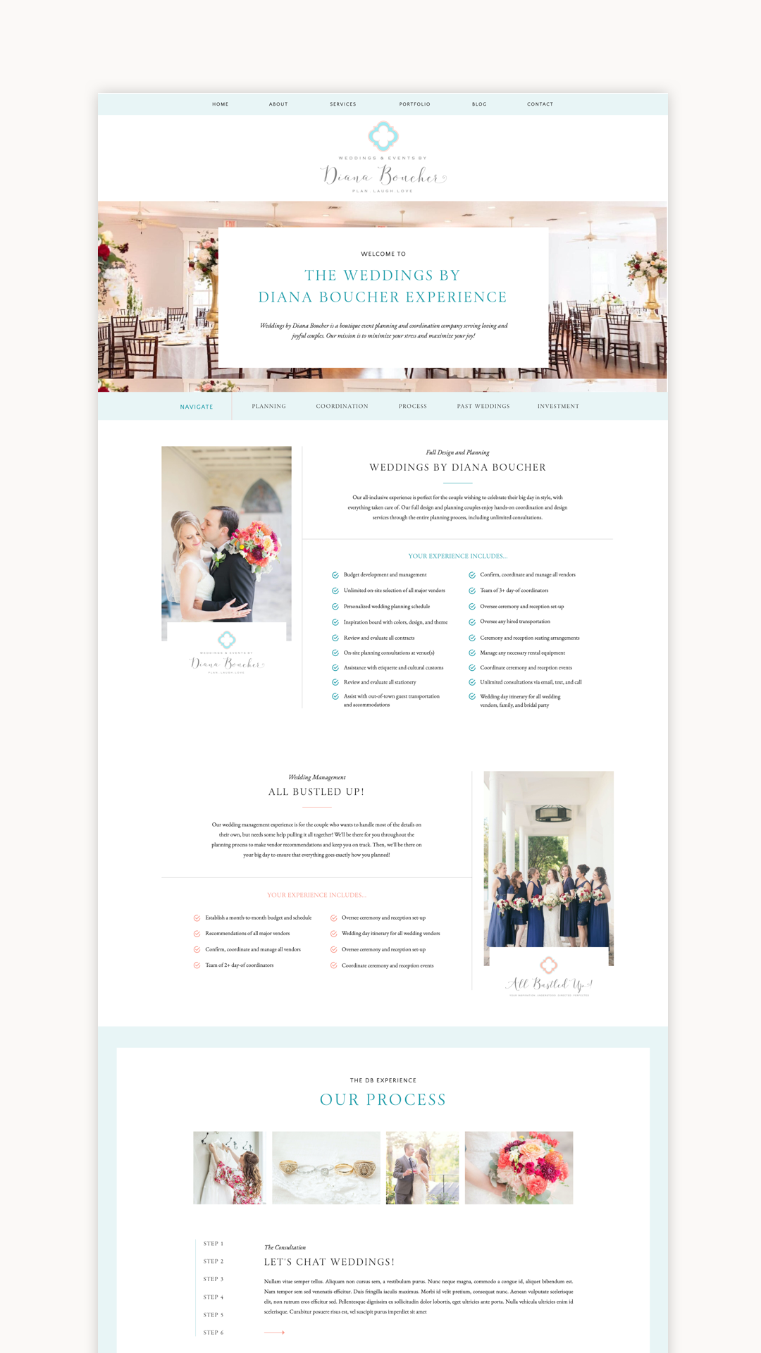
Diana also wished to combine websites from her primary brand, Weddings By Diana Boucher (full design and planning), and her sister brand, All Bustled Up (wedding management). Over the years as her business and team have grown, she’s added this element to her business and it just wasn’t making sense to keep them separate. We were able to bring these sister brands together on Diana’s services page, which elegantly outlines her services and the process of working with her.
Diana shared a bit about her experience going through a website redesign:
My website has needed the windows thrown open to let the fresh air in for a long time. I wanted to showcase how we help couples in a more modern way.
Ha! I wouldn’t even know where to start! For someone like me, it would be way too difficult a task to attempt myself. [Alex] knows not only the technology behind building a website but also the aesthetics.
I’ll be so happy to send current and future brides to the new site! The pages and content are much more organized.
Still too new to tell but from what I’ve seen so far it’s very user friendly.
Check out some screengrabs of Diana’s site below!


Thank you so much, Diana! I hope your new website serves you and your couples well!
You can see Diana’s site live at weddingsbydianaboucher.com.
Alex Collier is a Showit web designer for wedding professionals. Are you ready for a website with beauty and brains? Get in touch!
Leave a Comment