


You already know that your website is your best chance to make a first impression. And for many of your future clients, the first place they will land is on your home page!
Overall, your goal on the home page is to catch people’s attention, provide a stellar first impression, and help users get where they need to go. People should leave your home page feeling impressed and excited to learn more about you and what you do!
I often hear from wedding pros that they just aren’t really sure what to put on their home page or even what it should include. Well, first of all, I recommend starting with a template that is designed with SEO and conversion in mind. My templates are just that—specifically designed for wedding pros and already include the elements I’ll lay out in this post. (Shop the templates here)!
But if you’re wanting to take a DIY approach, improve your existing site, or just learn more about what your home page should look like as a wedding pro, this post is for you! I’ll go over the 9 sections I recommend including on your home page, including the section’s goals, sample calls to action, potential roadblocks, tips, and real examples from my clients.
This is the strategy I actually use as a brand and web designer for my clients, who are wedding pros like you. And I can tell you that this strategy works. So read on, and let’s get to work!
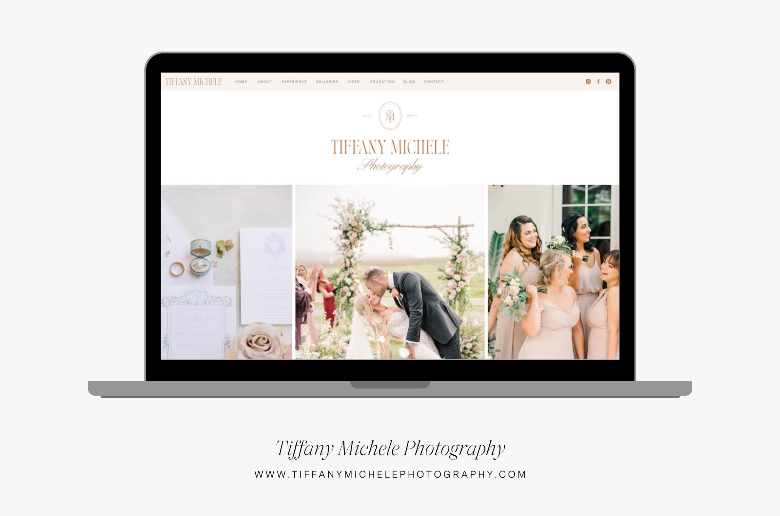
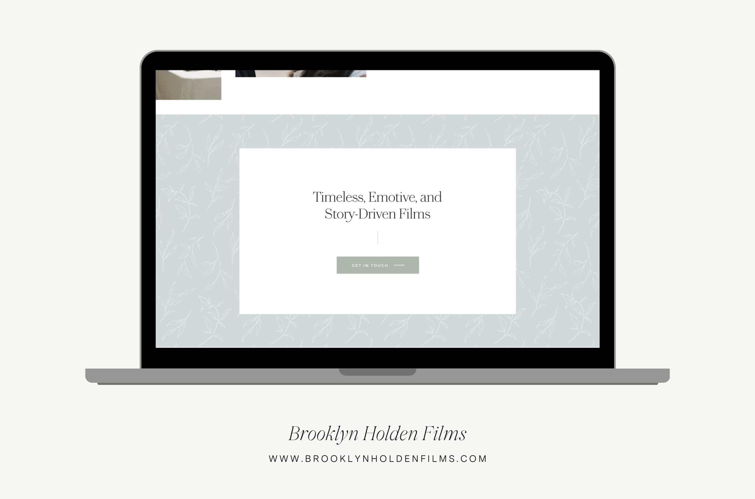
1. The Hero Section
The hero section refers to the section of the page “above the fold” – aka, what people see immediately when the page loads, before they scroll.
Goal of this section: The goal here is to nail the first impression. This is your princess-entering-the-ball moment. All eyes on you, entranced by your (website’s) beauty. So here is the place to showcase your absolutely BEST work. If your branding is top-notch, this is a great place to showcase your logo. You want people thinking: “Damn, they’re good” right from the jump.
Call to action: A lot of web professionals will tell you it is CRUCIAL to include a call to action above the fold. I think there’s something to be said for leveraging attention when you have it the most, but weddings are a much more visual industry than many others. If it makes sense to have a button here linking to your services page, then great! But if no CTA is the trade off for a super visually compelling section that encourages people to scroll and explore more, I’m all for it.
Avoid this roadblock: I often see wedding pros get into trouble on this section by making their text unreadable. If you are overlaying text or a logo on top of an image or video, ensure that it is readable. Try finding an image that is not quite as busy or detailed, or using a gray or color overlay to increase the contrast with the text.
Bonus tip: We continue to see video as a major trend in web design! If you want to capture attention even more, consider using a background video showcasing your work. A word of caution though: videos are large files and can slow down your site. Use a short looping video and compress it to minimize the impact to your loading speed!
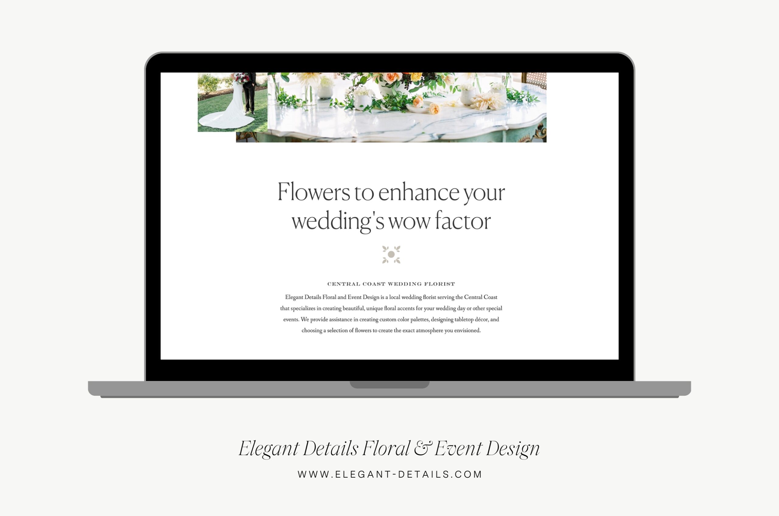
2. The Intro Section
The intro is where you need to start diving into the need-to-know details. What do you do, where are you located, and who you serve. The trick here is incorporating your personality while remaining super clear.
Goal of this section: Let people know they are in the right place. Tell them what services you provide, and most importantly, where you are located.
Call to action: I don’t always include a call to action here, but it is a good place to link folks to your services/experiences page!
Avoid this roadblock: If you’re waiting until after this section to state your location, you’re waiting too long. This is perhaps THE most relevant information to your local couples. Be cautious not to bury this information so it’s difficult to find or easy to miss.
Bonus tip: Ensure that your target keyword is marked as your H1 in your website’s backend. Most likely, this will be something incorporating your location, like “San Antonio Wedding Planner.” This keeps your site Google-friendly so Google’s robots can understand your content!
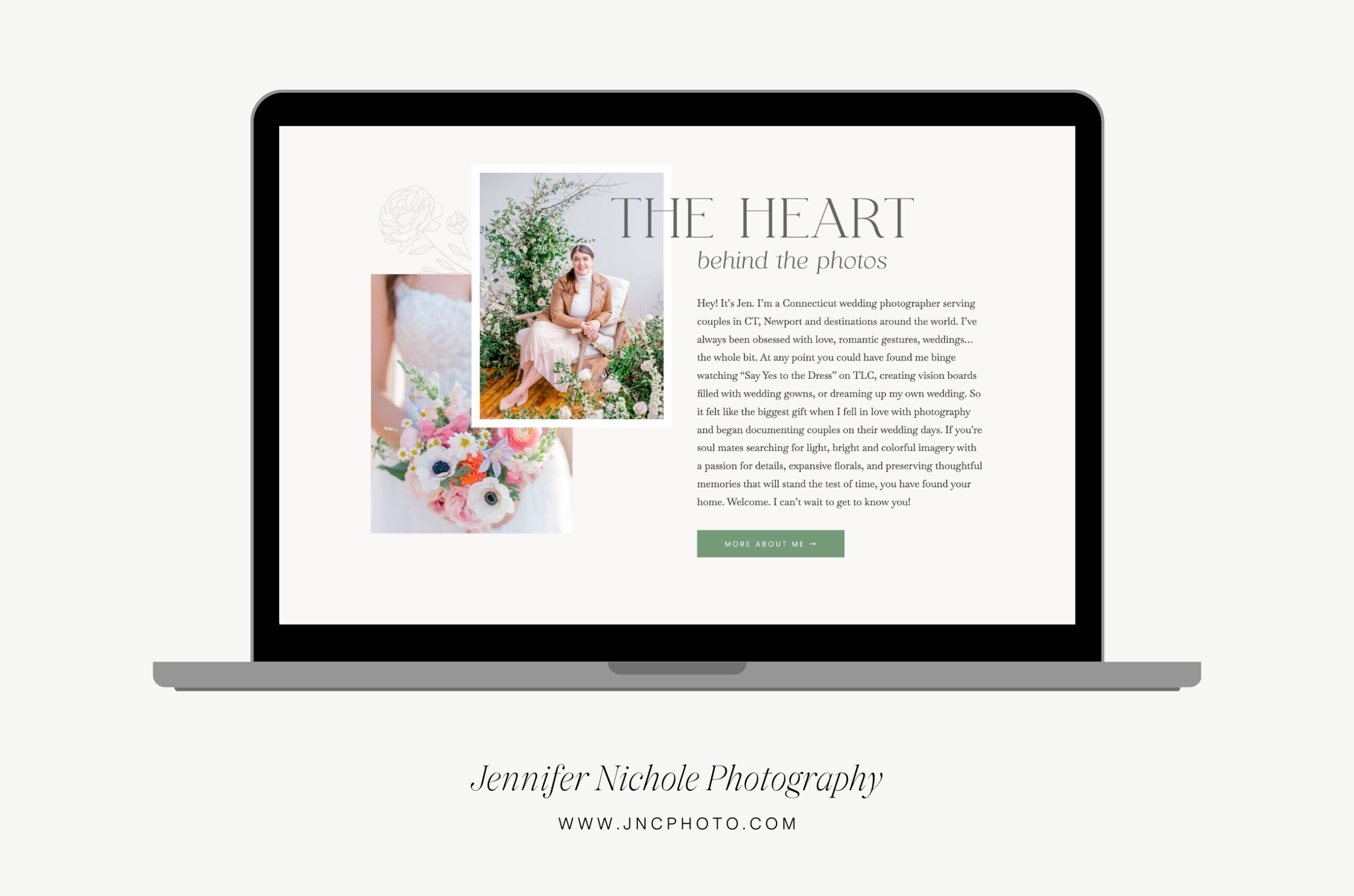
3. The About Section
Time to get personal! Introduce yourself or your team. Share a bit about the heart behind what you do, your unique approach, or your goal or vision in serving your clients. Make the connection for them about the business and the real human behind it.
Goal of this section: Make a personal connection with your potential client. Marketing is all about building the know, like, and trust factor, and this section is designed to do exactly that.
Call to action: Invite users to click to visit your about page. Some ideas: Learn more about me, Explore our story, Get the details
Avoid this roadblock: Real talk? It’s not 2015 anymore. So this section is NOT the place to share your favorite coffee order and gush about how much you love being a dog mama (though it’s ok to mention those things in passing). Instead, think of this section as talking about you as a business owner. Consider how you are uniquely positioned to bring your clients’ wedding day vision to life.
Bonus tip: Use a picture of you making eye contact with the camera! I get it—those artsy looking-away shots are so pretty. But studies have shown time and time again that eye contact projects confidence and builds trust.
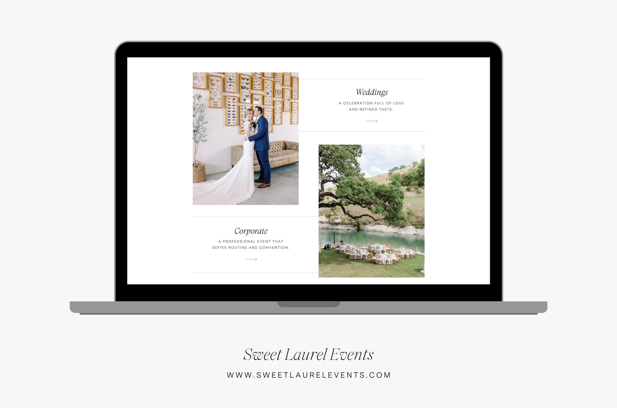
4. The Experiences/Services Section
Here is the real meat of your home page. This is where you will share a bit about the experience working with you, or what services you provide. If you offer more than one service (for example, wedding planning and photobooths), I recommend having a section for each service and linking out to that relevant page!
Goal of this section: Share what it is you do and tease a bit about what it’s like to work with you. You don’t want to overwhelm folks with information at this stage, but you do want to pique their interest enough so that they want to click and learn more.
Call to action: Invite users to visit your experience page, or your specific services pages if you offer multiple services. It’s best to be clear here where exactly you are linking them. For example: Discover the wedding experience, Our floral services, Get the details
Avoid this roadblock: Your website is not a restaurant menu! Don’t fall into the trap of simply listing out each service and pricing on the home page. A luxury client experience starts with your website—so this is place to start to show people what that experience looks and feels like.
Bonus tip: Consider whether it makes sense to funnel people to a singular services page here, or to multiple pages. If you serve one type of client and offer one main service (though possibly at different tiers), one page is usually a good call. However, if you offer multiple services, like wedding and corporate planning or wedding and family photography, I recommend creating separate services pages that you’ll link to here.
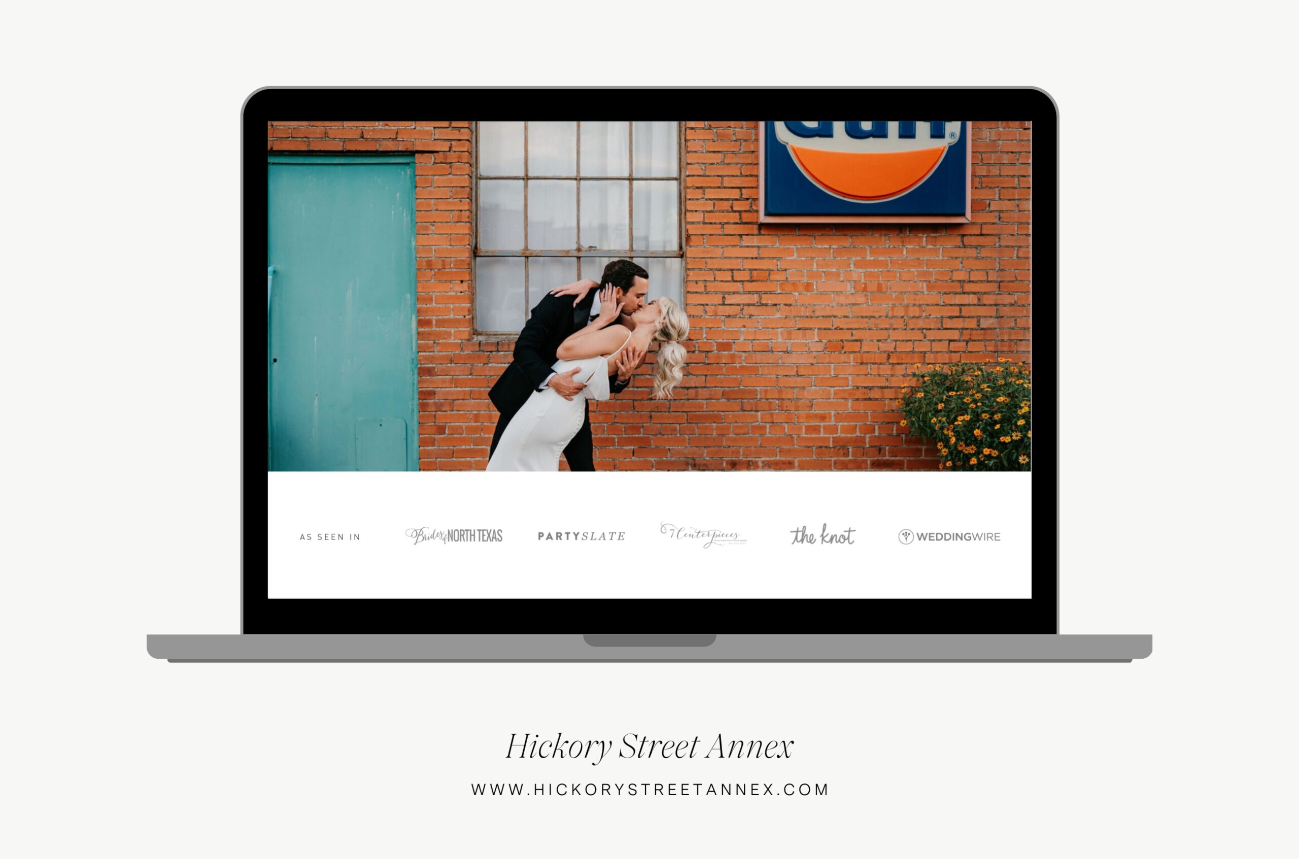
5. The As Seen In Section
This section is a place to feature logos or names of publications where your work has been featured. Think places like Style Me Pretty, Brides, Martha Stewart Weddings, and MunaLuchi Bride. This is the place to name drop and impress.
Goal of this section: This is a form of social proof designed to showcase your expertise and experience. You want to showcase to your couples that you aren’t just saying you’re a pro at what you do—leading industry publications think so, too.
Call to action: This section doesn’t typically include a CTA, though you can link the logos to the feature if you wish. Just make sure it opens in a new tab!
Avoid this roadblock: Avoid what I lovingly refer to as “badge vomit”! Wedding publications love to give you a badge to showcase on your site, but these are often not aligned with your own brand, take up way too much space, and just don’t look very high-end. In my opinion, the biggest thing you are doing by featuring those badges on your site is giving that company advertising space on your site, totally free of charge. Now call me crazy but I believe your website’s home page should advertise for YOUR business and your business only. So a more refined way to showcase this is with publication logos in a simply white or dark grey!
Bonus tip: Sizing can get tricky with logos since they may all be different shapes and orientations. Give each logo some breathing room and size them so that they look evenly weighted (even if that means they aren’t all necessarily the same height, for example).
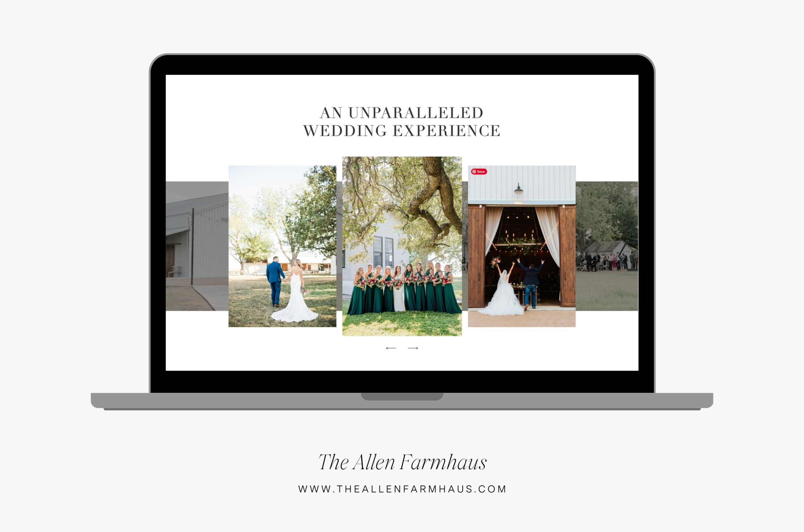
6. The Portfolio Section
As a wedding pro, this is one of the main reasons couples are visiting your site! They want to see with their own eyes just how good you are. Whether you are a photographer, venue, planner, florist, cake decorator, or something else, a picture says 1,000 words.
Goal of this section: The goal here is to showcase your best work. This could look different depending on what you do! You might choose to link to some specific wedding galleries (on your blog or galleries page). Or, you might want to have a slider showcasing a lot of different work!
PS – Are you a wedding pro whose work doesn’t necessarily translate visually, like an officiant, DJ, or musician? Consider showcasing “featured weddings” with an image or two plus something pertinent from their wedding, like a reading they did or their first dance song. This showcases your work and allows future clients to envision themselves in their shoes!
Call to action: Link website visitors to your portfolio or galleries page. Some ideas: Browse the galleries, Explore our portfolio, View more work, See our recent weddings
Avoid this roadblock: Keep your site from looking cluttered by selecting images that are consistent in color and tone. That doesn’t mean the weddings themselves need to have the same color palettes, but rather, that the lighting and editing are similar enough to look cohesive. I also recommend creating some nice variety by varying your use of close up shots versus full body.
Bonus tip: Set aside a specific day on your calendar once or twice a year to update your featured portfolio work! A good time is 2-3 months after your busy season when you’re likely to have the images back and ready to go. This keeps your site looking fresh and new!
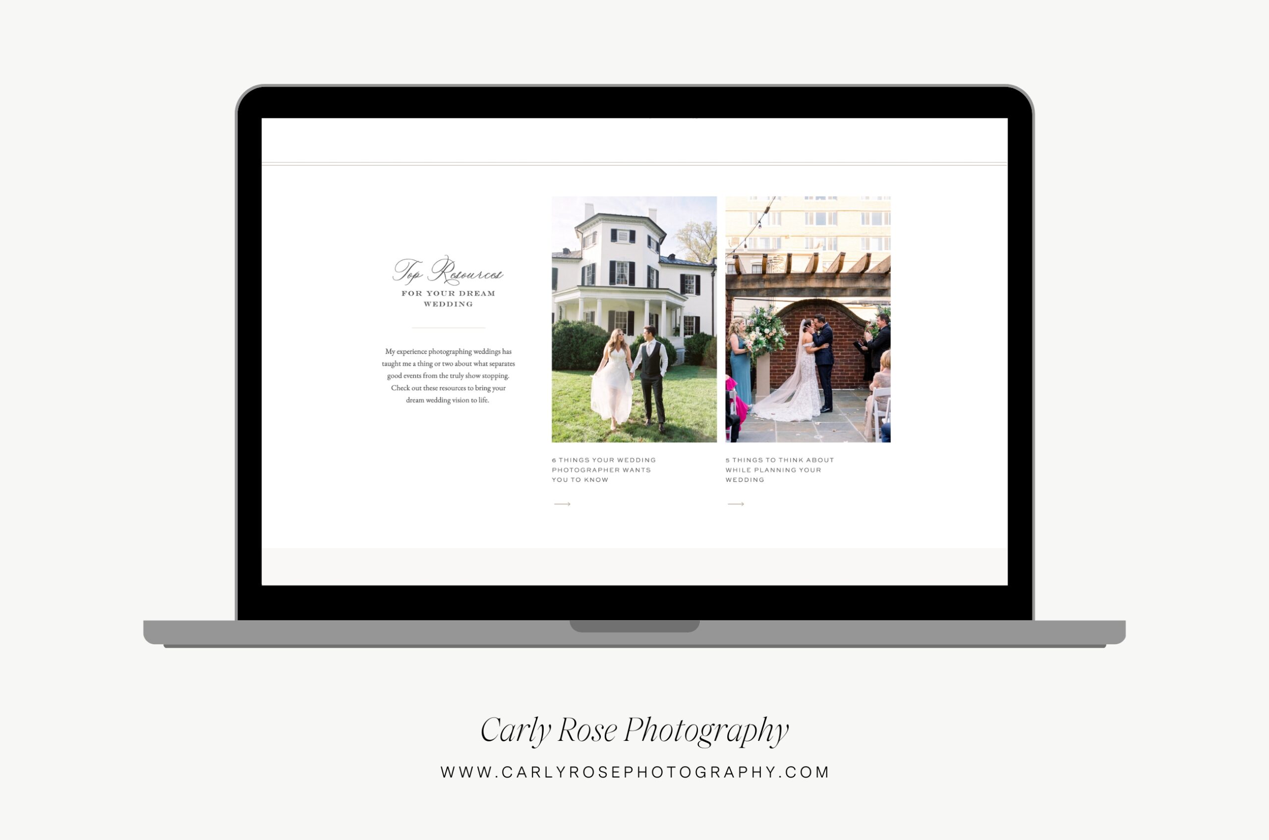
7. The Blog Section
In this section, choose a selection of your blog content to feature. Ideally, this will be strong, SEO-focused content that positions you as the expert. Linking to your blog from your homepage can help search engines crawl and index your content more effectively, potentially improving your website’s ranking!
Goal of this section: Build your credibility with your audience, positioning you as a reliable source of helpful information, and increasing your search ranking. Alternatively, this could double as your portfolio section if you choose to feature recent weddings on your blog!
Call to action: Depending on the type of blog content you are featuring here, you could title this section something like “Our Top Resources” or “Helpful Guides from Our Expert Team.” The posts themselves could have a “Read More” button or simply have the title be clickable!
Avoid this roadblock: I get it—a blog is a lot of work and it’s easy to dismiss this section and think, “I’ll get to that later when I have time!” But if you are serious about using SEO as part of your business’s marketing strategy, a blog is a must! Don’t skip this section!
Bonus tip: If you’re not already using Google Search Console to help you plan your content, consider this your sign! Take a look at which of your blog posts are performing the best in search and put those on your home page. I also recommend using this information to plan future content, since you can see what resonates most with people!
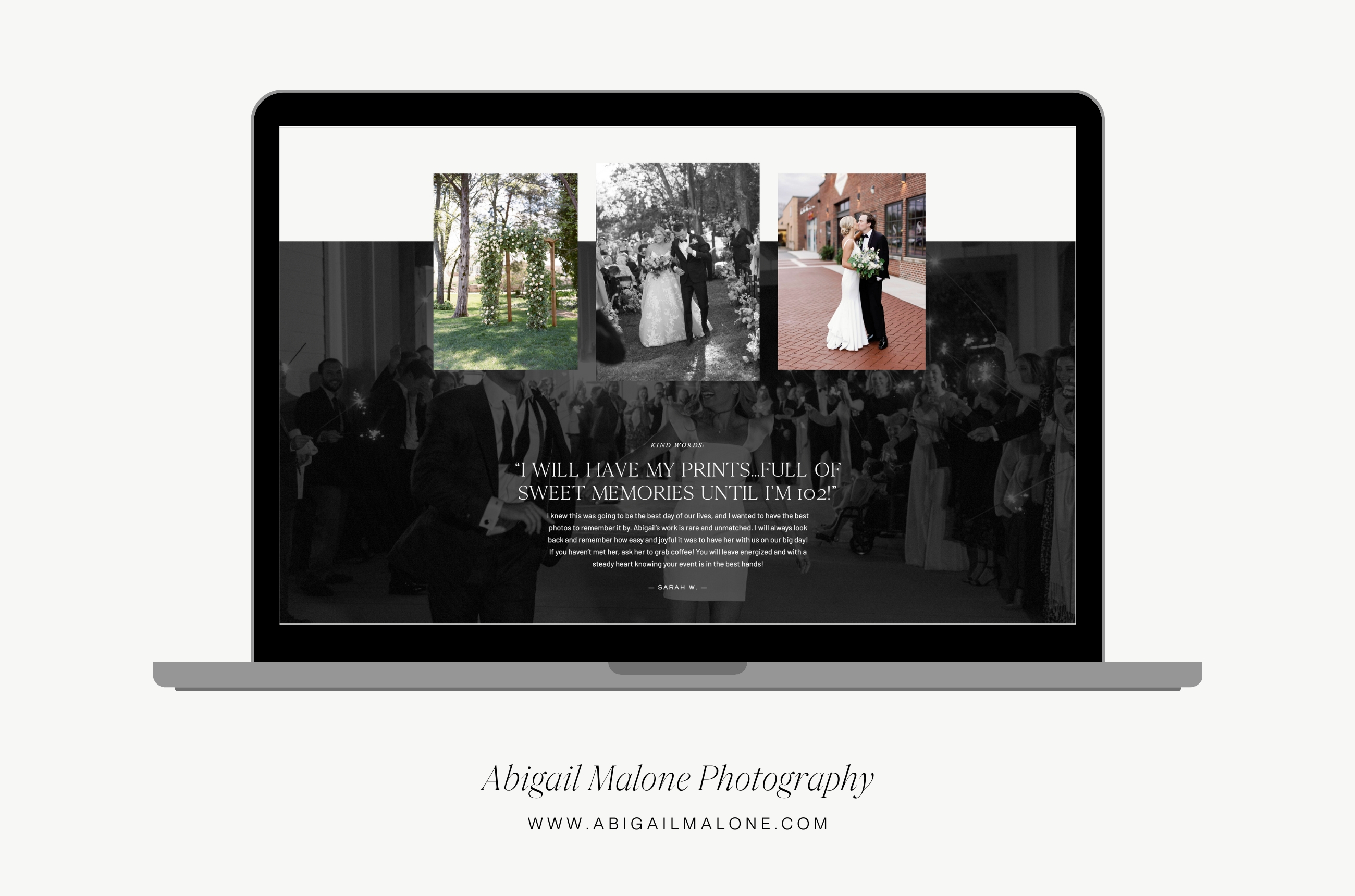
8. The Testimonial Section
I recommend including a testimonial on every page of your site, and your home page is no exception! Testimonials are an excellent way to provide social proof and build know, like, and trust.
Goal of this section: Allow your website visitors to put themselves in your real clients’ shoes and envision exactly what it will be like to work with you (and how amazing it will be!). Share your best testimonials that showcase what makes you unique and exceptional as a vendor.
Call to action: No call to action needed here! This section isn’t designed to take folks anywhere else on your site, but rather, to allay their fears and hesitations, and to build their confidence in hiring you for their wedding. If you wanted, you could make this a click through with a handful of testimonials instead of just one!
Avoid this roadblock: Avoid copy and pasting testimonials word for word. Remember, people don’t really read, they scan. So which a long, gushing review feels amazing, it can easily become noise on your website. Instead, pull out a really impactful sentence or two to showcase. Even better if the couple uses language or mentions specific aspects of working with you that you’ve already mentioned elsewhere on the page!
Bonus tip: It’s always a nice touch to include an image of the couple next to their testimonial as well as their names and possibly even a detail about their wedding, like their date or venue. This puts their testimonial quote into context and makes the statement even stronger!
9. The Contact Section
It’s great practice to end your home page with a call to action to your contact page. While many users will want to explore your site further before inquiring, this section encourages visitors to reach out, ask questions, and explore the idea of working with you further. Ultimately, the primary goal of your homepage (and website in general) is to convert visitors into clients. A CTA to contact you can contribute to this goal by encouraging that next step!
Goal of this section: Get visitors to visit your contact page to complete your inquiry form!
Call to action: Link website visitors to your contact/inquiry page, which ideally will include a form they can complete to tell you more about themselves and their wedding. Some ideas: Get in touch, Inquire now, Contact us, Inquire about your date
Avoid this roadblock: It might seem like a great idea to embed your contact form itself on your homepage, but I advise against this for a couple reasons. First, it can feel off putting to potential clients—a little bit like asking to meet their parents before the first date. People like to feel in control, so give them the option to click over to your contact page on their own terms. Second, and most importantly, embedded contact forms (such as those from Honeybook or Dubsado) can slow down your page speed. That’s not a big deal on your contact page, which is not designed to rank in search results. But your homepage, on the other hand, is your biggest ranking opportunity. Page speed can factor into your ranking since it is a measure of usability. So for SEO reasons, I recommend leaving the form itself off your home page!
Bonus tip: Be specific about what you are asking people to do here! By reaching out, are they scheduling a consultation with you, getting your pricing and availability, scheduling a tour, or something else? Call that out in the CTA copy!
Summary
Designing your website’s home page isn’t an exact science—it’s all about what will resonate with your ideal clients and create a delightful web experience. But in my years of designing websites for wedding pros, I have found these sections foundational to most of the sites my clients and I launch! Use this guide next time you are wanting to update or refresh your website’s home page!
Looking for an expert web designer who can help you launch your new brand + website and become the highly sought-after choice for your ideal clients. I’m currently booking clients and would love to chat with you! Reach out to get in touch here: Inquire with Alex Collier Design
Leave a Comment