


How to find and pair fonts for your Showit Website
One essential ingredient in a distinctive brand and website is the font. There are so many beautiful fonts out there, and if you have the budget, I recommend checking out Creative Market. However, I truly believe that a fancy expensive font is totally unnecessary! There are tons of high-quality free fonts out there. My favorite resource for font pairings is Google Fonts, which not only has an amazing selection, but all of their fonts are totally free to use on your website!
In this post, I’m going to teach you how to upload and use Google Fonts fonts in Showit, important font terms to know, and ideas for pairing fonts.
Uploading and using fonts in Showit
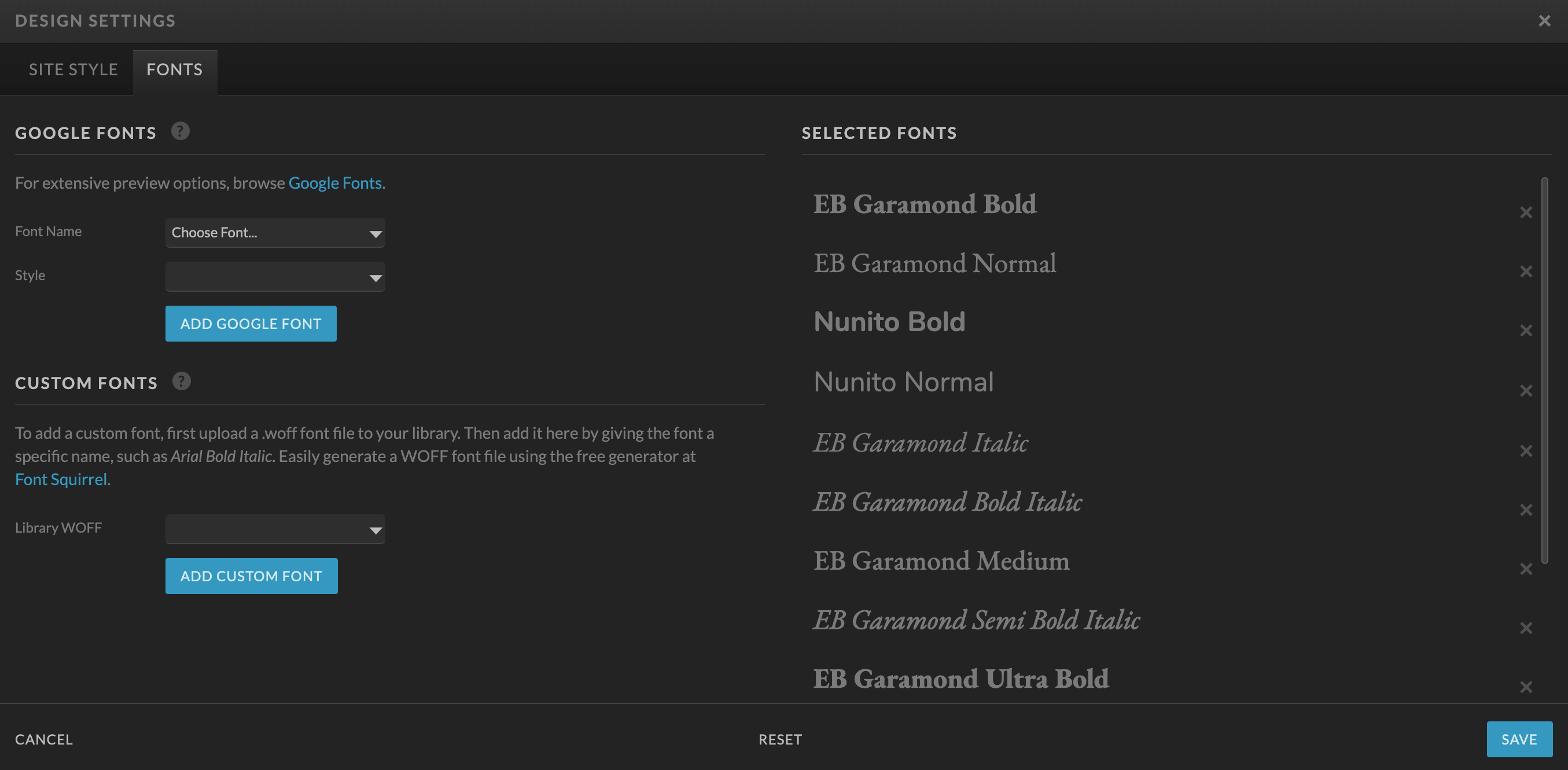
Google fonts are easy to use in Showit. All you need to do is go to your design settings, click the “fonts” tab, and select the Google font you’d like to add to your site.
When thinking of fonts for your website, keep it simple! Too many fonts, or too many variations on the same font, can look cluttered and make your site difficult to scan. Consistency is important—all headers should look the same as each other, and all body text should look the same.
For your Showit site, you will need to select Title, Heading, Subheading, and Paragraph text styles.
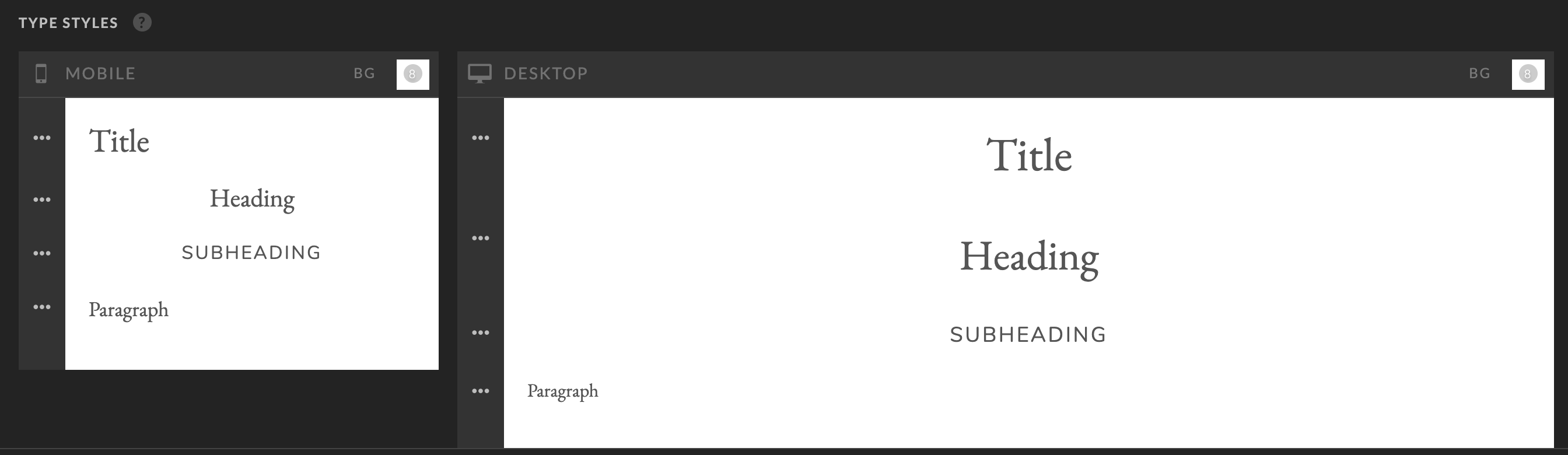
Title: The title tag will automatically mark your text as an H1. Since SEO best practices dictate using only one H1 per page, you won’t use this very often! This should be the biggest, splashiest font that is used exclusively for page titles (Like “services,” “about me,”etc)
Heading: Showit automatically marks this text as an H2. That means you will use this text as the title for any sections on your page (For example, on a “weddings” page, the sections might be titled “galleries,” “investment,” “the experience,” etc). You could think of this also as for each new canvas you are placing in Showit, you should have an H2 Heading to title it.
Subheading: The subheading tag will mark your text as an H3. This should be used anytime you have a subheading to go along with your section heading (H2), or have subsections within a section.
Paragraph: This text gets automatically marked with a p (paragraph) tag. This text should be super readable because it’s what the majority of the text on your site will be. Any time you are writing complete sentences for your user to read, it should use this style.
Font vocabulary to know
You don’t need to be a designer to thoughtfully choose fonts for your website, but it is helpful to know some key terms when it comes to typography. Choosing fonts for your brand and website will feel less intimidating if you are familiar with these common terms!
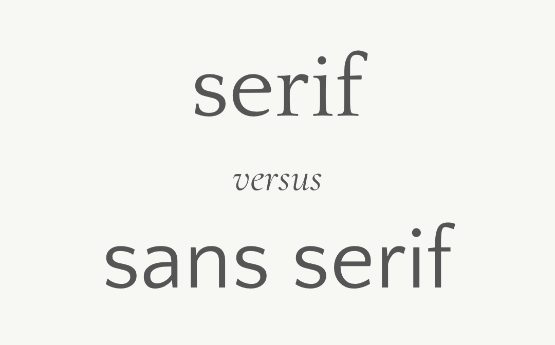
Serif versus Sans Serif: A serif font has “feet” or decorative strokes at the end of each character. A sans serif font does not have these strokes. Serif fonts tend to evoke more a classic, elegant mood, while sans serif tend to be viewed as more modern. Because I design for wedding professionals and weddings tend to be classic, elegant events, I typically recommend serif fonts for the most-used fonts on a website (headings and paragraph text) and incorporating sans serifs as accents in the navigation or subheadings. Of course, all brands are different, so sans serif headings or paragraph text might be the right choice in many cases! It’s all about what works for your brand.
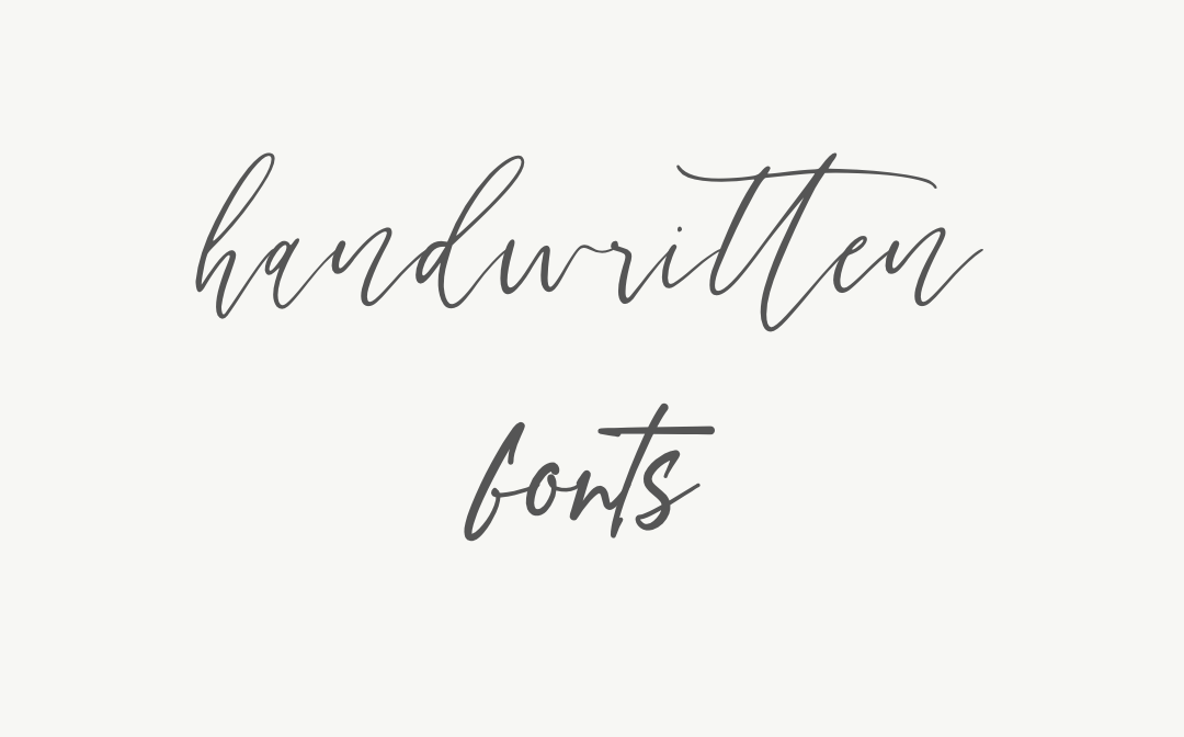
Handwritten or script fonts: A script or handwritten font is exactly what it sounds like—font intentionally created to look like handwriting or calligraphy. Creative Market has a ton of dreamy script fonts that I love to incorporate into brands. These fonts, however, tend to be difficult to read, so they are ideal for use as decorative marks or when used very large (like a logo). I would hardly ever recommend using a script font as one of your primary fonts in Showit.
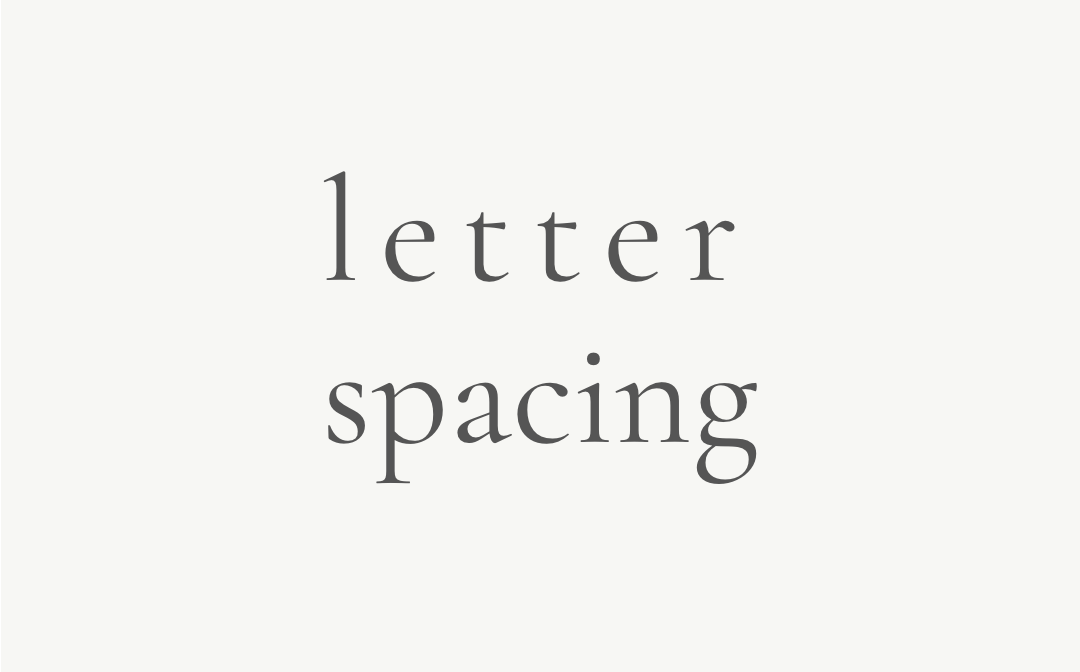
Letter Spacing: Letter spacing is the space between the letters (also referred to as characters) in a line of text. This is also called “tracking” in programs like Adobe Illustrator. In Showit, you can change letter spacing under the “text styles” menu, and you can also set it as part of the fonts style in your design settings. In Showit, you will input letter spacing in terms of “em” measurements. An “em” measurement is equivalent to whatever pixel size the font is set at. So for example, setting your character spacing as “1 em” with 12px font will mean there will be 12px between each character (hint, that’s a lot!).
Character spacing looks best when it is very subtle, so you will want to input this as a number less than 1. My subheadings, for example, have .2 em letter spacing. I recommend using letter spacing anytime you are using all caps as a heading or subheading. I strongly discourage you from using letter spacing in paragraph text, because it negatively impacts readability.
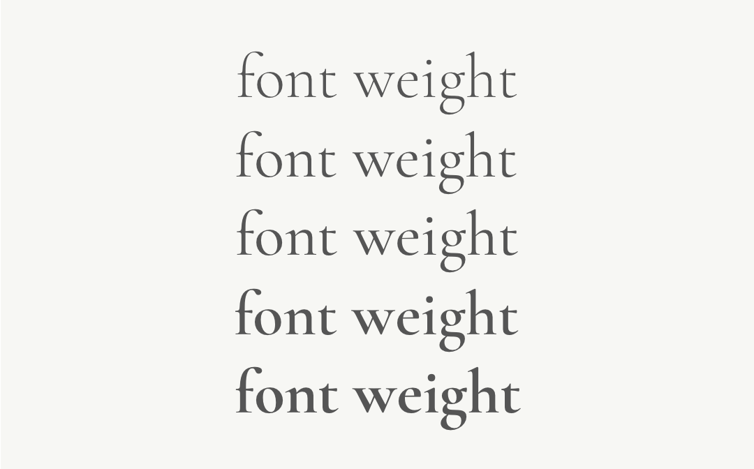
Weight: A font’s weight refers to its thickness or boldness. Changing the weight of a font can give it an entirely different appearance and feel. Some fonts only have one weight, while others have 5 or 6! In Google Fonts, you can search for fonts with more weights under the “Font Properties” dropdown, and drag the “Number of Styles slider to the right. This will show you fonts that have many different weights such as thin, light, regular, semi-bold, bold, and black. In Showit, you will need to add each weight you’d like to use on your site as a separate font.
Guidelines for pairing fonts
When pairing fonts, the most important thing to remember is to keep it simple. I recommend choosing no more than two fonts for your website and using things like weight, italics, and size to differentiate headings, subheadings, and paragraph text.
Contrast is key! Think of pairing fonts as setting up your friends on a date: you want them to be similar enough that they will “vibe” but not so similar that they will compete with each other. Think of this like an “opposites attract” situation.
Here are just a few ideas for “rules” to follow when pairing fonts.
Pair a serif and a sans serif: This is one of the easiest and most common ways to pair fonts! You really can’t go wrong here. Serifs and sans serifs have enough contrast in appearance that they make the perfect pair. One caveat is to make sure the fonts have the same general personality; don’t pair a strong, bold serif with a delicate, romantic sans serif.
Pair fonts in the same family: There are many fonts which have been created in different variations. Often these variations are a serif/san serif match like Noto Serif and Noto Sans, or have to do with character width, like Roboto and Roboto Condensed. These fonts are easy to pair together because they were specifically designed to do so!
Pair different weights of the same font (light, bold, semibold): Rather than choosing two different fonts for your site, you could simply choose one and differentiate headings, subheadings, and paragraph text using different weights and sizes. Typically, this would mean using a semi-bold or bold font as the heading, and regular weight for paragraph text.
Pair all caps with normal caps: Headings or sub-headings in all-caps can add variety and visual interest to your website. You actually don’t even need to use the caps lock key to do this; you can just use the “letter case” setting in Showit. That way, if you re-style your website later, you won’t have to re-type everything. I love the look of all-caps headings, especially with increased letter spacing to create a really elegant look. One word of caution: never use all caps for paragraph text; it is really difficult for our eyes to follow, so folks will tend to skip over it as they scan your page! (you can read more about text=readability here).
Pair regular text with italic text: I wouldn’t recommend using italic text for large chunks of text because it can be difficult to read, but italic fonts work really well as subheadings, especially serifs! The really nice thing about italic text is that it tends to look romantic and elegant—perfect for wedding professionals! This is another example in which the italic you use can be the same font as your heading text. Making the subheading italic and smaller (and playing around with letter spacing) gives them enough contrast that they work together.
Typography is such an essential component of a well-designed website. Follow these guidelines to elevate the look and feel of your site and make a striking first impression on potential clients.
Alex Collier is a brand, logo, and Showit web designer for wedding professionals. Are you ready for a brand and website that elevates your business and books ideal clients? Get in touch!
This is such a beautiful and helpful blog. Thank you!
Ive been playing around with font pairings and BY FAR, this is the most helpful post I’ve come across… and I’ve been diving deep for weeks! A huge thank you for this.
– Karen (@karenduckettevents)