


If you’ve ever created a website for your business, you’ve probably wondered: “What pages should my website include?” You might have just kept the pages your template included or peeked at a competitor’s site to see what they do. But did you know your page structure has a huge impact on your user experience and SEO? It’s something you should think about pretty seriously when designing your site!
Here are the five pages you need to include on your website:
1. Home Page
The home page is typically where users will land when they first visit your website. It’s important to give a good first impression! I always say, “your website is an airport, not a museum.” People aren’t visiting to stand around and look at how pretty it is; they are trying to GO somewhere and DO something (hopefully, hire you!).
Your home page’s job is to tell them where to go. Think of it as your site’s “arrivals board.”
The goal of your homepage is to grab the user’s attention, tell them who you are and what you do, and direct them where they need to go next.
Here are some things to include on your home page:
- An eye-catching hero image and CTA: The “hero” section refers to the section at the very top of your home page. This section’s primary job is to capture the user’s attention. For wedding professionals, I love using a stunning image (or a few stunning images)—even if you aren’t a photographer! This is where you should be showcasing the very best of the best of your work.
- A blurb stating who you are and what you do: The higher up on the page, the better. Don’t frustrate your couples by making them search to figure out what you do or what location you serve. State that important information right away!
- Sections linking out to your other pages: Each section on your home page should invite users to explore the other pages of your site. Tease your portfolio images, recommend some blog posts, give a quick summary of your “about”—and then give users a call to action to those pages!
- Header and footer: The header and footer will appear across your website, not just on your home page, but it’s so important I couldn’t leave it out! Check out my header and footer tips in my other posts.
2. About Page
The about page is your chance to tell users more about you and your business. This page is all about building the know, like, and trust factor with your potential clients. It should include storytelling that will make an emotional connection. You want to get people thinking: “YES! This is the calligrapher/florist/planner for me!”
Keep in mind, the about page isn’t so much about you as a person as it is about your business. The goal is to show users that you empathize with their needs and goals and that you are uniquely prepared to solve them.
Some sections to include on your about page are:
- A personal introduction: Kick this page off with a brief note from you that introduces yourself and shares how excited you are for the user to be considering hiring you!
- A picture of you: Include at least one picture of yourself making eye contact with the camera. I love those artsy “looking wistfully into the distance shots” as much as the next gal, but it’s important to include at last one photo where you are smiling directly at the camera. Psychology studies have shown that eye contact is an important way to build confidence and trust!
- Your why: Share your mission statement for your business and why you do what you do. My client Rachel does a great job of this on her about page, sharing a really interesting personal story and connecting it back to her why.
- Features and awards: Don’t be afraid to brag on yourself a little! The about page is a great place to link out to some of the awesome places you have been featured or awards you have won.
- Some fun facts about you: Add some personality here! Just be careful not to let these cutesy “fun facts” take over your whole page. The story and why behind your business is the most important part!
- CTA linking to the services/portfolio page: Invite users to learn more about what you do by telling them exactly where to go next.
3. Services/Portfolio Page
The services and portfolio page is where you will share with users what you do and show off how beautifully you do it. I know what you’re thinking: “Wait, Alex, isn’t that two pages?”
The reason I’m combining services and portfolio here is that I believe for most wedding vendors, your services and portfolio should actually be combined onto ONE page. By combining your services and portfolio on one page, you will be able to provide the client with all the relevant information in one place. That’s better both for your user experience AND for SEO!
I recommend calling this page “Weddings.” This allows you to group all relevant content onto one page: the experience, your portfolio, pricing information, and testimonials.
The other reason to combine services and portfolio is that many wedding vendors serve more than just wedding clients. A planner that also does corporate events, for example, could have a page for “weddings” and a page for “corporate.” The services and portfolio for those clients will be very different, so it doesn’t make sense to have them visiting the same pages as each other!
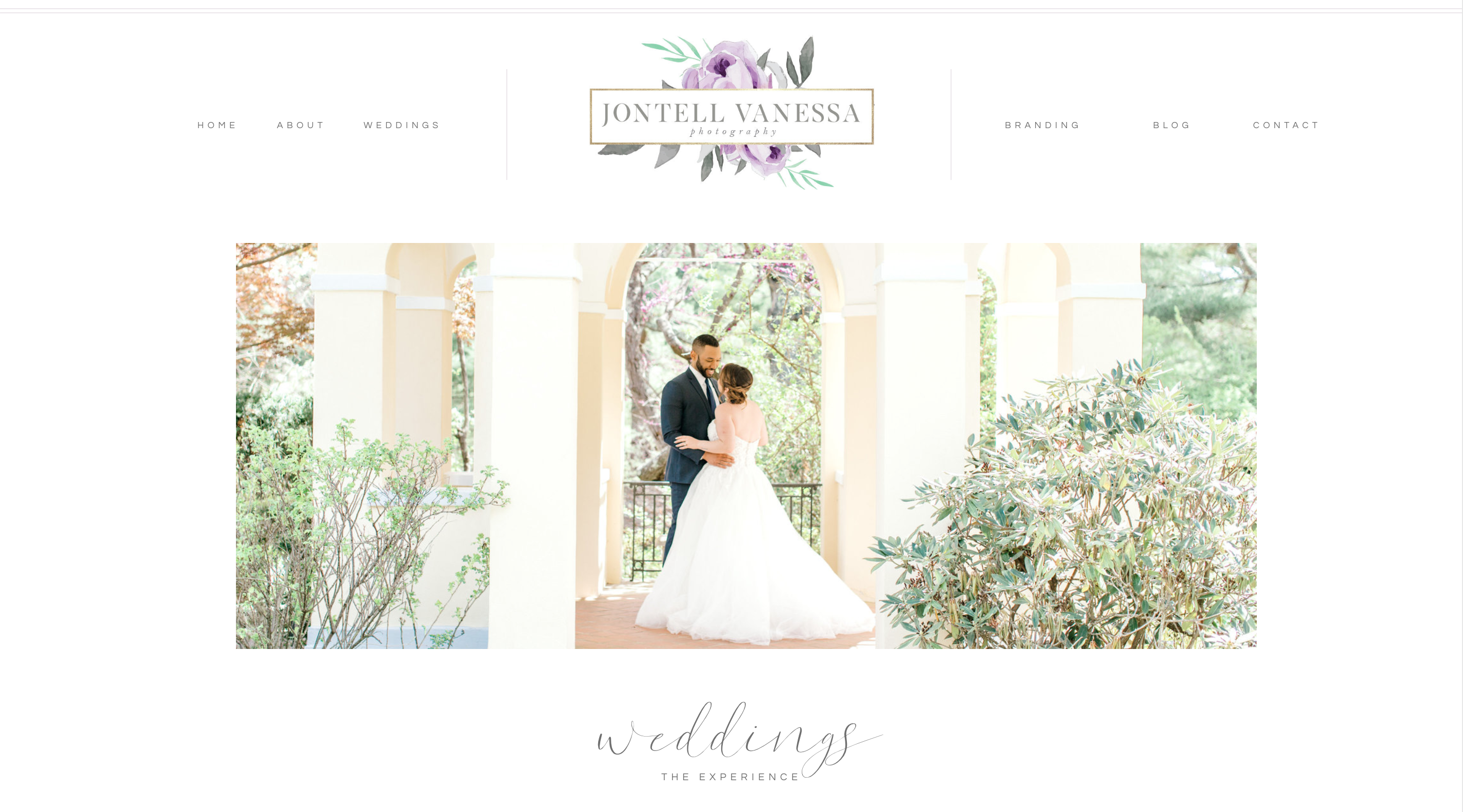
I love how my client Jontell did this with her template customization. Because she does both wedding and branding photography, each is separated out into their own page!
Here are a few things to include on your combined services/portfolio page:
- The experience: Share what it’s like to work with you. What can people expect when they become your client? Are you a photographer who prides yourself on delivering images two weeks post-wedding? Are you an invitation designer with a super fun revision process? Here’s the place to share!
- Featured galleries: I love grouping these galleries by event, to showcase the couple’s story. Even if you aren’t a photographer, I recommend including images from the couple’s day that you were a part of! Check out this post on requesting wedding day images from photographers.
- Testimonials: Share those wonderful kind words from your past couples. This is social proof that shows this wonderful experience you’re talking about is really true!
- Investment: Share a starting price or average investment for your services. If you’re comfortable listing the details of your packages, you could do that here too! There’s a lot of debate about this in the wedding world, but I believe you will always win if you make things easier on your potential clients.
- CTA to contact you: Link users to your contact form so they can reach out and inquire about working with you!
4. Blog Page
If your website doesn’t have a blog, you are missing out big time! Your blog allows you to establish yourself as an expert in your field, make a personal connection with potential clients, and it’s great for SEO. I love this article from Sara Does SEO about the five reasons blogging is good for SEO. Here are a few things to include on your blog:
- Portfolio posts: Showcase each couple you work with, tell a little bit about their story, and how your services made their dream wedding day a reality! Make sure to link to the other vendors!
- Education posts: Do some research and figure out what questions your clients have that you can answer. Writing about these topics can be great for SEO and establish you as an expert!
- Sidebar: Include a sidebar with your headshot, a brief intro, and links to your social media. Keep in mind some users may be visiting your site for the first time via a specific post (from Google or Pinterest), so you want to make sure they know who you are!
- Categories: In WordPress, assign each of your posts a category: weddings, portraits, education, etc.
5. Contact Page
When we talk about website “conversions,” the contact page is where the magic happens. It’s when users take the step from being visitors to leads. The contact page should be short and sweet! The goal is to get users to inquire with you about your services. You can read more about optimizing your contact page here, but here are a few things to include:
- A picture of you: Continue to build that know, like, and trust all the way up until that moment when a user submits their inquiry form! A picture of you is a great way to make the experience more personal and remind users who exactly they are contacting.
- 5-7 form fields: Ask only what you absolutely need to know, and nothing more. Shorter forms have been shown to convert at higher rates. Save all the fun questions, like how the proposal went down, for later. Just ask the need-to-know: name, email, and wedding date. You can also leave some space for an open-ended question where users can choose to tell you as much or as little as they’d like!
- Your email address: Always include your email address just in case your form isn’t working, or someone has a specific question they’d like to simply email. A photographer on Instagram pointed out recently that it was such a challenge to find vendor’s emails to send a wedding gallery. So including your email also makes it easier for other vendors to reach out to you!
- A thank you message: Let users know you got their message, and tell them what they can expect next. When will you be contacting them? Where can they learn more about you in the meantime?
That’s it! Those are truly the ONLY pages I believe most wedding professionals need on their website (not including landing pages, newsletter opt-ins, etc!). These five pages are the only ones you will need to link to from your main navigation. I often see wedding vendors with really complex navigation menus. This is bad because it’s confusing for users—they aren’t sure where to go or what to do next because it’s so overwhelming! So if you’re not sure what pages you can cut, here are a few pages you absolutely don’t need:
Pages you don’t need on your website:
- Testimonials Page: Testimonials are great. You’ve probably heard them referred to as social proof. The keyword there is PROOF! Testimonials are meant to prove, or support, the claims you are making about yourself on your website. So putting them on their own page doesn’t make sense because it’s separating the proof from the claims. Instead, include testimonials as a page section throughout your website! (ps, check out this post for tips about getting great testimonials for your site).
- FAQ Page: An FAQ page is a symptom of bad user experience. A little tough love: if you need an entire page to answer user’s questions, you must not be doing a very good job of explaining who you are and what you do throughout your site! I think an FAQ section can be very useful on your services page, where it’s very likely that users do have more specific questions, like what exact deliverables you provide, or what they can expect from your services. But just like with testimonials, it’s so much more clear and powerful to present those FAQs in context! No need for a separate page!
- Press Page: A press page is likely junking up your main navigation and not serving any real purpose. A press page is not providing any new information to the user that will help them achieve their goal. It’s unlikely a user will click over to this page and read it very in-depth, if at all. Including your press on your about page, and in blog posts is much more powerful!
Whether you are customizing a template or starting from scratch, considering your page structure is the key to website success! I hope this post gave you some ideas for how to organize the pages on your site.
Alex Collier is a Showit web designer for wedding professionals. Are you ready for a website with beauty and brains? Get in touch!
Leave a Comment